pkgs <- c("tidyverse", "glitr", "scales", "glue",
          "gt", "gtExtras", "systemfonts", "usethis")

install.packages(pkgs, repos = c('https://usaid-oha-si.r-universe.dev',
'https://cloud.r-project.org'))Data Visualization Remake
Local Partner Data
The data used in this lesson are from the PEPFAR 2022 Annual Report to Congress. The .csv file consists of PEPFAR operating units that received funding to local and international partners. The share of funding is represented in the local and international columns.
We will be recreating the Figure H graphic found within the report.

Preparing your work space
To load, munge, and visualize the data requires numerous R packages. The code chunk below prepares your R-Studio environment. If you do not have any of the packages referenced below, you’ll need to download them from CRAN or rOpenSci/GitHub.
We recommend setting this exercise up within an RStudio Project. We recommend you download the course materials using usethis::use_course() and then opening it up as a project. You will be given a series of prompts and then the project will open automatically. If you need to come back to a project, you can access through the menu bar - File > Open Project and then navigate to the Revolutionaries folder and select the .Rproj file
usethis::use_course("USAID-OHA-SI/Revolutionaries")When you have the project open, you can load the packages we will use throughout this session.
library(tidyverse)
library(glitr) # for custom colors
library(scales, warn.conflicts=FALSE) # for formatting
library(glue) # useful for creating dynamic text
library(gt) # create beautiful tables
library(gtExtras) # adorn gt tables
library(systemfonts, warn.conflicts=FALSE) # register fonts with R
Loading the data
You can load the local partner data directly from GitHub using the readr package. In the code below, we create an object (url) that points to data on our GitHub repo. You can use this argument in readr’s read_csv()` to read in the data.
#local path (if using RStudio Project)
path_local <- "Data_public/PEPFAR_local_partner_share.csv"

#url path (if loading from GitHub)
path_url <- "https://raw.githubusercontent.com/USAID-OHA-SI/Revolutionaries/main/Data_public/PEPFAR_local_partner_share.csv"

#determine which data path to use
(path_data <- ifelse(file.exists(path_local), path_local, path_url))

#load data into a dataframe (df)
df <- read_csv(path_data)
Codebook
| variable | description | type |
|---|---|---|
| operating_unit | name of the operating unit (typically country name) funded by PEPFAR, abbreviated where longer than 20 characters | character |
| operating_unit_long | full name of the operating unit (typically country name) funded by PEPFAR | character |
| local | share of PEPFAR funding directed to local implementing partners (operated by local institutions, governments, and community-based and community-led organizations) | double |
| international | share of PEPFAR funding not going to local implementing partners (1-local) |
double |
| goal | does the share of local partner funding meet or exceed 70%? 1 =TRUE, 0 = FALSE | integer |
Inspecting the data
There are numerous options for reviewing data frame objects in R. The View() function is great for seeing the tabular layout of the data. You can also use glimpse() to get a short preview of each column, or even the gt package to create a nicely formatted table.
# Inspect the data
glimpse(df)
Rows: 29
Columns: 5
$ operating_unit <chr> "Angola", "Asia Region", "Botswana", "Burundi", "C…
$ operating_unit_long <chr> "Angola", "Asia Region", "Botswana", "Burundi", "C…
$ local <dbl> 0.29, 0.12, 0.67, 0.14, 0.27, 0.28, 0.20, 0.55, 0.…
$ international <dbl> 0.71, 0.88, 0.33, 0.86, 0.73, 0.72, 0.80, 0.45, 0.…
$ goal <dbl> 0, 0, 0, 0, 0, 0, 0, 0, 0, 1, 0, 0, 0, 0, 0, 0, 0,…# Preview as a gt table
# View the resulting data frame as a table
df %>%
slice(1:10) %>%
gt() %>%
gt_theme_nytimes() #gtExtras| operating_unit | operating_unit_long | local | international | goal |
|---|---|---|---|---|
| Angola | Angola | 0.29 | 0.71 | 0 |
| Asia Region | Asia Region | 0.12 | 0.88 | 0 |
| Botswana | Botswana | 0.67 | 0.33 | 0 |
| Burundi | Burundi | 0.14 | 0.86 | 0 |
| Cameroon | Cameroon | 0.27 | 0.73 | 0 |
| Cote d'Ivoire | Cote d'Ivoire | 0.28 | 0.72 | 0 |
| DRC | Democratic Republic of Congo | 0.20 | 0.80 | 0 |
| DR | Dominican Republic | 0.55 | 0.45 | 0 |
| Eswatini | Eswatini | 0.47 | 0.53 | 0 |
| Ethiopia | Ethiopia | 0.81 | 0.19 | 1 |
Reshaping & Creating Color Objects
Making a stacked bar graph is easier if your data are in a long format. For this example, we’d like to stack the share of funding into a single column and to create a new column that captures the type of funding. We also to assign a blue color to locally funded partners and orange to international. We finish by renaming our operating unit variable.
# The hexadecimal code below can be passed directly to ggplot to add color.
# Excel default colors
hex_blue <- "#3C67BE"
hex_orange <- "#F27A2A"

# Reshape the data long for ggplot geom_col stacked bar graph
df_long <-
  df %>%
  pivot_longer(
    cols = local:international,
    names_to = "type",
    values_to = "share"
  ) %>%
  mutate(fill_color = case_when(
    type == "local" ~ hex_blue,
    TRUE ~ hex_orange
  )) %>%
  rename(ou = operating_unit,
         ou_long = operating_unit_long) %>%
  arrange(ou)
df_long %>%
slice(1:10) %>%
gt() %>%
gt_theme_nytimes() #gtExtras| ou | ou_long | goal | type | share | fill_color |
|---|---|---|---|---|---|
| Angola | Angola | 0 | local | 0.29 | #3C67BE |
| Angola | Angola | 0 | international | 0.71 | #F27A2A |
| Asia Region | Asia Region | 0 | local | 0.12 | #3C67BE |
| Asia Region | Asia Region | 0 | international | 0.88 | #F27A2A |
| Botswana | Botswana | 0 | local | 0.67 | #3C67BE |
| Botswana | Botswana | 0 | international | 0.33 | #F27A2A |
| Burundi | Burundi | 0 | local | 0.14 | #3C67BE |
| Burundi | Burundi | 0 | international | 0.86 | #F27A2A |
| Cameroon | Cameroon | 0 | local | 0.27 | #3C67BE |
| Cameroon | Cameroon | 0 | international | 0.73 | #F27A2A |
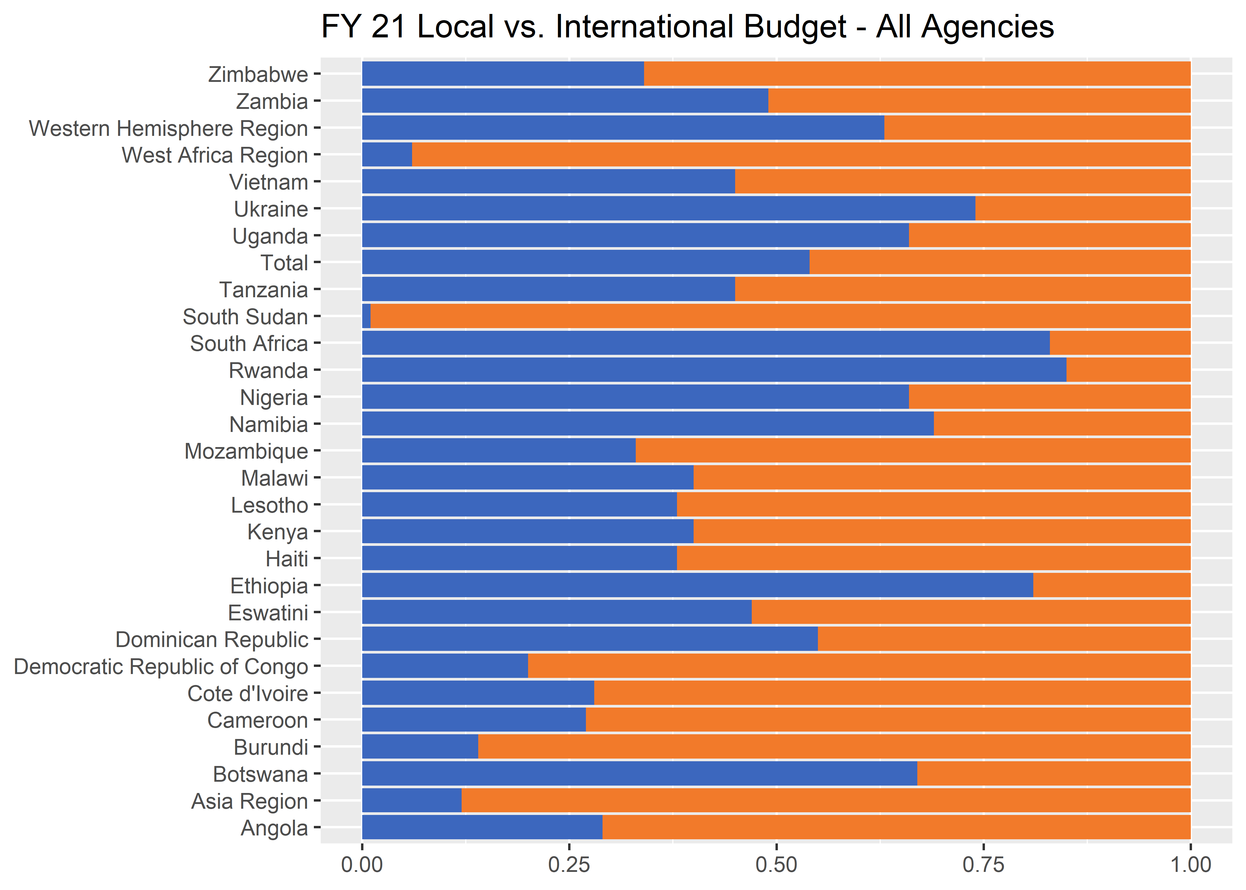
Building a plot from the ground up
To create a stacked bar graph with ggplot we can use the geom_col() geometry with the fill aesthetic.
Adding text labels
The final component we need to match to the original plot is the add the share labels with geom_label()
p1 <- df_long %>%
  ggplot(aes(y = ou_long, x = share)) +
  geom_col(aes(fill = fill_color),
           position = position_stack(reverse = T)) +
  geom_label(aes(label = scales::percent(share, 1)), # Adds labels
    size = 8 / .pt,
    position = position_stack(vjust = 0.5)
  ) +
  labs(
    x = NULL, y = NULL,
    title = "FY 21 Local vs. International Budget - All Agencies",
    fill = NULL
  ) +
  scale_fill_identity()
p1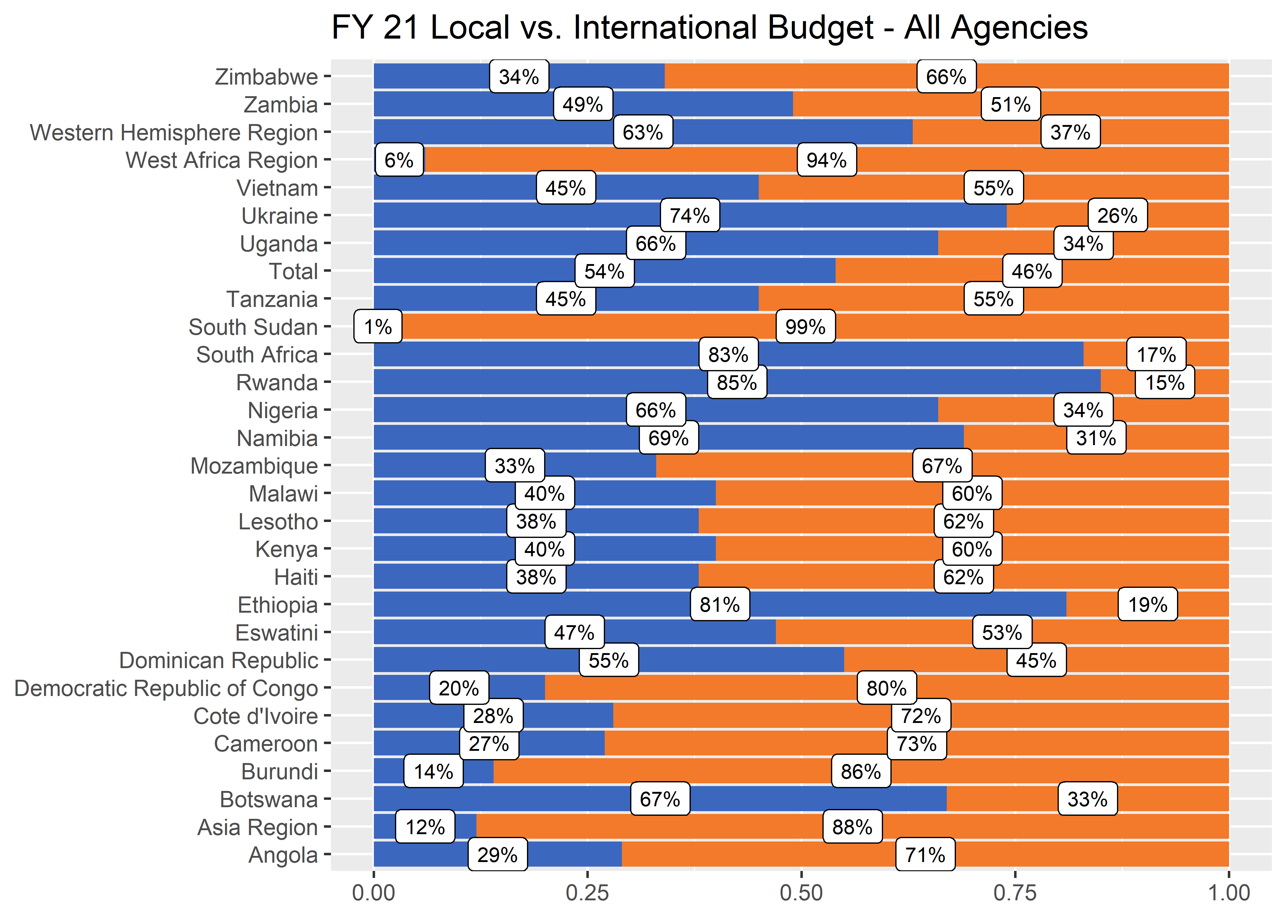
Sorting data
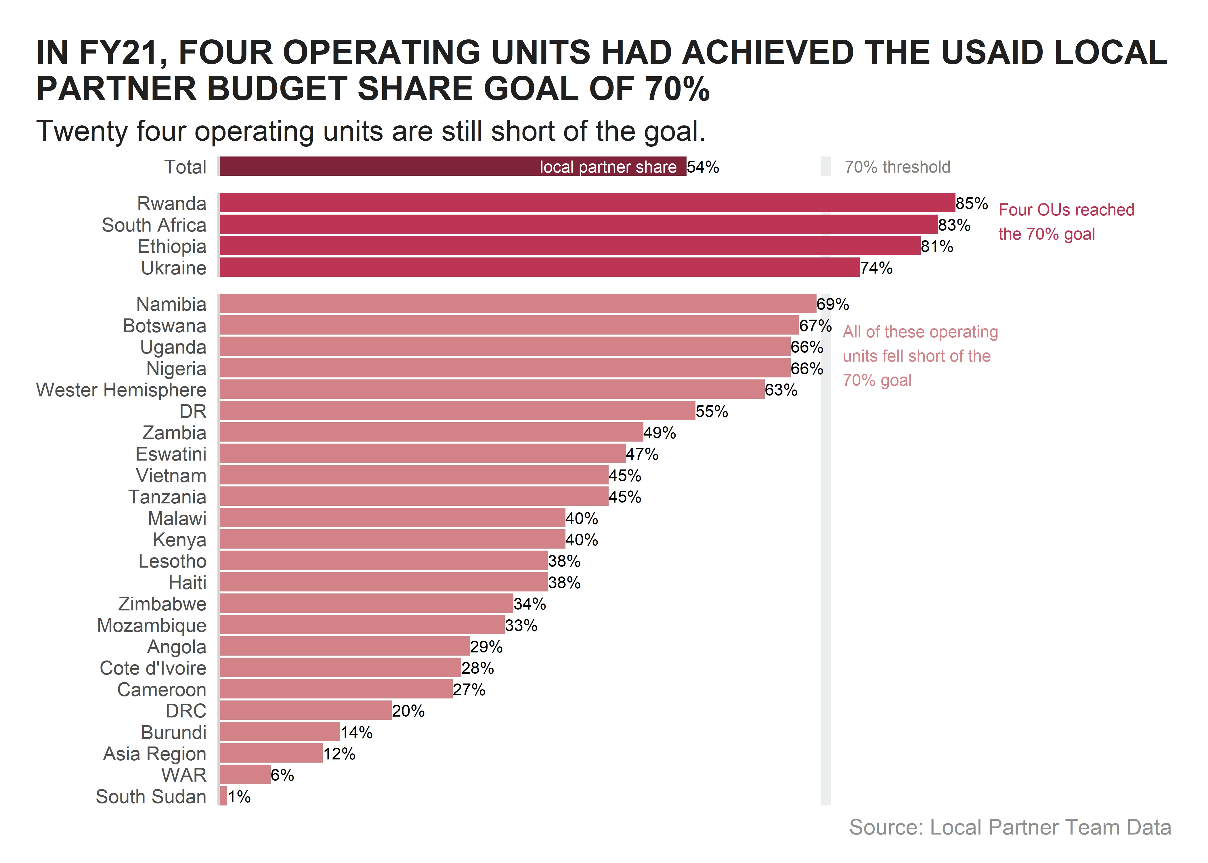
For our very first step in the remake, we want to start by resorting the data by something more meaningfull that alphabetically. Sorting the data makes a huge difference already. We can start to see some order in the data. In fact, it looks like a majority of the operating units are below the 50% threshold. For the sake of this exercise, let’s focus on the 70% threshold as that is what is important to USAID.

df_long_ordered <-
  df_long %>%
  mutate(
   lp_value = case_when(
    type == "local" ~ share), # Creating a new column to sort factors on
   ou = fct_reorder(ou, lp_value, .na_rm = TRUE), # overwrite ou into a factor
   ou = fct_relevel(ou, "Total", after = Inf) # move Total to the Top of factor list
   ) %>%
  arrange(ou)

# levels(df_long_ordered$ou)

p2 <- df_long_ordered %>%
  ggplot(aes(y = ou, x = share)) + # Use the factor column as y-axis
  geom_col(aes(fill = fill_color),
           position = position_stack(reverse = TRUE)) +
  geom_label(aes(label = scales::percent(share, 1)), # Adds labels
    size = 8 / .pt,
    position = position_stack(vjust = 0.5)
  ) +
  labs(
    x = NULL, y = NULL,
    title = "FY 21 Local vs. International Budget - All Agencies",
    fill = NULL
  ) +
  scale_fill_identity()
p2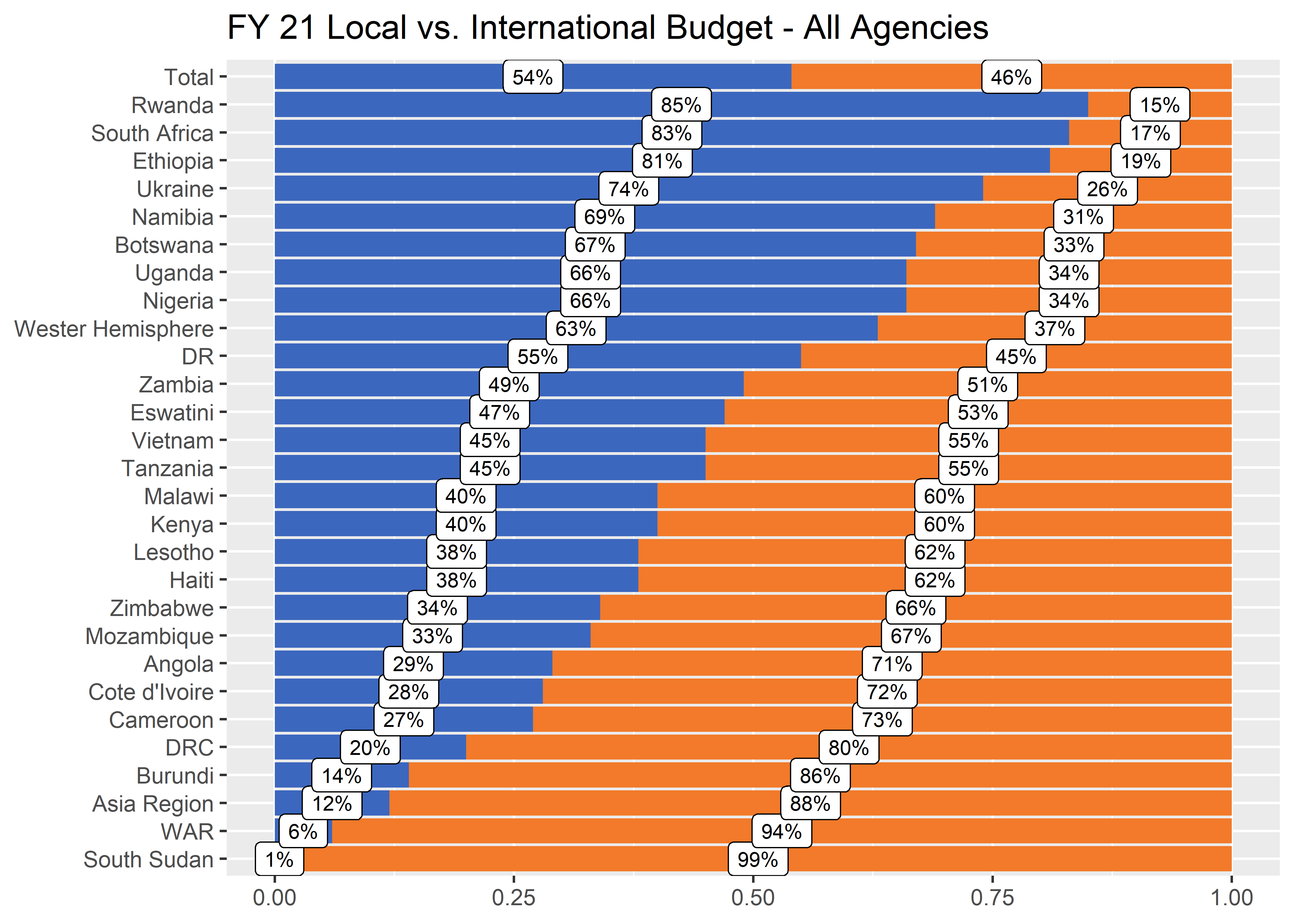
Getting it right in black and white
One of our common operating procedures is to try to get a plot right first in black and white, and then add color as needed. To convert the filled bars to black and white we can either create a new column and pass that to the scale_fill_identity() function or we can use scale_fill_manual() to manually recolor.

df_long_ordered_bw <-
  df_long_ordered %>%
  mutate(fill_color = case_when(
    type == "local" ~ grey90k,
    TRUE ~ grey30k
  ))

p3 <- df_long_ordered_bw %>%
  ggplot(aes(y = ou, x = share)) +
  geom_col(aes(fill = fill_color),
           position = position_stack(reverse = TRUE)) +
  geom_label(aes(label = scales::percent(share, 1)), # Adds labels
    size = 8 / .pt,
    position = position_stack(vjust = 0.5)
  ) +
  scale_fill_identity() +
  labs(
    x = NULL, y = NULL,
    title = "FY 21 Local vs. International Budget - All Agencies",
    fill = NULL
  )
p3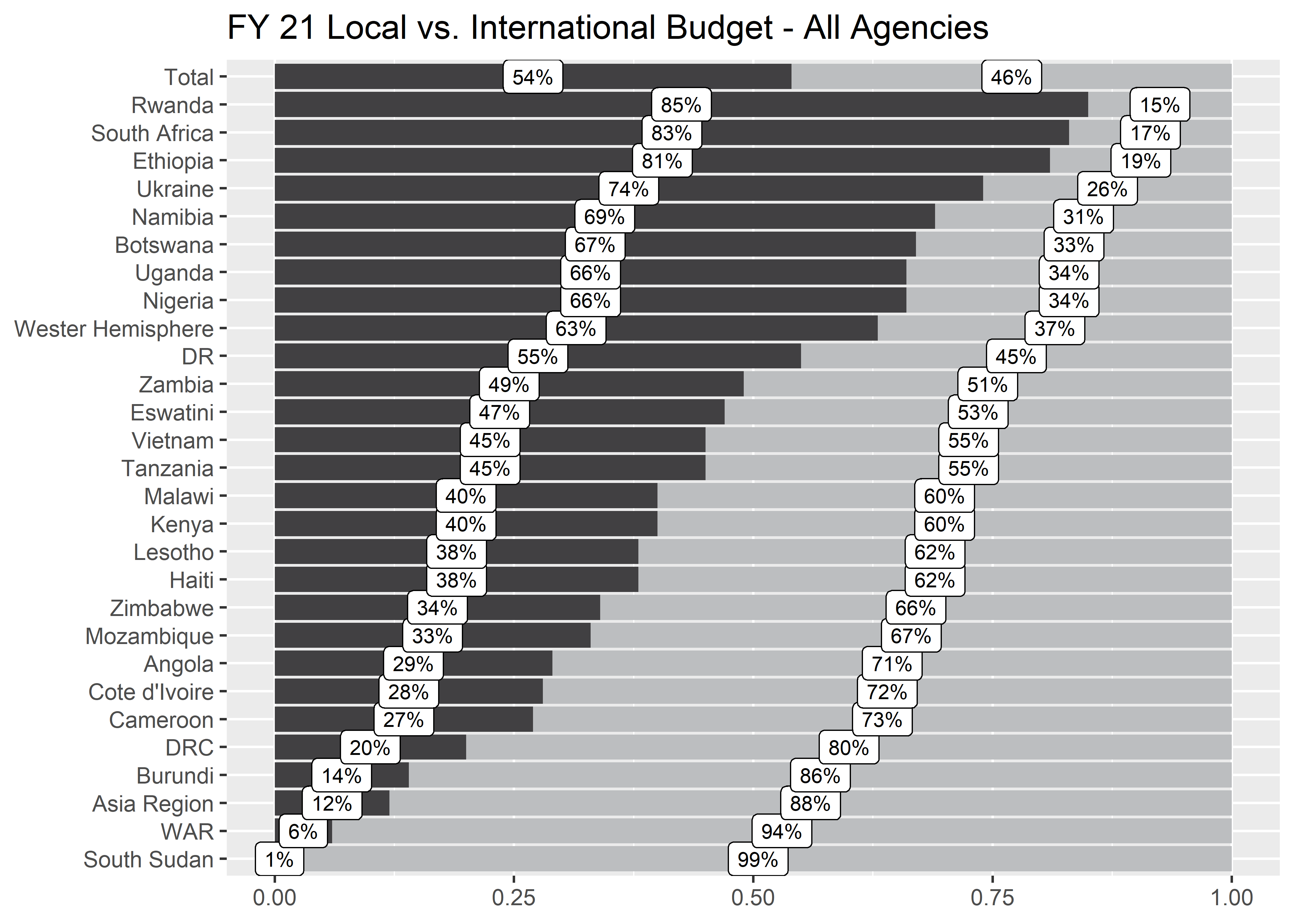
Removing labels?
Too many labels can make a plot feel clustered. We want the reader to focus on the most important points and if we try to highlight everything, it can be difficult to know where to focus attention.

p4 <- df_long_ordered_bw %>%
  ggplot(aes(y = ou, x = share)) +
  geom_col(aes(fill = fill_color),
           position = position_stack(reverse = TRUE)) +
  scale_fill_identity() +
  labs(
    x = NULL, y = NULL,
    title = "FY 21 Local vs. International Budget - All Agencies",
    fill = NULL
  )
p4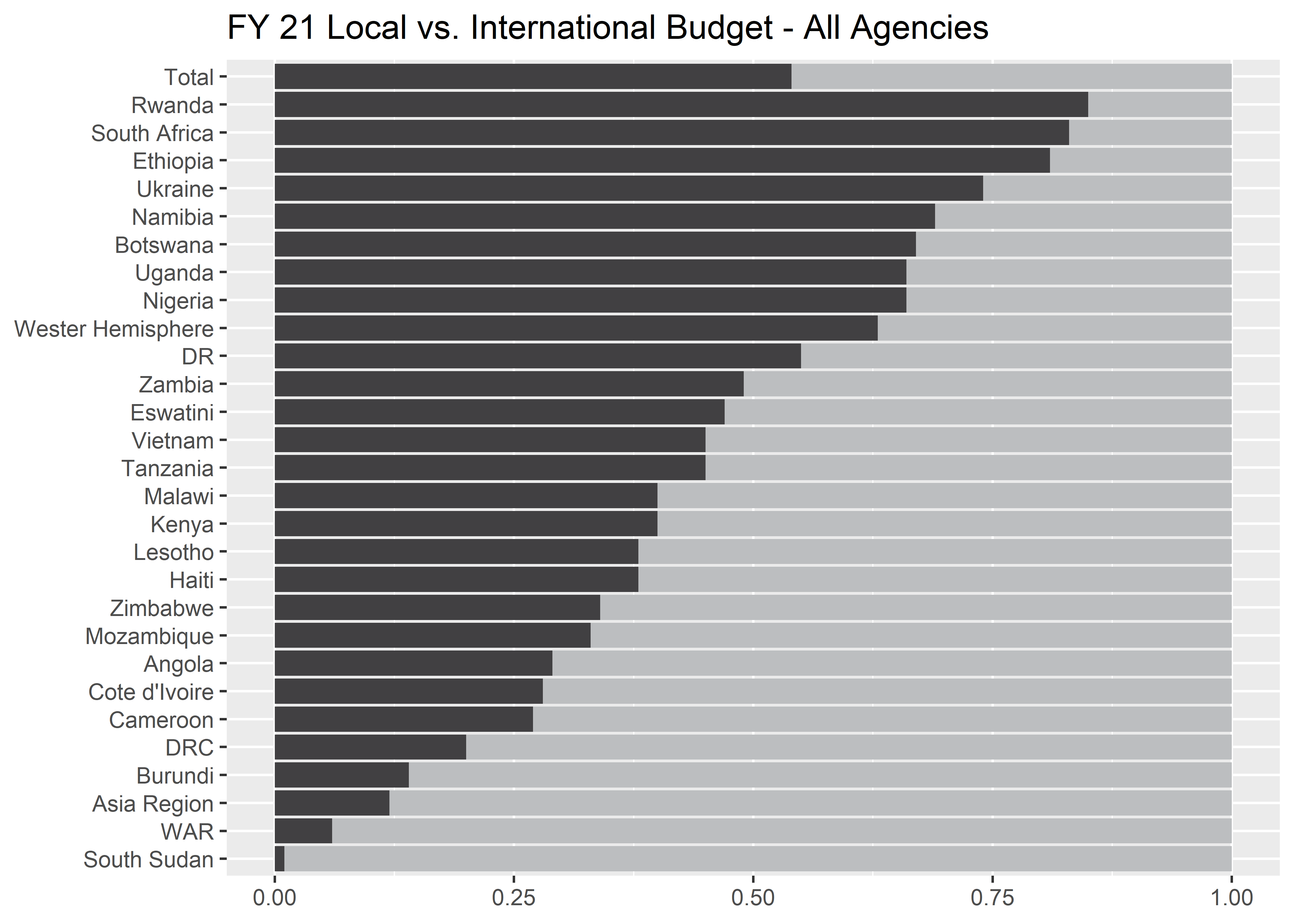
Filtering out unnecessary rows
In this case, the labels do not add much value, in fact they are kind of distracting. If the share in each country has to add to 100 and the focus of the graphic is on the local partner share, we can drop one of the labels and let the reader calculate the international share independently (it’s not the focus).
One way to remove the international shares from the graph would be to filter the data frame to type == "local". With the international share bar and text dropped, we can also soften the labels using the geom_text() function. This drops the stroke and fill around the text object.

p5 <- df_long_ordered_bw %>%
  filter(type == "local") %>%
  ggplot(aes(y = ou, x = share)) +
  geom_col(fill = "#be3455") +
  geom_text(aes(label = percent(share, 1)),
    size = 7 / .pt,
    hjust = 0,
  ) +
  labs(
    x = NULL, y = NULL,
    title = "FY 21 Local vs. International Budget - All Agencies",
  )
p5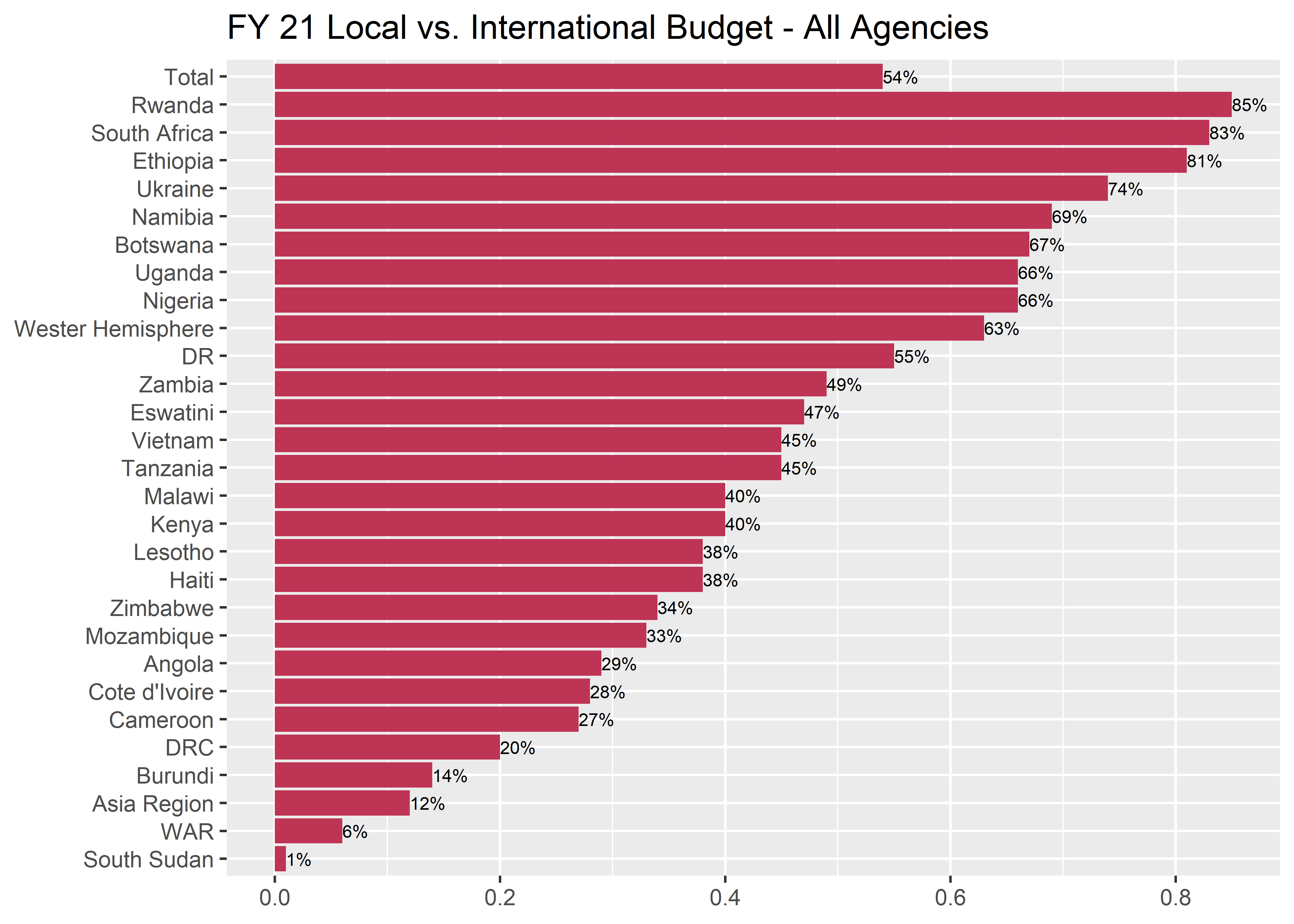
Creating breathing room with facets
If you recall from earlier in our talk, we mentioned that the USAID local partner goal was 70%. How can we break up the operating units to create some groupings?

df_long_ordered_bw_goal <-
  df_long_ordered_bw %>%
  filter(type == "local") %>%
  mutate(
    facet_order = case_when(
      ou == "Total" ~ "",
      goal == 1 ~ "> 70%",
      TRUE ~ "< 70%"
    ),
    facet_order = fct_relevel(facet_order, c("", "> 70%", "< 70%"))
  ) %>%
  mutate(recolor = case_when(
    facet_order == "" ~ "#7f2339",
    goal == 1 ~ "#be3455",
    goal == 0 ~ "#d38388",
    TRUE ~ grey20k)
  )
p6 <- df_long_ordered_bw_goal %>%
ggplot(aes(y = ou, x = share)) +
geom_vline(xintercept = .7, linewidth = 2, color = grey10k, alpha = 0.75) +
geom_col(aes(fill = recolor)) +
scale_fill_identity() +
geom_text(aes(label = percent(share, 1)),
size = 7 / .pt,
hjust = 0,
) +
labs(
x = NULL, y = NULL,
title = "FY 21 Local vs. International Budget - All Agencies",
fill = NULL
) +
scale_x_continuous(limits = c(0, 1.1)) +
facet_grid(facet_order ~ ., scales = "free_y", drop = T, space = "free") p6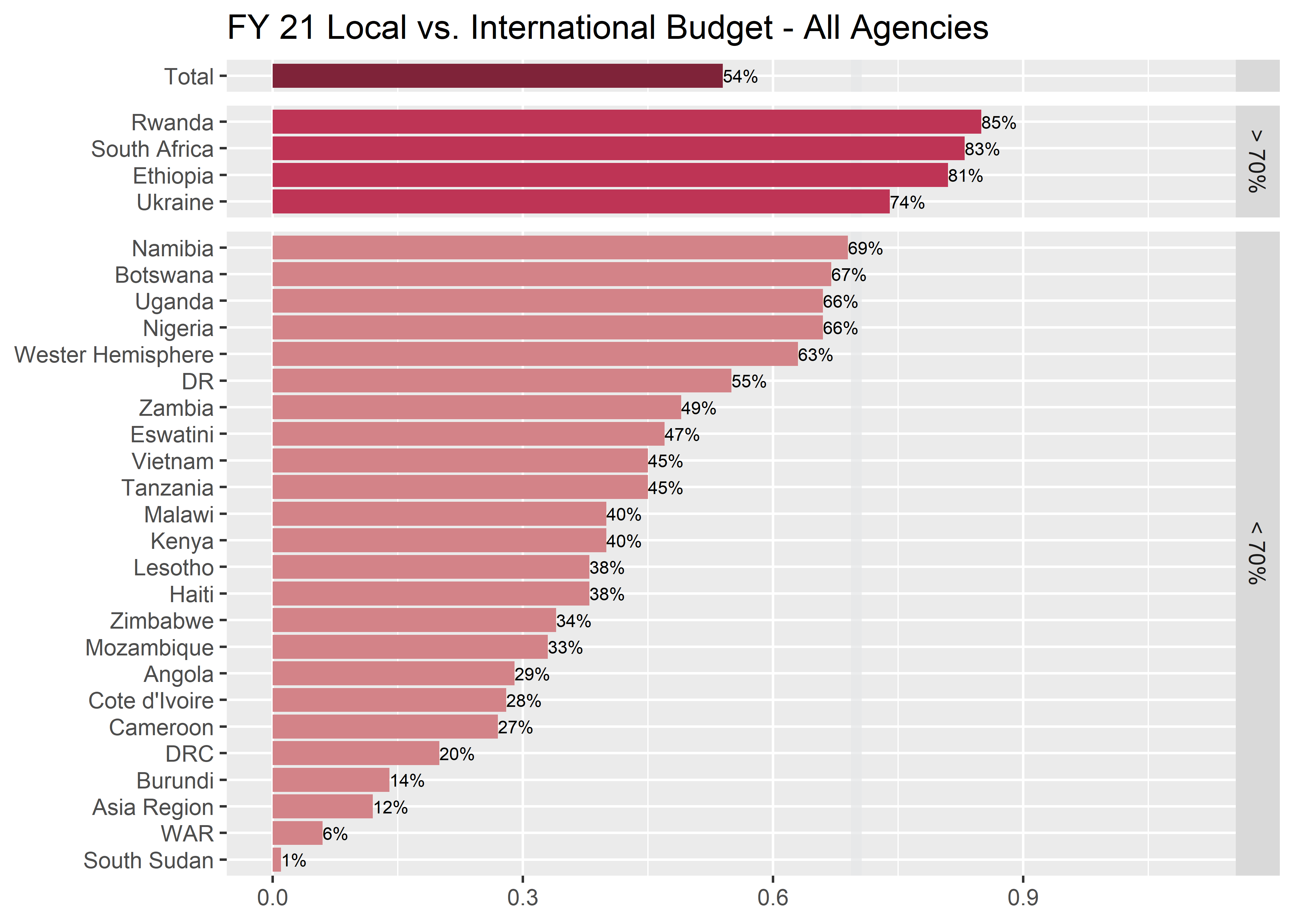
Reducing clutter
Starting to get some breathing room, but we still have a lot of extra chart junk competing for our attention. Let’s continue to reduce clutter and focus the visualization on the 70% threshold.

p7 <- df_long_ordered_bw_goal %>%
  ggplot(aes(y = ou, x = share)) +
  geom_vline(xintercept = .7, linewidth = 2, color = grey10k, alpha = 0.75) +
  geom_col(aes(fill = recolor)) +
  scale_fill_identity() +
  geom_text(aes(label = percent(share, 1)),
    size = 7 / .pt,
    hjust = 0,
    family = "Source Sans Pro"
  ) +
  labs(
    x = NULL, y = NULL,
    title = "FY 21 Local vs. International Budget - All Agencies",
    fill = NULL
  ) +
  si_style_yline(facet_space = 0.5) +
  scale_x_continuous(limits = c(0, 1.1)) +
  facet_grid(facet_order ~ ., scales = "free_y", drop = T, space = "free") +
  theme(strip.background = element_blank(),
        strip.text = element_blank(),
        axis.text.x = element_blank(),
        axis.text.y = element_text(size = 8))
p7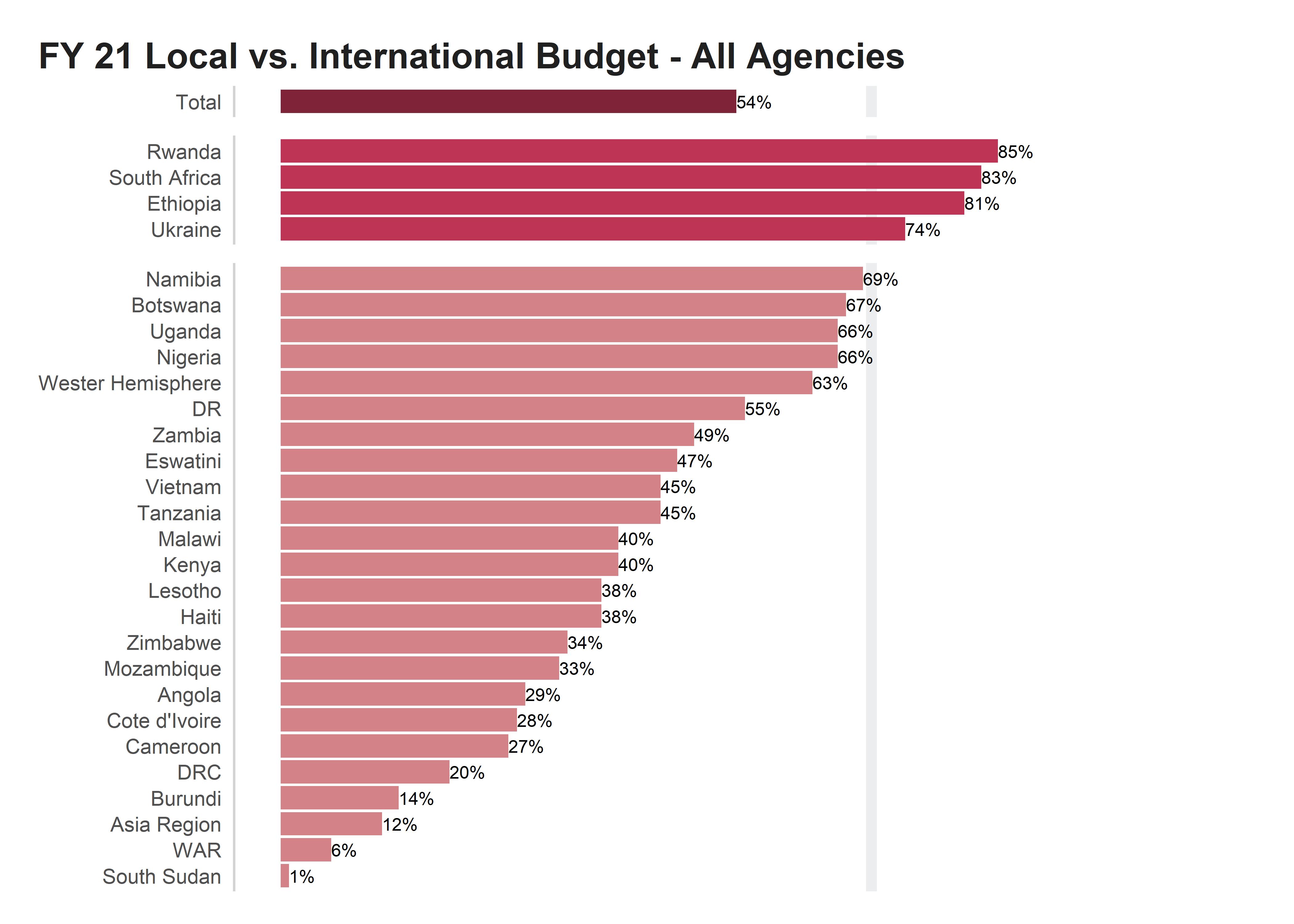
Cleaning up the edges & adding annotation
This is looking great, but for our last step, we want to apply annotation and improve our title to amplify our takeaway message with our audience.

goal_text <- "Four OUs reached\nthe 70% goal"
fail_text <- "All of these operating\nunits fell short of the\n70% goal"
font_size <- 7/.pt

p8 <- p7 +
  coord_cartesian(clip = "off", expand = F) +
  geom_text(data = . %>% filter(ou == "Total"),
            aes(x = .45, label = "local partner share"),
            color = "white", size = font_size) +
  geom_text(data = . %>% filter(., ou == "Total"),
            aes(x = .71, label = "70% threshold"),
            color = grey60k, size = font_size,
            hjust = -0.1) +
  geom_text(data = . %>% filter(ou == "Rwanda"),
            aes(x = .9, label = goal_text),
            color = "#be3455", size = font_size,
            vjust = 1, hjust = 0) +
  geom_text(data = . %>% filter(ou == "Botswana"),
            aes(x = .72, label = fail_text),
            color = "#d38388", size = font_size,
            vjust = 1, hjust = 0) +
  labs(title = "IN FY21, FOUR OPERATING UNITS HAD ACHIEVED THE USAID LOCAL\nPARTNER BUDGET SHARE GOAL OF 70%",
       subtitle = "Twenty four operating units are still short of the goal.",
       fill = NULL,
       caption = glue("Source: Local Partner Team Data"))
p8