DATA VISUALIZATION STYLE GUIDE
Welcome to the OHA SIEI data visualization style guide.
The purpose of this product is to provide SIEI a set of guide rails on how to present data in-line with an overall vision so that all SIEI data visualizations have a common look and feel. SIEI produced visualizations do not need to all be identical, but they should appear as if they belong to the same family. This common appearance is achieved through the use of a set of elements belonging to an organization’s graphical style. For example, by using the same font, font size, color schemes, graphical elements, annotation patterns, and placement options, different users can create graphics grounded in a base style, while still allowing for creative flexibility. Think of organizations like FiveThirtyEight, Financial Times or BBC which have such distinctive styles that even on their own in the wild, you can clearly identify their origin.
Creating a consistent look and feel for graphics has at least three organizational benefits. First, product creators can spend more time focusing on graphical content and messaging as the style elements are pre-defined for them. Secondly, a regular consumer of SIEI’s analytic products will be able to more easily read and interpret the graphical content based on familiarity of its preset guidelines. Finally, product consumers will come to recognize SIEI graphical products based on their style and may place more trustworthiness in them due to their familiarity with the product. At the end of the day, we want to create and disseminate visualizations that are consistent, trustworthy and easily identifiable as belonging to SIEI.
OVERVIEW

WHY A STYLE GUIDE
The motivation for creating this style guide comes from an SI assessment of Q1 Review presentation. The study documented over 150 different colors that were used for encoding data or annotations in visualizations contained in the Q1 Review.
This not only results in a set of graphics that lack a standard look and forces a user to reorient themselves each time, it also creates a brand that is unmemorable/ unrecognizable and potentially not as trusted as a more polished product.
This style guide serves as a tool to define and enhance brand cohesion. It is designed to save you and your SIEI colleagues time in the long run by reducing the number of decisions you have to make about chart size, graphical elements, which font, font sizes etc. This style guide is meant to provide clear recommendations on nearly every aspect of data visualizations. The guide can also help improve your data visualization skills as the recommendations contained within are built on the foundation of tested visualization principles. Lastly, a cohesive look for all our charts will improve our professionalism and help communicate messages to stakeholders more effectively.
HOW TO USE
This guide should not be viewed as a software specific tool that will tell you how to create visualizations, but rather a tool that lays out the foundational elements of the OHA brand. There are definitely things that you should and should not do when creating a visualization. But, because of the diversity of visualization tools used across the office there is no one size fits all solution to data visualization creation. Instead, this document is simply a guide complete with suggestions that are to be emulated. The chart types presented herein are not meant to be exhaustive. They are there to illustrate a stylistic approach that is consistent, identifiable and built on industry best practices. A situation may call for the use of a bee-swarm diagram or bump chart. Our hope is that this guide provides you the stylistic rationale that is to be applied to these types of visualizations and beyond.
CHART ELEMENTS
Title
Convey the takeaway message you want the audience to come away with. Should be written in all upper case letters.
Subtitle
Provides additional contextual information not covered in the title. Smaller in size, not bolded or italicized, and may be a lighter color than the title.
Axes/Grid
Thin and dark in appearance so as not to detract attention from the information in the visual. Text should always, always, always be horizontal as opposed to vertical or at a 45 degree angle. Values use a comma separator and limit the use of decimal places. If directly labeling all values on the chart elements, you should not also include axis text. Axis ticks detract more than they add to the visual and should be removed. Labels should be used sparingly and should be added only when it’s unclear what the values are.
Annotation
Provides contextual information beyond the values stored in the graph. Draws the reader’s eye to important information, such as highlighting outliers, important countries/partners, and helps tell a story about the data. Annotations include direct labels of data elements and longer comments about the context or data. Annotations should be used sparingly; rather than directly labeling every point or column, they should only highlight the important elements of the visual. Text should be thin and light to not overpower or detract from the data in the visual.
Caption
Footer text containing the data source and notes or caveats about the data, providing information critical for integrity and transparency. Located in the lower right hand corner of the visual and be a light shade of gray.
Legend
Mapping between colors/sizes and values used in a graph. Where possible, incorporate into direct labeling or graph title/subtitle.

CHART PRINCIPLES
TEXT
Title conveys takeaway message
Titles are a critical, but often overlooked, element of a visualization. All plots should have purpose that should be conveyed in the title. What do you want the reader to come away knowing? Avoid being vague and emphasize your point.

Subtitle adds context
Subtitles convey additional information not contained in the title, typically written as a full sentence describing what is going on.

Consistent typeface and sizing
Using the same font across visualization will convey uniformity and care put into the work. OHA/SIEI uses Source Sans Pro as the primary typeface and should be used throughout. Arial or Gill Sans are alternatives if Source Sans Pro is not available. Text sizing, not just typeface, should be used consistently for each plot element to convey hierarchy and importance.

Annotations provide clarifying details
Annotations add addition information directly within the visualization to both provide the audience with additional context not found in the numbers themselves. Thin, gray arrows are good to pair with annotations.

Integrated legend
Legends take up valuable real estate and make the audience work harder to flip between the legend and the plot. A better practice is to label elements directly or to integrate your legend into your title where appropriate. Remove axis labels when direct labels are used.

Category labels abbreviated where needed
Avoid clutter or taking up ample space by abbreviating labels.

Clean numbers
Round numbers to avoid false precision and minimize clutter. Add commas for thousands/millions separator.

LINES
Plot is void of border and thick lines, unnecessary tick marks and lines removed
Avoid clutter that distracts from your visualization by removing tick marks and unneeded lines, maximizing the data-ink ratio as Edward Tufte would say.

Avoid dual axes plots
Dual axes are more difficult to interpret. “The scales of dual axis charts are arbitrary and can therefore (deliberately) mislead readers about the relationship between the two data series” (Rost 2018). Consider using two side by side graphs.

Reference lines/areas used to provide context
Extra information can be provide by adding reference lines or areas, as a point of comparison, like an average line, or to denote a period.

POSITION AND ARRANGEMENT
Data ordered in an intentional manner
The default ordering for graphs often is alphabetical, which should be avoided. Graphs should be ordered strategically. For instance you may want to order on a particular category or value, helping convey a focus or underlying purpose

Chart text is consistently aligned, axis intervals consistent and evenly spaced
Having good chart hygiene will convey that care was taken in creating the plot, improve trust and legibility for your audience.

Axis lines start at appropriate values
Bar and area charts should always start at zero. Other charts may start at other values, but should not mislead the audience.

Small multiples show data across categories
Reduce chart clutter by breaking out each category into its own graph and displaying these in a grid. A small multiples structure allows the viewer to see each category’s data on its own and compare that to the data in other categories.

All graphics are two dimensions (no-3D)
Nothing added with the extra dimension and should be completely avoided.

Plot is free from decoration (chart junk)
Reduce visual clutter in your plot in order to maximize the data-ink ratio and show the data.

COLOR
Color use is intentional and consistent
Use color sparingly; it should be used to convey a message. Thought should go into each color used, not just defaulting to the software default palette.

Text color sufficiently contrasts with background
Ensure that your text is legible and stands out from the plot of slide background.

Approved colors applied throughout
Use the specified OHA/SIEI colors that are color-blind safe and chosen with care. If plot will be used for external engagement, USAID colors should be the default.

Annotation colors are subtle
Annotations provide additional context but should not detract from the visual. Avoid colored boxes or arrows.

Color gradients applied appropriately
Ensure there is enough contrast between different steps of lightness and saturation when using a continuous or diverging color palette.

TYPOGRAPHY
Font, or typeface, can convey lots of information to the audience and create a sense of branding consistency. OHA/SIEI uses the Source Sans Pro family for visualizations. If Source Sans Pro is not available, Arial can be used as an alternative.
The table below provides the attributes associated with each typography option from the chart elements. Use the following elements to structure your visual along the OHA/SIEI guidelines. As with color and other elements, these are guides not laws so artistic license can be taken, but know that the less the guidelines are adhered to, the less the visualization will look like an OHA/SIEI product.
Source Sans Pro Family
1234567890-!@#$%^&*()_{}:”<>?
1234567890-!@#$%^&*()_{}:”<>?
1234567890-!@#$%^&*()_{}:”<>?
1234567890-!@#$%^&*()_{}:”<>?
HOW TO DOWNLOAD
Source Sans Pro does not come standard on PCs or Macs, but they accessible from Google Fonts. Search for “Source San Pro” and then click on the “Download family” in the upper right hand corner. When its downloaded, unzip the folder, right click on one of the typefaces in the folder and select “Install.” The typeface should now be available. If you are unable to install, you may need to reach out to M/CIO to have them install it for you. They are currently working on making this accessible from Software Center.
COLORS
The USAID Graphics Standard Manual lay out the two colors found in the agency’s logo as the primary color palette, USAID Blue and USAID Red. These colors are used to “reinforces that the aid is From the American people” but provides a limited ranges of colors to work with for data visualization.
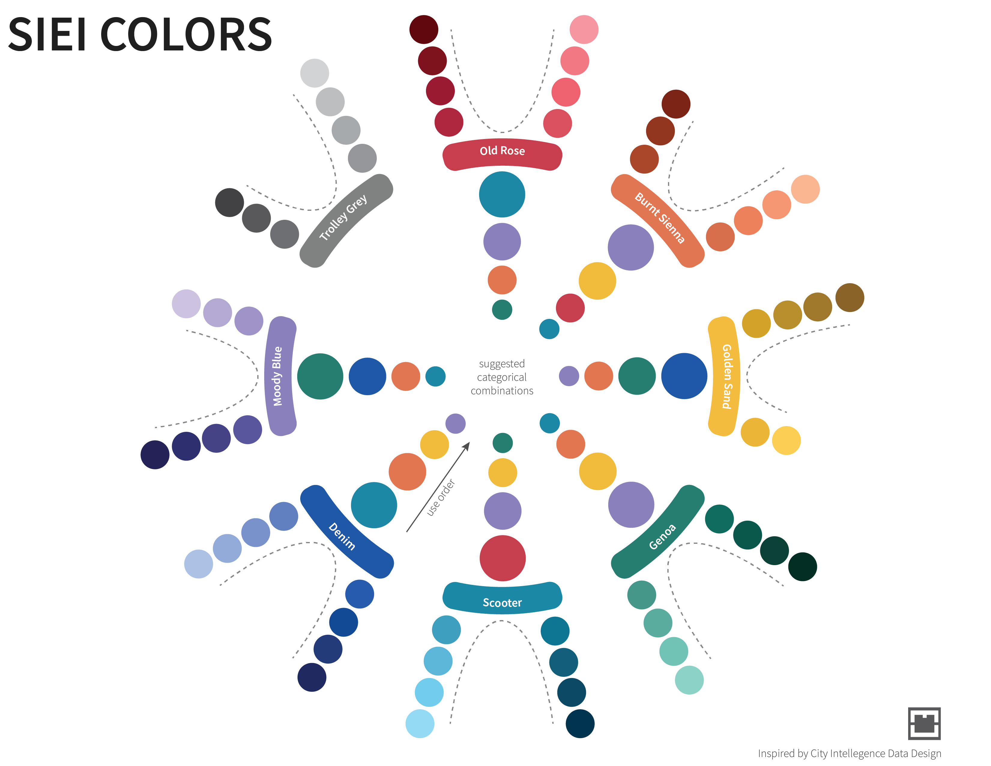
OHA/SIEI has developed an offshoot of these colors for visualization, expanding the number of categorical colors to choose from and create a color-blind friendly palette (508 compliant). We started with Medium Blue and USAID Red and used a combination of platforms (Adobe Color, Palettable, Viz Palette and chroma.js), modifying them into Denim and Old Rose. From there, we expand these colors into a full palette of categorical and continuous colors.
Using the following palette strategically will allow for consistent branding and reduce the time needed to think through color choices in every visualization. Colors should be used meaningfully in any visualization. If using the categorical/ discrete colors, the graphic on the right provides the suggested color order. For example, if using Old Rose as the primary color, the next color that should be used is Scooter. Alternatively, if you need to encode a quantitative palette, the continuous palettes on the left was developed using chroma.js to create perceptible steps in lightness and saturation.
USAID COLOR PALETTE
#002a6c
rgb(0, 42, 108)
#ba0c2f
rgb(186, 12, 47)
#212721
rgb(33, 39, 33)
#0067b9
rgb(0, 103, 185)
#a7c6ed
rgb(167, 198, 237)
#6c6463
rgb(108, 100, 99)
#8C8985
rgb(140, 137, 133)
#cfcdc9
rgb(207, 205, 201)
OHA/SIEI COLOR PALETTE
#2057a7
rgb(32, 87, 167)
#c43d4d
rgb(196, 61, 77)
#8980cb
rgb(137, 128, 203)
#e07653
rgb(224, 118, 83)
#1e87a5
rgb(30, 135, 165)
#f2bc40
rgb(242, 188, 64)
#287c6f
rgb(40, 124, 111)
#808080
rgb(128, 128, 128)
OHA/SIEI COLOR PALETTE (light)
#bfddff
rgb(191, 221, 255)
#ff939a
rgb(255, 147, 154)
#dfd3ff
rgb(223, 211, 255)
#ffcaa2
rgb(255, 202, 162)
#83dbfb
rgb(131, 219, 251)
#ffdda2
rgb(255, 221, 162)
#7ecfc0
rgb(126, 207, 192)
#e6e6e6
rgb(230, 230, 230)
AGENCIES COLOR PALETTE
(Denim)
#2057a7
rgb(32, 87, 167)
(Scooter Light)
#83dbfb
rgb(131, 219, 251)
(Genoa Light)
#7ecfc0
rgb(126, 207, 192)
(Moody Blue)
#8980cb
rgb(137, 128, 203)
(Trolley Grey)
#808080
rgb(128, 128, 128)
PROGRAMS PERFORMANCE COLOR PALETTE
(old rose light)
#ff939a
rgb(255, 147, 154)
(burnt sienna light)
#ffcaa2
rgb(255, 202, 162)
(scooter medium)
#1e87a5
rgb(30, 135, 165)
(trolley grey light)
#808080
rgb(128, 128, 128)
GENDER COLOR PALETTE
(Moody Blue)
#8980cb
rgb(137, 128, 203)
(Genoa)
#287c6f
rgb(40, 124, 111)
(Trolley Grey)
#808080
rgb(128, 128, 128)
OHA/SIEI Continuous Color Palettes
SIEI Color Pairs