Monday Data Viz - Action Oriented Data Viz
2022-04-04 Aaron Chafetz
data-viz vizualisation monday-data-viz
I saw a blog post last week that filled my thoughts the rest of the week and wanted to share with you all. In the post, Albert Rapp draws on a Storytelling With Data Makeover video) by Elizabeth Hardman Ricks and applies it to R. It’s fascinating to watch the transformation process occur in R, but what really sticks with me is the end product compared with the original, which doesn’t look terribly dissimilar to some of the PEPFAR graphics we frequently see.
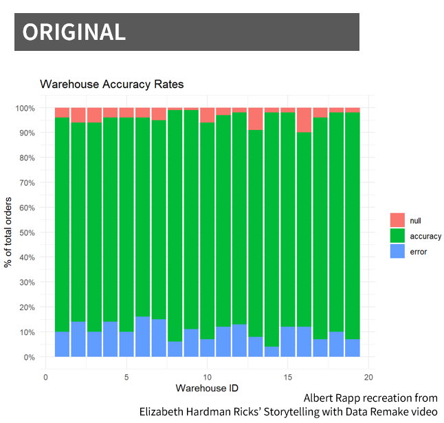
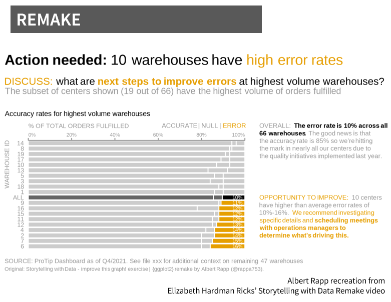
The above visuals mimic the data and viz from the SWD video Ricks remakes. These two charts have exactly the same data and yet by moving away from program defaults in graphing the data, we went up with two vastly different plots. Ricks uses the following process in her remake.
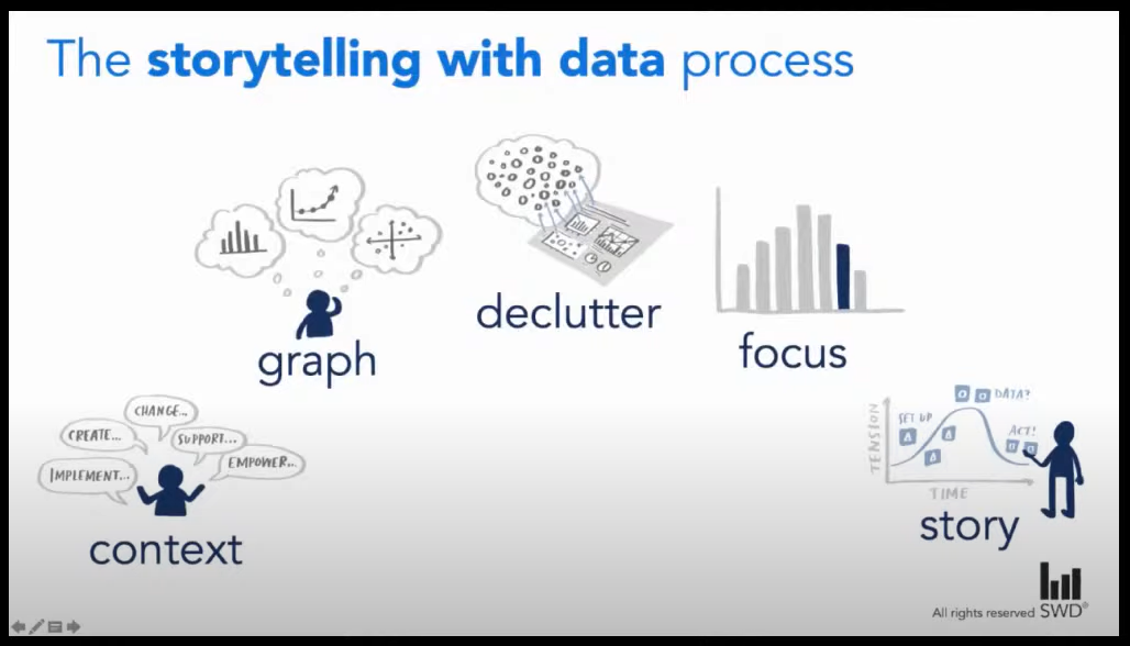
In the remake, Ricks starts by understanding the context and uses that to play into what graph makes the most sense to use. Next, she declutters the graph and focuses it through applying a number of different data viz principles: reoridents the graph (useful if the category labels were long, but we’re just working with dummy numbered ids), orders the categories based on the error rates, uses color to strategically call attention to the particular areas of focus and not all the data, integrates the color legend into the text subtitles and annotations, and includes a baselines (average warehouse in this case).
The last step takes that graph to the next level with the story component. She weaves in contextual annotations and questions to make this graphic actionable when presented. Rather than having the audience have to make sense of the original stacked bar with no titles or use of color, she is able to craft the key questions needed to take action on base on the data. It’s just fantastic.
I encourage you all to check out the SWD video (and Rapp’s post on doing this in R) and think about how you can take these concepts and apply them to your own work.
Happy plotting!