RBBS - 2 Visualizations, Part II
2022-02-28 Aaron Chafetz
corps rbbs r
Part 2 of the coRps R Building Blocks Series (RBBS). All content can be found on this blog under the rbbs category as well as on the USAID-OHA-SI/coRps GitHub repo.
RBBS 2 - Visualization, Part II
Today we will be picking up where we left off during our last session, covering the second half of plotting based on Chapter 3 of R for Data Science.
Learning Objectives
- Part II
- Be aware of how data transformation works
- Know how to apply data transformations
- Understand how to apply themes and styles
Recording
USAID staff can use this link to access today’s recording (not available to external users).
Setup
For these sessions, we’ll be using RStudio which is an IDE, “Integrated development environment” that makes it easier to work with R. For help on getting setup and installing packages, please reference this guide.
Load Packages
library(tidyverse) #install.packages("tidyverse")
library(scales) #install.packages("scales")
library(glitr) #remotes::install_github("USAID-OHA-SI/glitr", build_vignettes = TRUE)
Transformation
Last session, we exclusively kept to plotting points, but can do things
more sophisticated with the data. For the scatter plots we used, we took
the the x and the y values mapped directly from our dataset. We can also
used ggplot to transform our data, say creating a count or a sum, and
displaying the output as a bar chart or histogram.
ggplot(data = hfr_mmd) +
  geom_bar(mapping = aes(x = date))
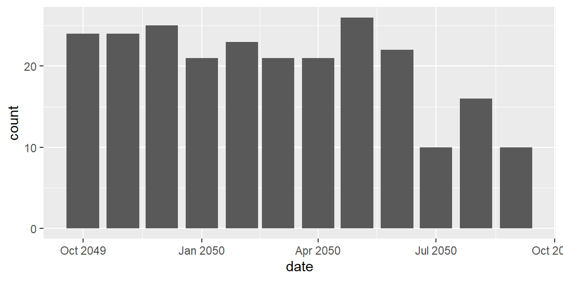
By using geom_bar we are getting a count of the number of rows that
exist in the dataset - in this case collapsing over districts and
mechanisms for each date. This could be useful for various purposes, but
of more import to us is being able to sum up the total number of
patient.
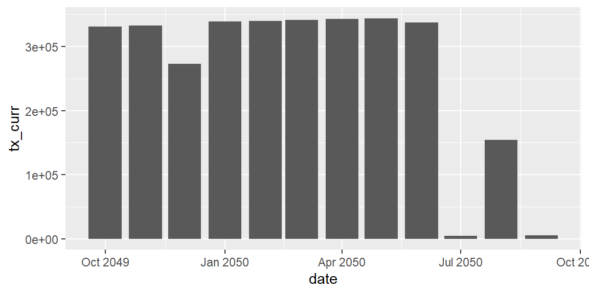
ggplot(data = hfr_mmd) +
  geom_bar(mapping = aes(x = date, y = tx_curr), stat = "identity")

A slightly simpler alternative to geom_bar is to use geom_col, which
defaulted to stat = "identity" that you would have to otherwise
specify to not get a count when using geom_bar. The plot below is
summing up tx_curr over each date, aggregating (or collapsing
distinctions within) psnu and mech_code.
ggplot(data = hfr_mmd) +
  geom_col(mapping = aes(x = date, y = tx_curr))
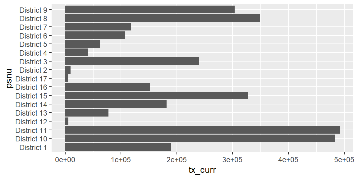
 The other nice aspect about using
 geom_col is that is allows us to
easily flip our x and y axis.
ggplot(data = hfr_mmd) +
  geom_col(mapping = aes(x = tx_curr, y = psnu))
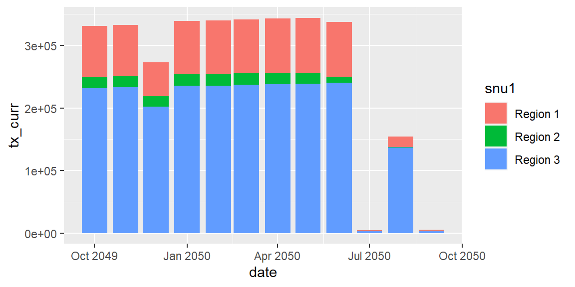
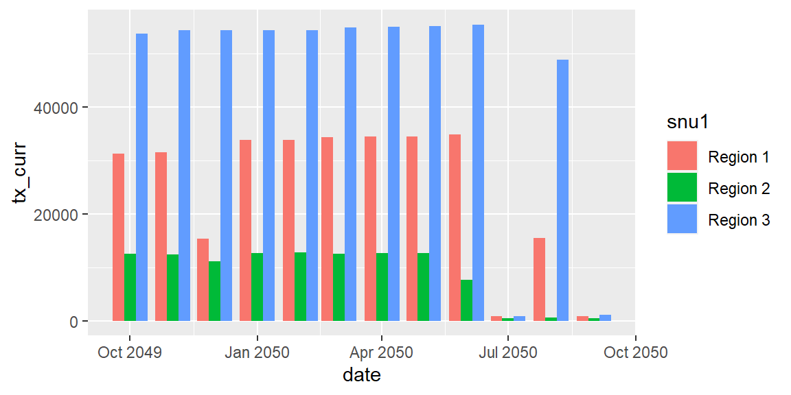
We can also quickly transform this into a stacked bar chart by applying
a color fill. The fill helps highlight again that geom_col is summing
up totals across multiple features, like region (snu1) in this case/
ggplot(data = hfr_mmd) +
  geom_col(mapping = aes(x = date, y = tx_curr, fill = snu1))
 Stacked bar charts aren’t ideal (we won’t get into principles of data
visualization here, but if you’re interested, you can check out Steve
Wexler’s quick talk here).
An alternative would be to create a small multiples plot like we did
earlier, which is preferable, but could also just dodge the columns by
changing the
Stacked bar charts aren’t ideal (we won’t get into principles of data
visualization here, but if you’re interested, you can check out Steve
Wexler’s quick talk here).
An alternative would be to create a small multiples plot like we did
earlier, which is preferable, but could also just dodge the columns by
changing the position.
ggplot(data = hfr_mmd) +
  geom_col(mapping = aes(x = date, y = tx_curr, fill = snu1),
           position = "dodge")
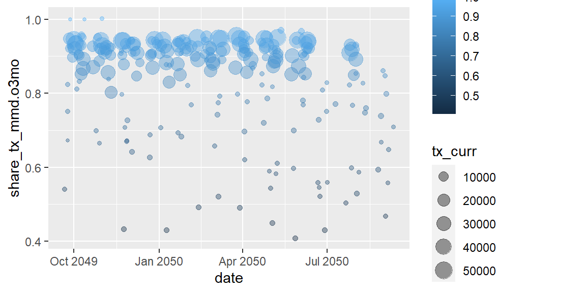
In mentioning the position, it may be useful to back to our scatter
plots from above. In the plots, many of our points were overlapping and
couldn’t be seen without adjusting the shapes’ opacity. Another option
would have been to adjust the placement of the points by jittering them
slightly to help with the overplotting. We can adjust the position by
using position = jitter).
ggplot(data = hfr_mmd) +
  geom_point(mapping = aes(x = date, y = share_tx_mmd.o3mo,
                           color = share_tx_mmd.o3mo, size = tx_curr),
             alpha = .4,
             position = "jitter")
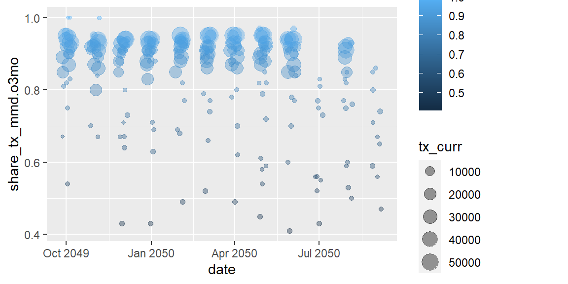
You can even refine the radius of the jittering by using a function,
position_jitter(), allowing us to do a few things like specifying the
height and width of the radius of the jitter from the action value as
well as to sent a seed so the jitter is not random each time it’s run.
ggplot(data = hfr_mmd) +
  geom_point(mapping = aes(x = date, y = share_tx_mmd.o3mo,
                           color = share_tx_mmd.o3mo, size = tx_curr),
             alpha = .4,
             position = position_jitter(width = 5, height = 0, seed = 42))
Exercises
- Using
geom_bargraph the number of observations for each period (date). - Plot a bar graph of TX_CURR over time. Rather than using
fill = snu1, usecolor = snu1in the aesthetics instead. What changes in your plot?
Additional Thoughts
Before closing the book on the basics of plotting using ggplot, I
wanted to delve hit on a few things.
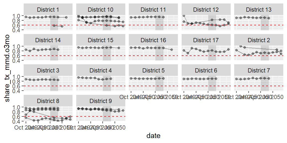
First up is structure. So far, we have passed in data to geom_ and
then mapped aesthetics. The great thing is that you can keep using that
simple structure and layering on more and more geoms and aesthetics. For
example, we could add in a geom_line to connect the points and even
add a static threshold line, geom_vline, or even an area to highlight
a particular period. annotate.
ggplot(data = hfr_mmd,
       mapping = aes(x = date, y = share_tx_mmd.o3mo)) + #global aes to apply to all geom
  annotate(geom = "rect", #type of annotation geometry
           xmin = as.Date("2050-04-01"), #box x coordinates (min)
           xmax = as.Date("2050-06-01"), #box x coordinates (max)
           ymin = -Inf, ymax = Inf, #box y coordinates to run length of plot
           alpha = .2) +
  geom_line(mapping = aes(group = mech_code), #lines need to know how to connect points
            alpha = .4) +
  geom_point(alpha = .4) +
  geom_hline(yintercept = .6, color = "red",
             linetype = "dashed") + #dashed line
  facet_wrap(~psnu)
In addition to layer on geoms and facets, we can also clean up the x and y scales as well as adding titles and captions.
ggplot(data = hfr_mmd) +
  geom_point(mapping = aes(x = date,
                           y = share_tx_mmd.o3mo,
                           color = share_tx_mmd.o3mo,
                           size = tx_curr),
             alpha = .4) +
  scale_x_date(date_breaks = "1 month", #date breaks on x axis
               date_labels = "%b") + #for conversions run ?strptime
  scale_y_continuous(labels = percent) + #in the legend, display values as %
  scale_size(labels = comma) + #apply comma separator to legend
  scale_color_continuous(type = "viridis", #color palette
                         labels = percent, #in the legend, display values as %
                         guide = "none") + #remove legend for color
  labs(x = "Reporting Period",
       y = "Patients on 3+ months of Rx",
       size = "TX_CURR\n volume", #legend title with line break (\n)
       title = "LARGERS DISTRICTS HAVE MORE PATIENTS ON +3 MONTHS OF RX",
       caption = "Source: HFR FY50")

We can also start adjusting the style and theme.
ggplot(data = hfr_mmd) +
  geom_point(mapping = aes(x = date, y = share_tx_mmd.o3mo,
                           color = share_tx_mmd.o3mo, size = tx_curr),
             alpha = .4) +
  scale_x_date(date_breaks = "1 month", date_labels = "%b") +
  scale_y_continuous(labels = percent) +
  scale_size(labels = comma) +
  scale_color_continuous(type = "viridis", labels = percent, guide = "none") +
  labs(x = "Reporting Period",
       y = "Patients on 3+ months of Rx",
       size = "TX_CURR\n volume",
       title = "LARGERS DISTRICTS HAVE MORE PATIENTS ON +3 MONTHS OF RX",
       caption = "Source: HFR FY50") +
  theme_minimal() + #change the plot theme
  theme(legend.position = "none", #no legend
        plot.title.position = "plot", #move the title to right align
        axis.text = element_text(color = "gray60"), #change x/y axis text color
        plot.title = element_text(face = "bold")) #change title to be bold
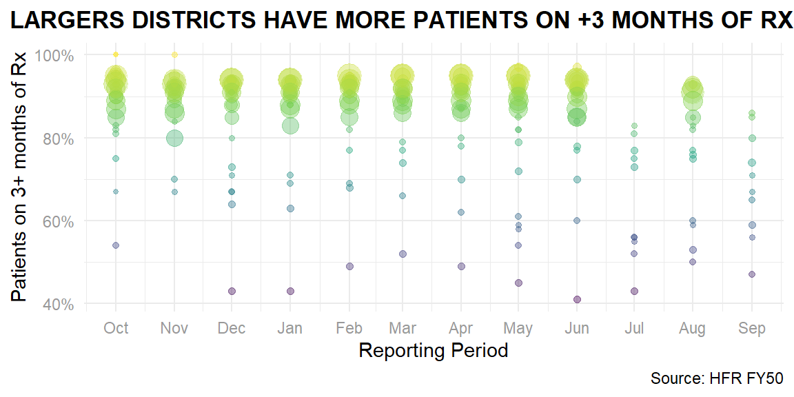
So far we have just been using glitr package to access the hfr_mmd
data, but the package’s function is to apply the OHA Style
Guide on top of
ggplot. Since part of the style is a non-standard R font, I am going
to load an extra package to load the font. For more information on how
to use extrafont the first time and install Source Sans Pro, see this
reference.
library(extrafont) #install.packages("extrafont")
ggplot(data = hfr_mmd) +
  geom_point(mapping = aes(x = date, y = share_tx_mmd.o3mo,
                           color = share_tx_mmd.o3mo, size = tx_curr),
             alpha = .4) +
  scale_x_date(date_breaks = "1 months", date_labels = "%b") +
  scale_y_continuous(labels = percent) +
  scale_size(labels = comma) +
  scale_color_si(palette = "scooters", guide = "none") +
  labs(x = "Reporting Period",
       y = "Patients on 3+ months of Rx",
       size = "TX_CURR volume",
       title = "LARGERS DISTRICTS HAVE MORE PATIENTS ON +3 MONTHS OF RX",
       caption = "Source: HFR FY50") +
  si_style_ygrid()
For more information on using the OHA styles and colors in glitr, check out this guide. And for a good guide on ggplot, see this cheatsheet from RStudio.