Monday Data Viz - The Time Axis
2022-12-05 Aaron Chafetz
data-viz vizualisation monday-data-viz
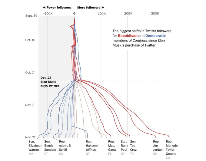
When we go to plot a trend graph, without even thinking, we use the x-axis for periods. This is a pretty typical thing we see when reading other trend plots, probably largely since we read from left to right. In the Post last week, however, Gerrit De Vynck, Jeremy B. Merrill, and Luis Melgar included a trend graph in their article where the periods ran along the y-axis from north to south. The graph depicted how top members in Congress’ Twitter followers shifted after Elon Musk bought the company. We can see that, on average, top Democratic Congressmen lost tens of thousands of followers (their trend lines shifting left on the plot) compared with top Republicans who saw even larger shifts in the positive (right) direction. This plot could have been transposed, where the periods were on the x-axis, but I think this works pretty well, giving the reader a sense of a cascading down effect.
Just because we see periods plotted on the x-axis more often than not doesn’t mean it can’t work another way. In this case, De Vynck et al’s graphic stands out against the norm, not only helping convey their story, but keeping it in the minds of their audience.
Happy plotting!