Monday Data Viz - Helper Annotation
2023-02-27 Aaron Chafetz
data-viz vizualisation monday-data-viz
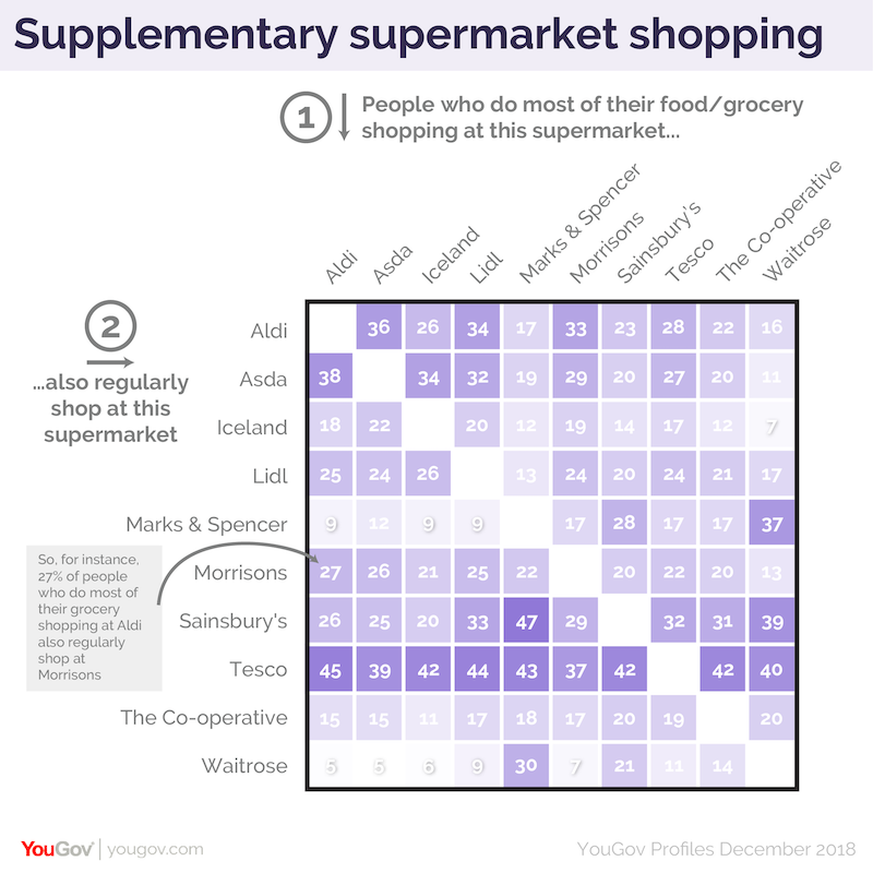
I came across a not-so-straight forward visualization the other day and it made me think of a piece from Andy’s Kirk’s “the little of visualization design” series from a long while back about making your work more accessible. In his post, Kirk highlighted a viz from YouGov that provided additional annotations at the top and left to help the reader understanding the axes and plot. I think what is especially useful is the explanation text that is giving an example of interpreting a data point from the graphic (or “coaching” as Kirk refers to it as).
Adding his sort of guided annotation may not be necessary for every plot, but it’s useful to consider your audience and the complexity of the visualization from their standpoint. A presentation that either needs to stand on its own without you presenting or material being sent to leadership may be prime for including an additional level of annotated text.
Happy plotting!