Monday Data Viz - Borrowing from Graphic Design
2021-04-19 Aaron Chafetz
data-viz vizualisation monday-data-viz
Working with data all the, when it comes to design we think primarily about data viz principles. But there is a lot we can learn from the broader graphic design space. Pascal Barry is a designer with a background in web design, UX/UI, topography, branding, in addition to data viz and is someone can offer some different vantage points. Some of the key areas that come to mind to me when thinking about the influence of graphic design are the use/importance of whitespace, layout, color, grids, and topography.
In the past few weeks, Pascal has taken a few plots from Tableau’s Viz of the Day and applied his design techniques to further improve upon them. I’ll leave it to you to go through his thread that’s well laid out, but wanted to highlight a few salient points that really resonated with me.
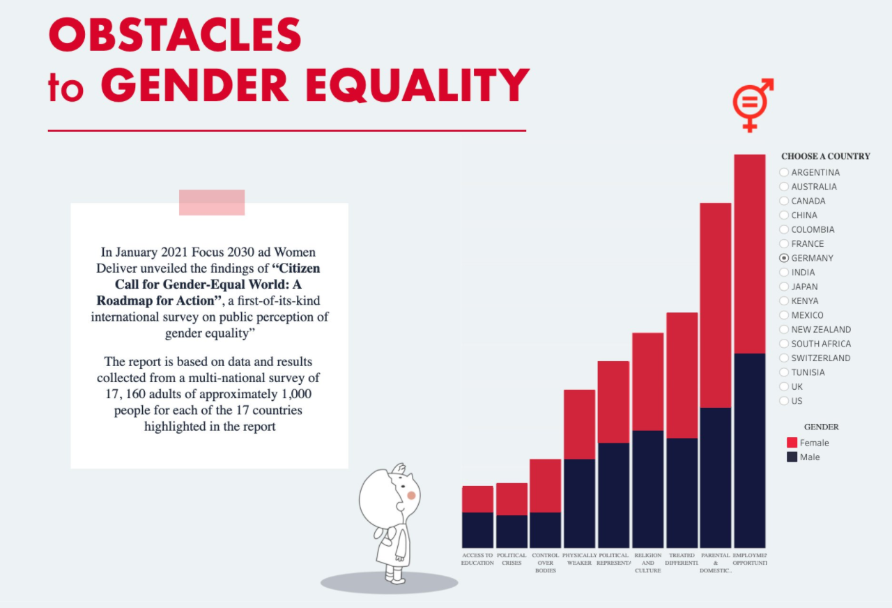
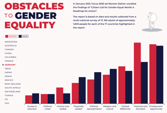
Here is the original plot from the public gallery.
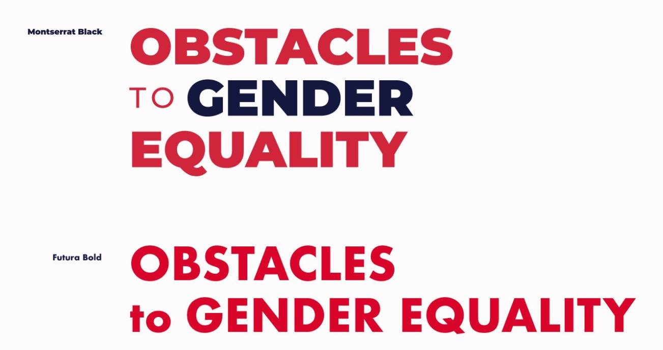
Barry updated not just the topography but also the structure and color usage in the title - “putting [the title] over three lines enabled me to align its height with the supporting text to the right. Using both colours in the title creates some punch”
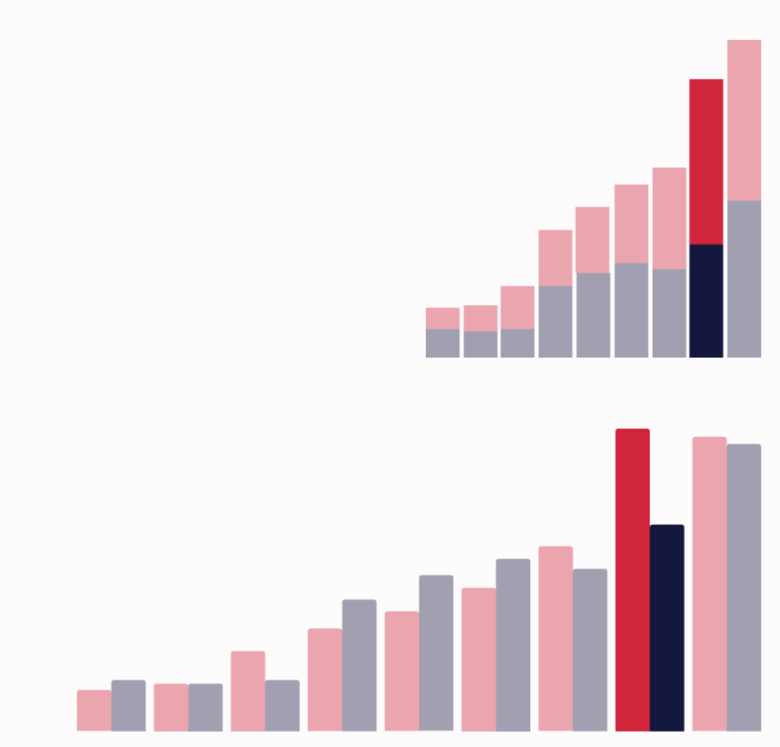
He changed the chart type as well, moving from a stacked bar to a dodged bar chart since it’s difficult to interpret the different bar lengths when they do not have the same baseline.
The redesign also benefited from ensuring there were balanced margins and a grid to align and size the different elements.
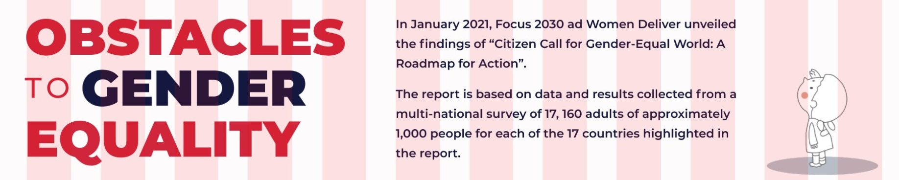
And the last thing I’ll note from the redesign is moving the icon from the SW quadrant up to the NE. The icon helps draw attention to the summary text (also seen above).
Barry goes into more detail and has some additional features that he changed to get to the final product below. I would highly recommend checking out his post and the first one in the series.
As always, there’s a lot and lots of knowledge out there that we can glean and apply to our own data viz.
Happy plotting!