Monday Data Viz - Stealing Design Cheats
2022-02-07 Aaron Chafetz
data-viz vizualisation monday-data-viz
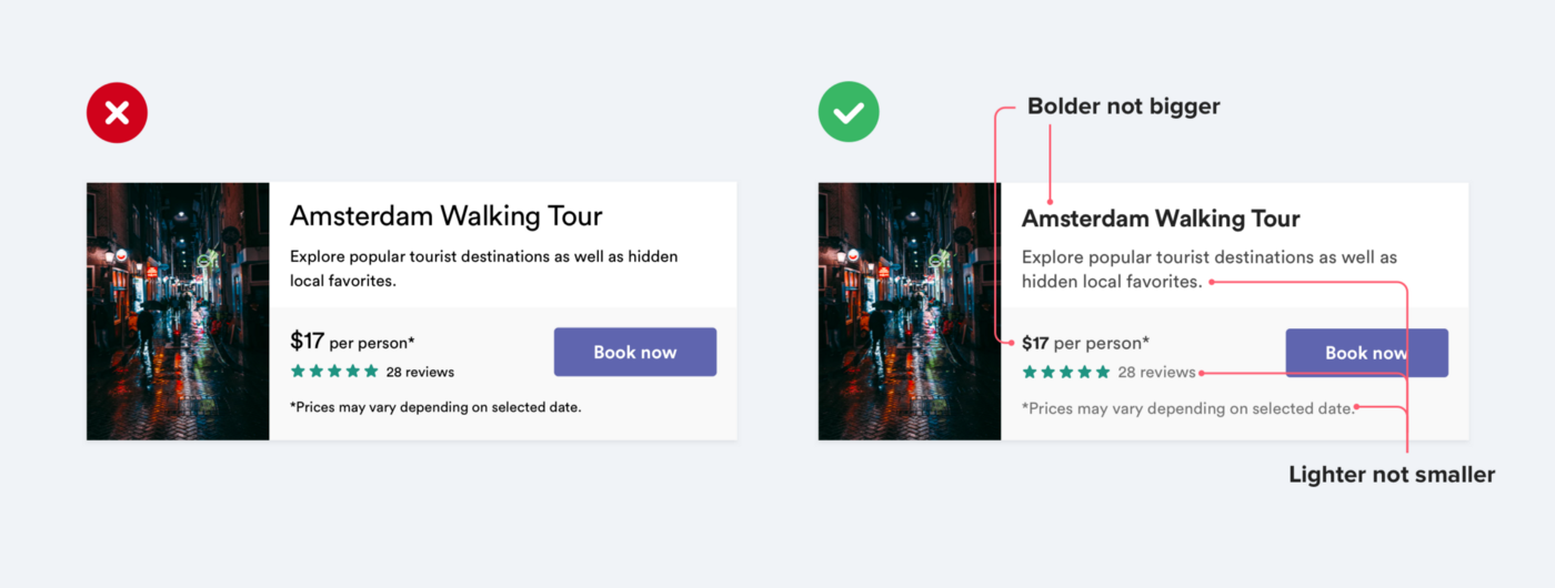
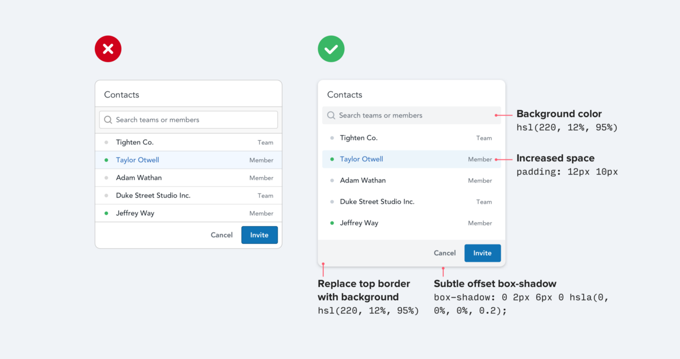
Data viz is it’s own particular arena, but there is lots to borrow for the design world (I’ve touched on this before). I came across this older post by Adam Wathan and Steve Schoger covering a few UI tips that I found pretty useful. Here’s a few I found particularly interesting.
- Use color and weight to create hierarchy instead of size
- Use fewer borders
- Don’t blow up icons that are meant to be small
![]()
Check out the rest of Wathan and Schoger’s design cheats for more details on the WHY for all of these as well as other ideas and see what you can apply to your own work.
Happy plotting!