Monday Data Viz - Multiple Facets of Different Sizes
2021-11-22 Aaron Chafetz
data-viz vizualisation monday-data-viz
In keeping with the recent theme of reviewing the visual hierarchy, I came across another great example from the New York Times. The NYT’s landing page for Coronavirus Map and Cases looks like this:
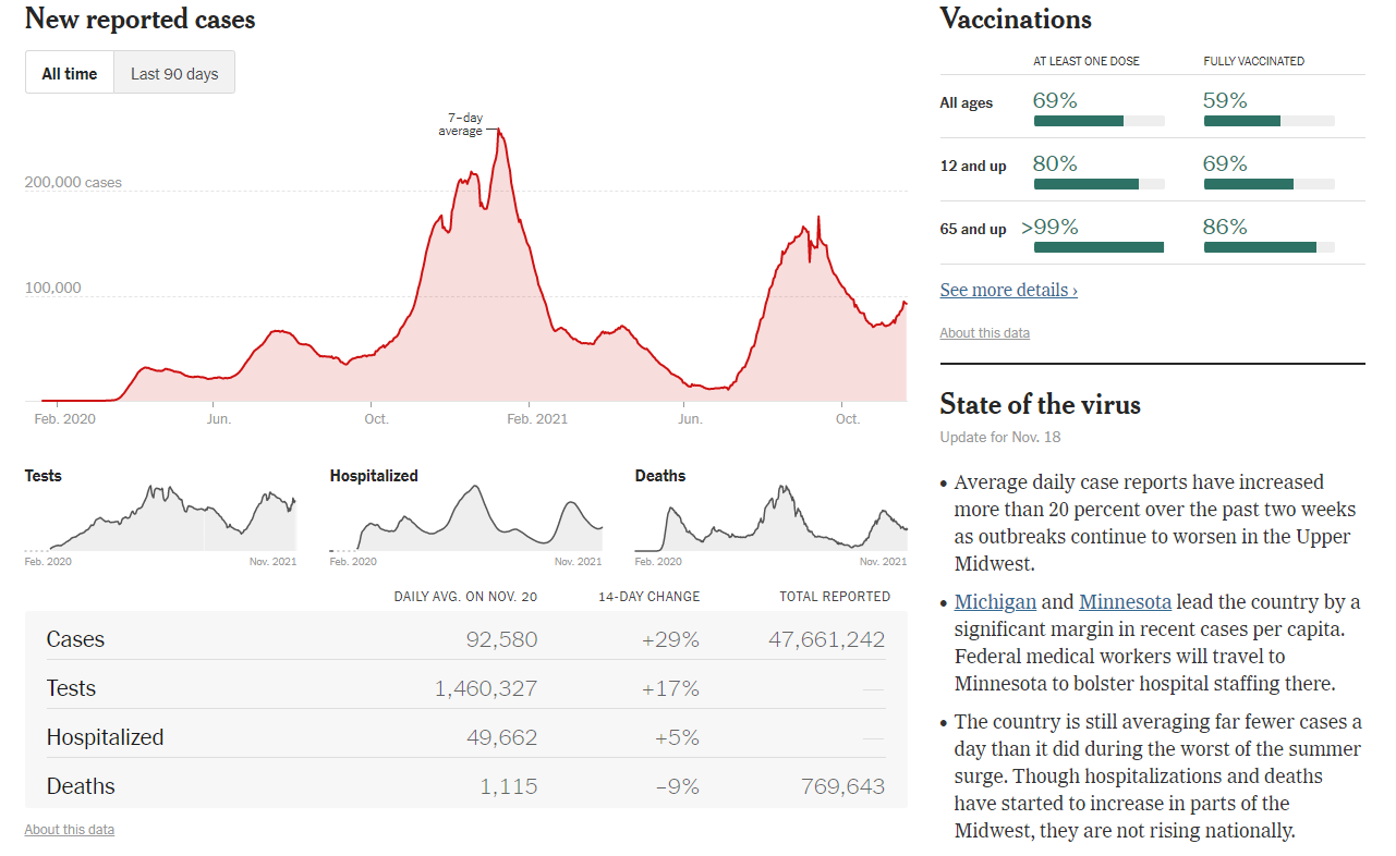
There is a bit going on here but NYT uses position, color, and size to draw your attention to different places sequentially. The first thing that stands out is the largest graphic at the top left - it’s red, it’s large, and it’s in the prime position (for a Western reader reading top to bottom, left to right). NYT has created facet graphs of slightly different information that fall below this main plot, focusing on other stats, but can be interpreted the same way the larger graphic is. Not only are these small plots, but they’re gray to divert some of the attention. Even the table below this is gray and has gray text to provide supplemental information about the faceted graphs, without drawing the eye in too many places at once. I really like this setup of having a large primary faceted plot and then having others smaller, but structured in the exact same way.
The other place the reader’s eye is drawn to is the graphic in the upper right on vaccinations, which is green and stands out in contrast to the red plot (opposite side of the color wheel) and obviously gray text and graphics below.
What I also like is the non-graphic element here. In the least emphasized place, bottom right. It provides key highlights about the data provided and provides some context about where we’re at with the epidemic.
Happy plotting!