Monday Data Viz - Tracking Patient Health Stories
2023-01-23 Aaron Chafetz
data-viz vizualisation monday-data-viz
This is my first email of the 2023 and I wanted to start off with something a bit inspirational. After reading through my Nightingale magazine last month (the theme was inspiration), I kept coming back to the story by Katie McCurdy entitled “Visualizing the Veternal Health Journey.” McCurdy shared her work on a project with the VA to capture the complicated health records of about a dozen military veterans. We all know how quick our doctors appointments can be, and it’s extremely challenging to convey all our pertinent medical history and ongoing/new issues: “Not only is it hard to tell a complex story, it’s also hard to listen to and comprehend these stories.” McCurdy’s solution has been to use timelines data visualization to help “tell our whole stories more consistently and accurately.”
In the article she digs into a particular case of a veteran, dubbed Max, now dealing with complex health issues.
With every appointment, [his wife] had to retell Max’s story, but it was impossible to remember every last detail. She’s created a binder to try to keep all of Max’s data close at hand during appointments, but it was sometimes hard to reference. Despite her efforts, [his wife] felt that his car eteams weren’t seeing the big picture or identifying the underlying causes behind the symptoms.
McCurdy designed a timeline of both health and more subjective data “to bring key aspects of someone’s health and functioning into one view: physical, mental, and social.” This medium helps both the patient and the health care team convey/manage/track all the important event and help see the bigger picture.
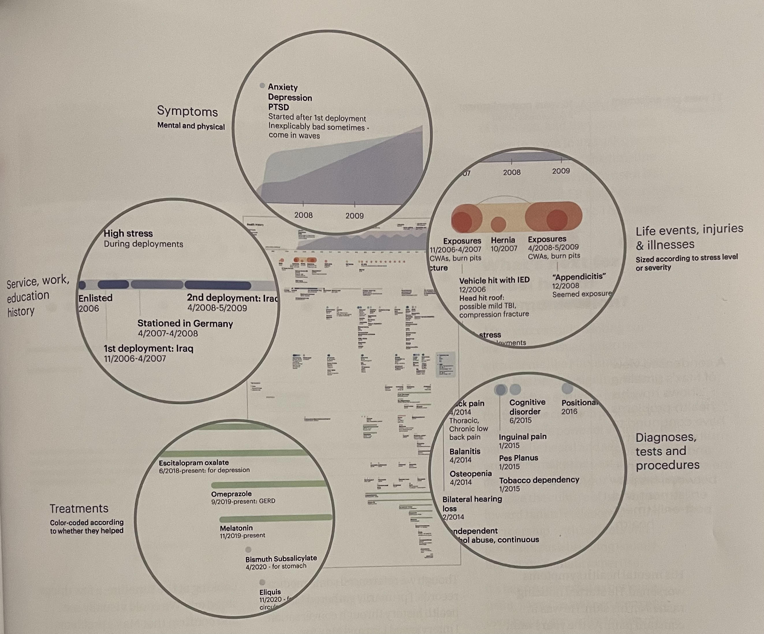

In PEPFAR, we work with lots of aggregate data and see the 10,000 foot view of things. It’s easy to forget the individuals our data are tied to and the impact data and data viz can bring to improving their health outcomes through projects much like McCurdy is piloting with Pictal Heath for the VA and others.
Happy plotting!