Monday Data Viz - Plot Function
2021-03-01 Aaron Chafetz
data-viz vizualisation monday-data-viz
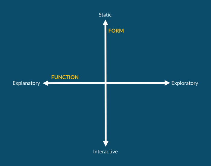
Last week, many of us were busy with the release of Q1 data, updating Tableau workbooks and/or creating visuals to support the country and technical teams for quarterly reviews. The visualizations we create exist on two spectrums, form and function, as Jon Schwabish has nicely laid out across an assortment of his work over the years. Form represents whether the graphic is static, e.g. a (non animated) graph of table in PowerPoint or interactive, e.g. a visual that the audience can interface with, like a hover over pop up or adjustable parameters/filters in Tableau. The second axis is the function spectrum which consists of explanatory, i.e. trying to convey a purpose with the visuals, and exploratory, i.e. allowing the user to come to their own conclusions with the data at hand.
When we create Tableau workbooks for technical teams in the office, we’re generally creating a series of exploratory, interactive visuals. This structure allows us to dig into the data, cutting it across various dimensions, and identifying interesting trends, outliers, issues, or achievements. This process is crucial to data analysis. Once an analyst identifies something of import and wants to communicate that out, they have to shift away from the exploratory work and towards the explanatory side of the spectrum. All too often, this involves just taking a screenshot of the visual in the Tableau workbook and pasting that into a presentation. Unfortunately taking a screenshot isn’t the best approach to creating a strong communication piece.
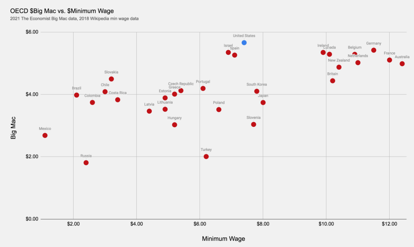
I really like this example of a change in form that I saw posted at the end of January. RJ Andrews posted a scatter plot to explore the relationship between the minimum wage and the Big Mac index.

Andrew’s scatter plot is a static exploratory visualization, allowing the audience to peruse the data, seeing where different countries fall (and highlighting the US). This plot is pretty nice and serves a purpose, but isn’t in a final state to be presented in say a quarterly review presentation, much like just taking a screenshot of a Tableau workbook
Lisa Charlottes Rost took Andrews’ original plot and added some of the missing elements. The new plot below is still more on the exploratory spectrum, but adds some key pieces that make this more of a communication piece - adding an informative title, adding annotations to assist the audience in interpreting the plot, integrating a legend, integrating units into axis titles to minimize repetition, only labeling select points, and encoding a 3rd dimension - population - into the dot size.
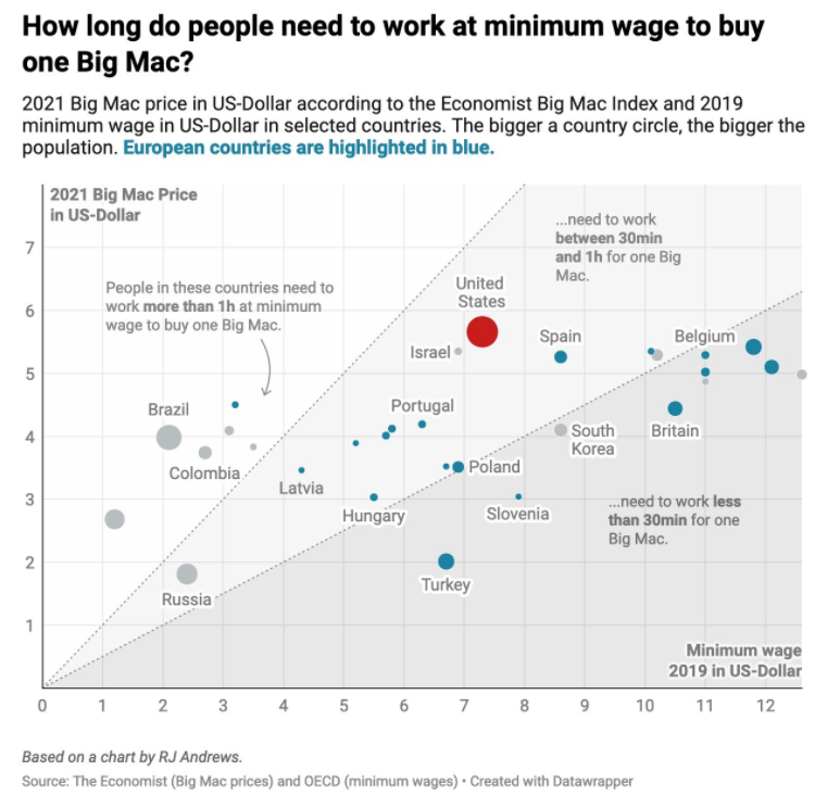
If this plot was to be used to communicate a particular message, moving it even closer to the explanatory end of the function spectrum, Rost could have adjusted her title to make an observation about the US (which is the focal point with the use of the red color) in comparison to European countries (encoded in blue).
When you create plots for communication, creating exploratory pieces are an important and necessary first step. But, we have to remember to convert it to more of an explanatory visual if that is the intended purpose, following along with how Rost adjusted Andrews exploratory work.