Monday Data Viz - Moving Beyond Bars with Beeswarms
2023-03-20 Aaron Chafetz
data-viz vizualisation monday-data-viz
For those of you following US news at home, the Silicon Valley Bank (SVB) failure the other week has kept news organizations busy and investors worried. The SVB, heavily utilized by the tech sector to invest in and back start ups, didn’t have enough money on hand as clients withdrew funds (causing worry and more clients to pull their funds) resulting in the bank failing. While not in the top tier of the largest US banks, they still commanded a sizable share of assets in the market worth about over $200 billion. And their failure “is the second-largest failure of a federally insured bank, behind only Washington Mutual, which crashed at the start of the Great Recession in 2008.”
Amongst the plethora of articles the Washington Post published on the topic last week, there was one in particular that caught my eye. Luis Melgar and Hamza Shaban wrote a very short article, but included a couple of pretty fantabulous graphics. I want to focus on the one included below.
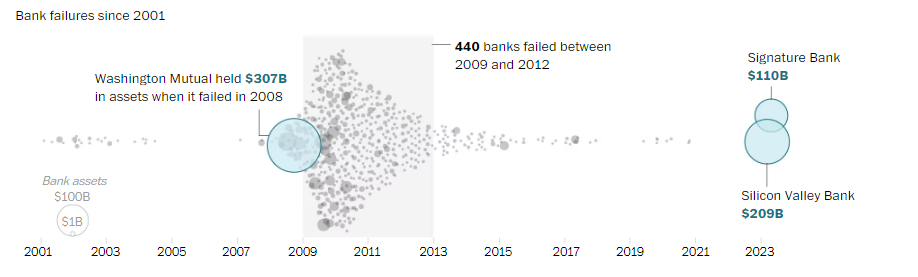
In their plot, Melgar and Shaban show how many banks have failed since 2001, as depicted by different sized points based on the size of their assets. This beeswarm plot is essentially a scatter plot that has one “real” axis. In this case, we have the date on the x-axis that is “real”. If we plotted these along a single x-axis, we wouldn’t be able to see how many banks failed because they could be overlapping points. To solve this problem, a beeswarm plot uses an artificial y-axis to distribute the points so they are not all on top of one another. All these points fanned out like this give the impression of a beeswarm, hence the name.
We can see that a lot of banks failed during the Great Recession, and Melgar and Shaban even annotated the plot to give you additional context that 400 banks failed during this period. The authors also used an encoding of size to show the magnitude. Washington Mutual in 2008 is the largest failure (and circle) followed by the recent failures of SVB and Signature Bank last week. These three banks are encoded with color as well to make them stand out against all the other bank failures.
This plot certainly could have been a bar chart, showing either how many banks failed in a given year or the value in assets, but this gives us a much richer understanding of what is going on. The same is also true with our PEPFAR data. We typically aggregate our site level data up higher orders of magnitude (e.g. national/sub-national units, agency, partner), which can be useful, but we lose out on a lot of great detail and stories by masking this more granular data. I encourage you all to go beyond reporting out aggregated data and to explore the stories contained within your finer level of detail data.
Happy plotting!