Monday Data Viz - Encoding Data
2021-01-24 Aaron Chafetz
data-viz vizualisation monday-data-viz
I saw a great graphic from the Washington Post (reposted on Twitter this week but actually from an article published three years ago) that I wanted to share.
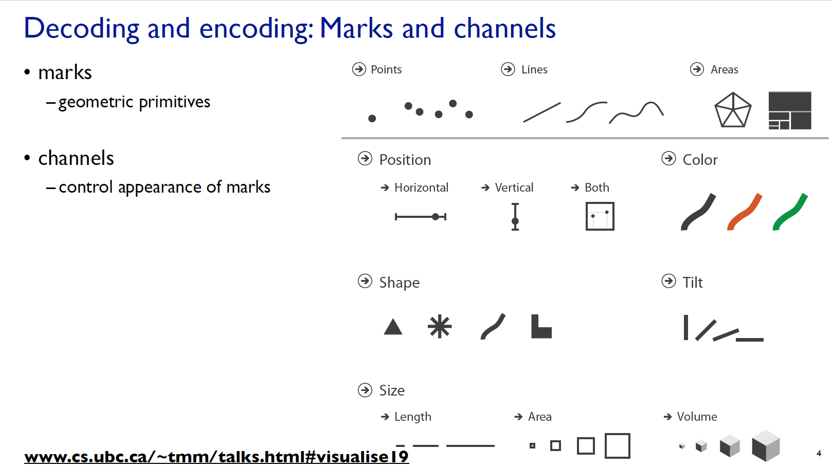
Before I do, I want to quickly talk about encoding data. At first glance this may seem overly technical, but it’s actually what we’re doing every time we plot a visualization. To overly simply what Tamara Munzner explains in Visualization Analysis and Design, we take our data and convert them into various forms for our reader to decipher using points, lines, and areas, which are referred to as “marks” and with “channels”, which include position, length, color, shape, and tilt.
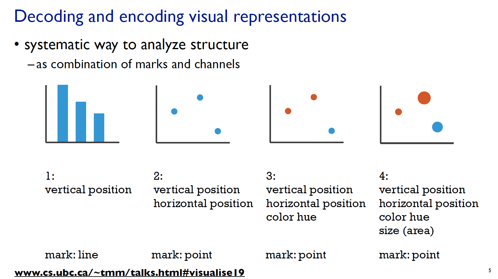
And we combine those marks and channels to create different plots.
Okay, sorry for the digression, but below is the graphic from Philip Bump of the Post. Back in 2018, he looked at how frequently White House Press secretaries held the daily press briefings and for how long between 2016-2018. To analyze the data, Bump created this plot that is using a number of marks and channels:
- each day is presented by a point
- position is used to encode time
- vertical represents days, horizontal represents months
- each WH press secretary is encoded with a different color (hue)
- the type of briefing (briefing/gaggle/briefing with third party) is also encoded using color but this time using saturation
- duration is captured by the size/area of each circle
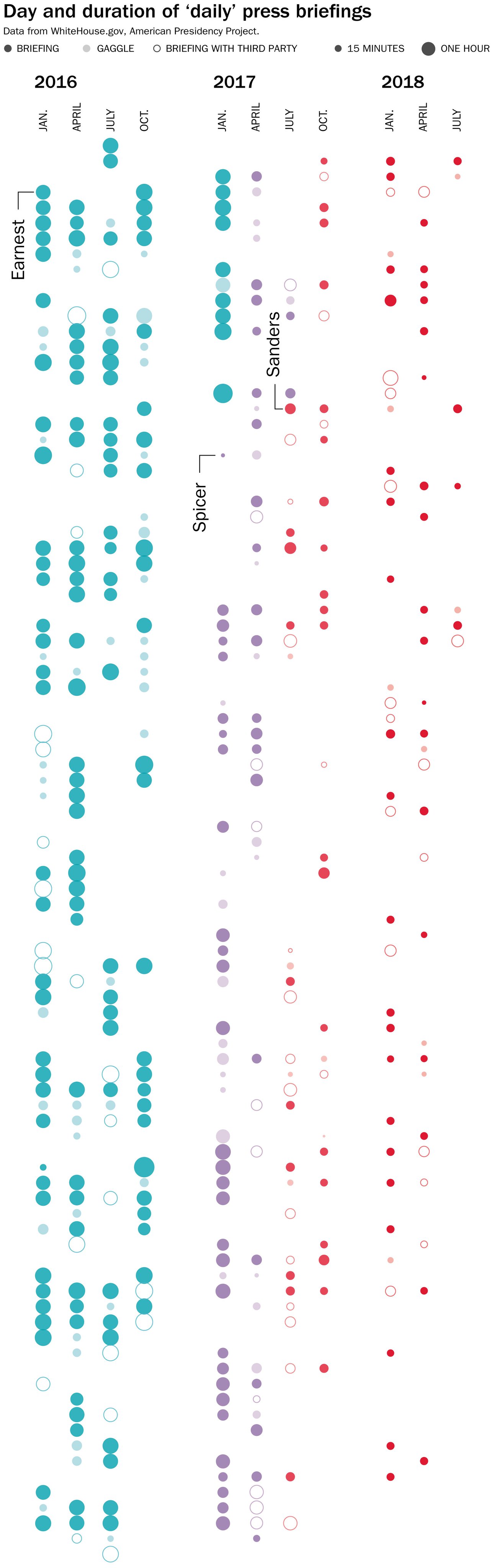
I really like Bump’s graphic because it is able to encode a lot of different elements to make for a more robust visualization and because it is a slightly untraditional display of time (we usually just think about time moving along the x axis)
When you’re creating your own exploratory analysis, consider the different ways you can use marks and channels as Munzner describes to add more dimensions to your plot.