Monday Data Viz - Aggregating Away the Signal
2022-04-18 Aaron Chafetz
data-viz vizualisation monday-data-viz
Last month, Zan Armstrong wrote an amazing article on Stack Overflow’s blog, The Overflow, where she discussed the problem that we grapple with every single day: aggregating data. In PEPFAR, we have data on up 30 indicators by age, sex, and other disagregates from about 30,000 sites across the globe. That’s a lot of data. As a result, we end up aggregating the data in order to make working with it more manageable. But is aggregating data all it’s cracked up to be? Unsurprisingly, Armstrong says no, writing:
Aggregation is the standard best practice for analyzing time series data, but it can create problems by stripping away crucial context so that you’re not even aware of how much potential insight you’ve lost.
By making the data easier to work with and visualize, we are making a decision that all the critical insights can be drawn from the sum or average and actual data points are just noise. Armstrong professes “the smoothed line doesn’t even give us any hints about what questions to ask or what’s worth digging into more.” So by aggregating and stopping there, we’re not able to truly explore the vast dataset for interesting patterns or outliers. This quote from Armstrong really resonated with me:
Informed aggregation simplifies and prioritizes. Uninformed aggregation means you’ll never know what insights you lost.
It’s well and good to just say we should be diving deeper, but what’s the call to action? How should we be exploring our large data beyond “uninformed aggregation”? Armstrong draws from a blog series on exploring time series data that she co-wrote to come up with the following three recommendations.
- Rearranging the data to compare “like to like.”
- Augmenting the data with concepts that matter, like “summer” vs. “winter” or data-defined categories like “high” or “normal” energy usage.
- Using the data itself as context by splitting the data into “foreground” and “background,” so the full dataset provides the context necessary to make sense of the specific subset of the data we’re interested in.
In her article, Armstrong walks all of these suggested solutions with great examples (using large California household energy consumption data). What rose to the top for me is the clear need to facet data (create meaningful small multiples) and apply context and/or comparisons.
Armstrong goes through lots of great examples, but I wanted to go through one that I particularly liked. Focusing on the last solution, splitting the data for context, she starts with a scatter plot of outdoor temperature and energy demand.
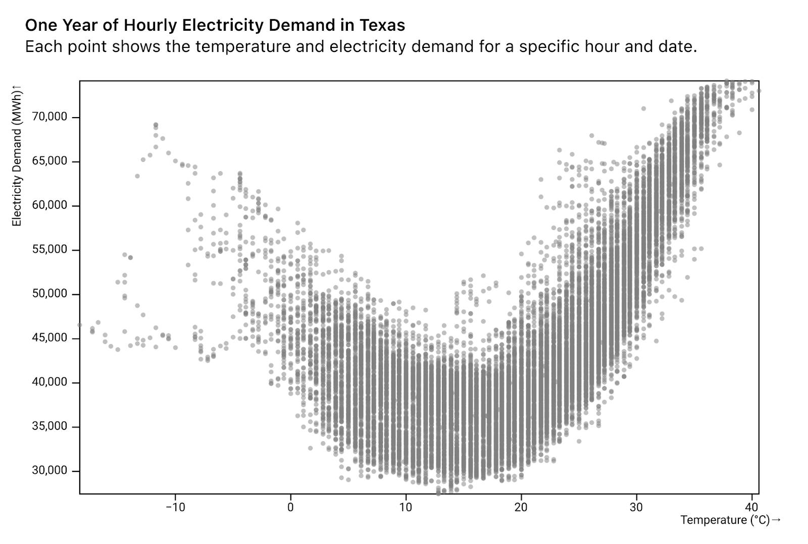
She points out that there is a clear (non-linear) relationship and next decides to explore this further by introducing color to capture time of the day.
Knowing that in our own homes we crank the thermostat a lot higher on a cold afternoon than on a cold night, we guessed that the hour of day could play a key role in the relationship between temperature and energy use.
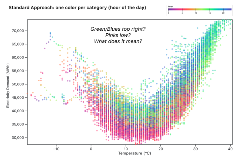
From adding this mark, we can start to see some patterns emerge, but she expresses that we have to spend a lot of time flipping back and forth between the legend and graph and can’t really answer questions like how does a particular time compare to other points in the day. Her solution is to group the data and apply the concept of foreground and background data.
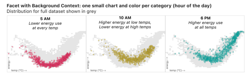
With the facets, we have the context of the whole dataset and can see trends for particular times start to emerge. She writes:
10am is in some ways the most interesting: at lower temperatures (in the left half of the graph) the yellow dots are relatively high compared to the grey dots, indicating high energy use relative to other hours of the day at the same temperature. Meanwhile, for high temperatures on the right half of the graph, the yellow dots hug the bottom of the grey area. At hot temperatures, relatively little energy is used at 10am compared to the rest of the day. This type of insight is made possible not just by grouping, but also by using the full “noisy” dataset as a consistent background providing context for all the faceted charts.
I’ve just pulled out this example out of the many great examples in her article. I highly encourage you to read the article in its entirety and think critically about how to apply these three solutions to the problem of aggregation so that you can “embrace the complexity of the data.”
Happy plotting!