Monday Data Viz - Iterate, Part III
2022-02-14 Aaron Chafetz
data-viz vizualisation monday-data-viz
Sorry to keep harping on this topic, but I really have to do one last write up on iteration and then I’ll leave this topic alone for at least a little while. Last Wednesday, Ryan Best and Elena Mejía at FiveThirtyEight, wrote a fabulous article on the pernicious effects that redlining still plagues cities and it’s residents today. It’s a great reflection on the legacy of institutional racism across the cities it explores including some great interactive visualizations along the way.
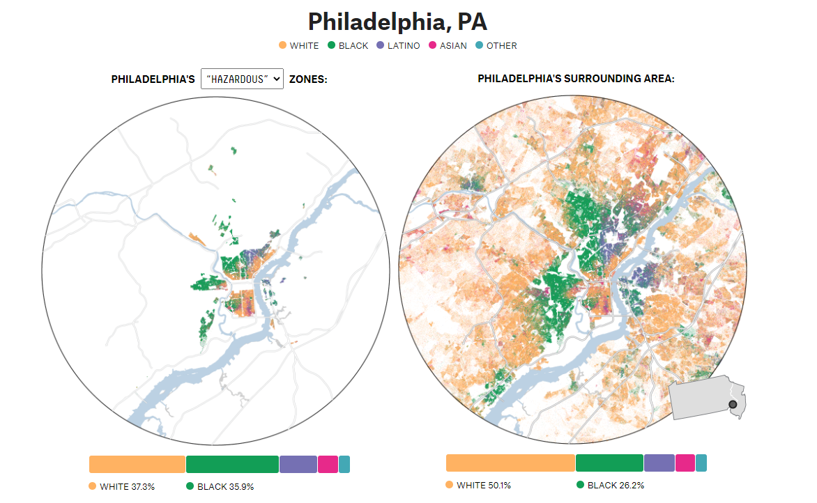
To add to this, Best describes some of the process in a thread on Twitter. In his post, Best describes the iterative process to get to the final visuals in the article. Not only did it take months to get right, but it required ample mediums, starting with pen and paper. The importance of color choice shone through in this coupled with their attempts to communicate ample information but still being able to clearly communicate key takeaways with the audience.
I really enjoyed both the article and also getting some sense of the iterative process behind these striking visuals. I encourage you to read both.
Happy plotting!