Monday Data Viz - Part to Whole
2022-11-14 Aaron Chafetz
data-viz vizualisation monday-data-viz
I came across this Tableau Viz of the Day by Megan Menth in September and have been thinking about one particular element of it since then. This visual breaks down some fake data about a call center and is designed for an “executive” to review. It provides a number of different data points and trends in different ways, all useful ways to cut the data.
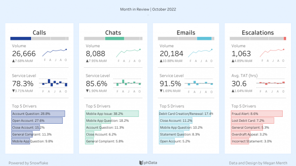
What stood out to me were the part-to-whole stacked bar charts on the top of each category. The data are faceted across the visual into the different avenues for into the different entry points/”modalities” - calls, chats, and emails and escalated. Those stacked bar charts at the top give you a very quick and useful sense of how much volume out of the total is coming from that particular entry point.

The volume BAN below the chart also gives you a sense of the absolute size (for a given month which is a little confusing since the chart is showing share over all time), but forces the user to do some mental calculation about relative size to compare the different entry points.
If you are comparing different groups in a visual, think about how you can incorporate some means like this in order to also show the relative size of that group compared to the total.
Happy plotting!