Monday Data Viz - Directional Dumbbell Plots
2022-05-16 Aaron Chafetz
data-viz vizualisation monday-data-viz
After going to my fourth Nats’ game over the weekend, I finally attended my first win of the 2022 season (I’m not superstitious, but I did get a new hat and sit in a different section so read into that what you will). The Nationals scored 13 runs, with two home runs. Despite all this scoring, the Nats win stands in juxtaposition to a possible new “dead ball” era, where there are less runs and home runs per game due to adjustments to the baseball itself.
The great Chelsea Janes discussed trends across baseball in the Washington Post yesterday. And as any good journalist would do, she has the data and the visuals to back it up. Janes mentions that “[in] the first month of the season, 10.3 percent of fly balls traveled for home runs, the lowest percentages since 2014.”
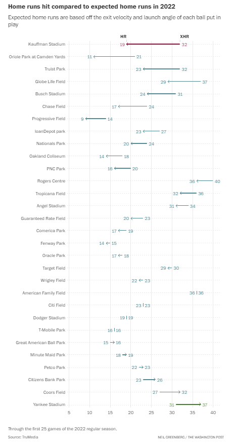
Janes includes the below graph by Neil Greenberg to depict the change between the expected rate of home runs for the beginning of the season versus the actual. Greenberg uses a dumbbell plot, where each category (baseball stadium) runs along the y axis and the two value points (home runs and expected home runs) are connected with a line that runs parallel to the x-axis to emphasize the magnitude of their difference in values. The Washington Post visual uses an arrow at the terminal point to better give the reader a sense of direction, i.e. was the actual home run rate less than expected. Nationals Park is towards the top of the list, where there were about 17% less home runs in the first 25 games than expected. At the bottom of the visual, you can see from the directional arrow that 6 ballparks actually had more actual home runs than expected.

When trying to compare the differences between two values for a given group, dumbbell plots are an excellent way to go. And if there is some directionality to your data, consider adding an arrow to make it easier for your readers to pick up on which way the trend is going.
Happy plotting!