Monday Data Viz - Bump Charts
2021-11-29 Aaron Chafetz
data-viz vizualisation monday-data-viz
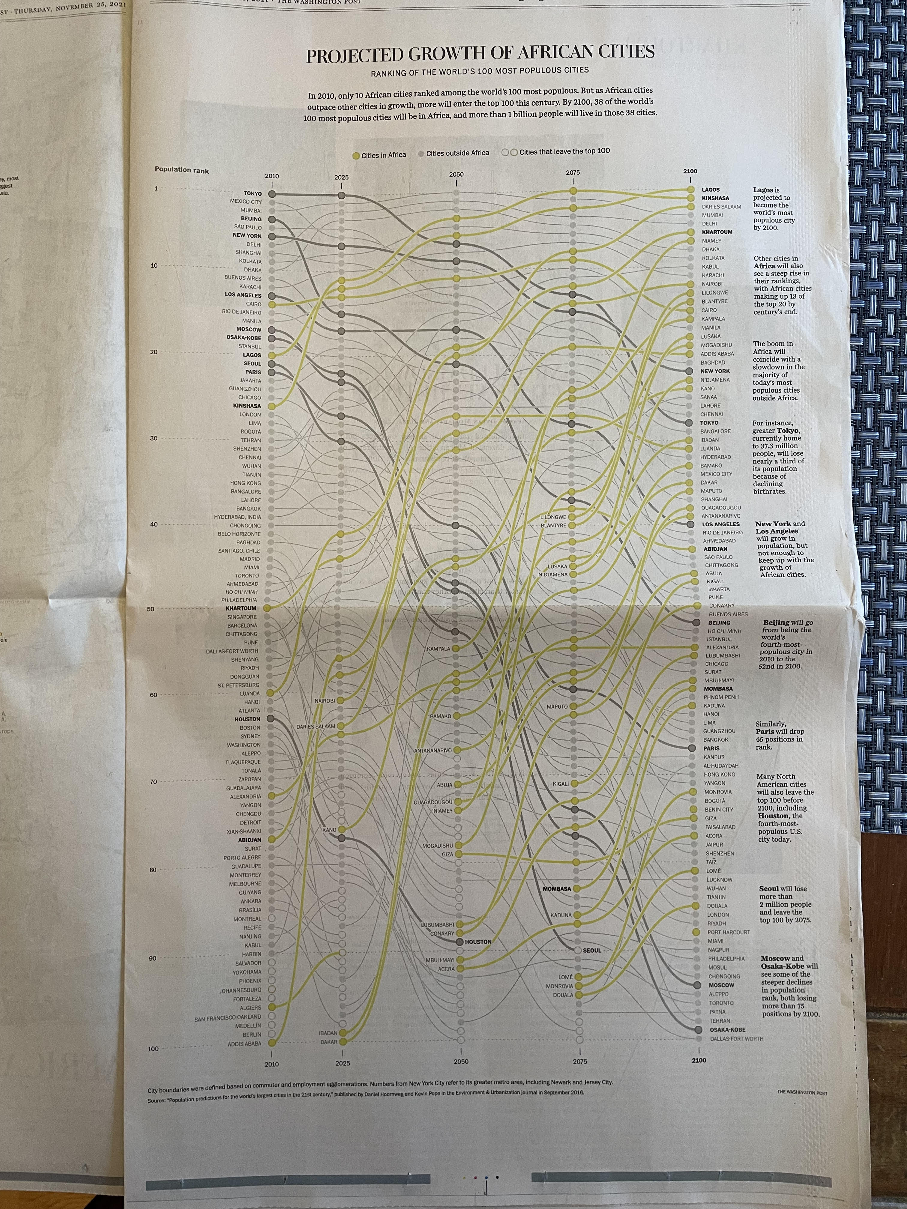
The Washington Post released a story on the rise of African cities two Fridays ago (printed as a special section last Thursday) by Max Bearak and graphics by Dylan Moriarty and Júlia Ledur. With African cities modelled to outpace the rest of the world in terms of growth, Bearak narrows in on five cities (Khartoum, Lagos, Mombasa, Abidjan, and Kinshasa) that “offer insights into the forces that will drive that group and place Africa at the center of our urban future.” The story itself is great, but the graphics (maps, charts, images, and videos) are outstanding and add a ton of the story.
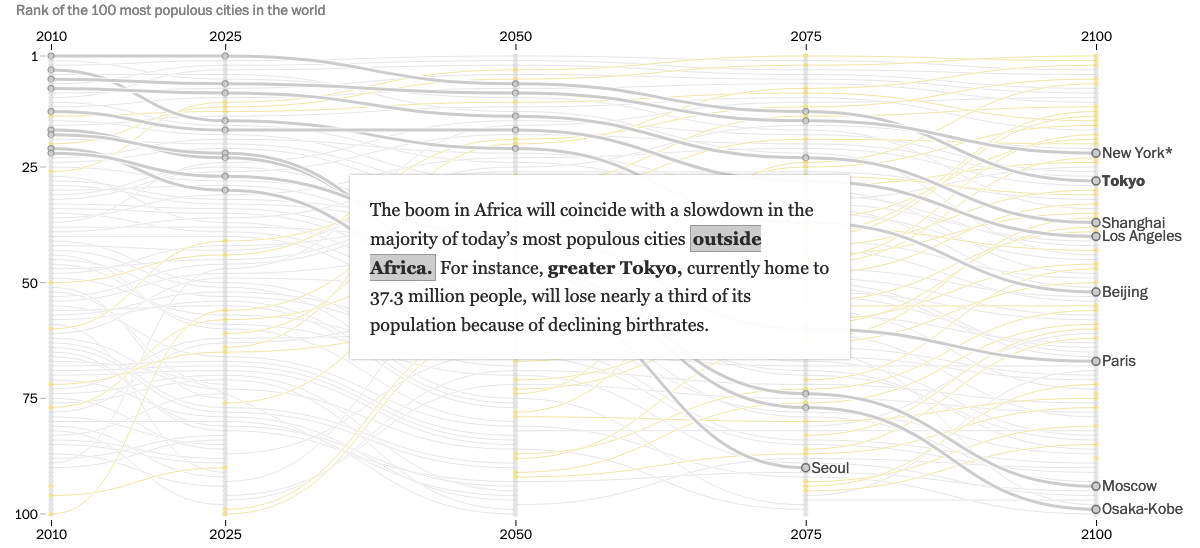
Moriarty and Ledur produced a plethora of fabulous visuals for this story, but I want to focus on their bump chart. Bump charts are essentially a line graph that tracks rankings over time. Since the article is about the projected growth of African cities, it seems like a no-brainer to plot the change in rankings over time to show the change from Africa having 10 largest cities in 2010 to the projected 38 cities by 2100.
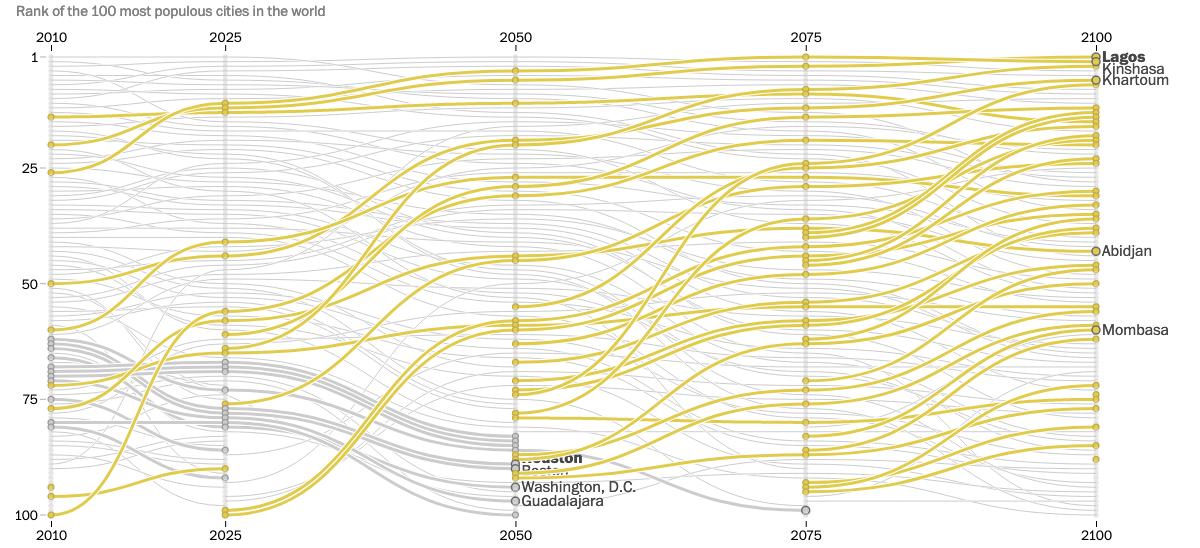
From the bump chart we can see (in gold) the rise of African cities. While not shown in this screenshot above, this visual is dynamic and Moriarty and Ledur break this treasure trove of information down into smaller, bite sized chunks with integrated legends (chef’s kiss), like the image below.
And to top this all off, the static print version is also just fabulous in person to explore.
While we don’t often rely on bump charts for our work, I’m still incredibly inspired by the work done here. I would highly recommend checking out all the other great graphics peppered throughout Bearak, Moriarty, and Ledur’s story.
Happy plotting!