Monday Data Viz - Connecting with Your Data, Part I
2022-07-18 Aaron Chafetz
data-viz vizualisation monday-data-viz
While there were a lot of great articles in the debut issue of The Nightingale, I wanted to share one that I couldn’t stop thinking about. Rohan Jhunja wrote a piece inspired by Dear Data about his data capture and viz project.
During the COVID lockdown in December 2020, he and his family had moved in together and in an effort to share chores, divided up who would be making meals each day. In an effort to also to track how healthy the meals were as well, Jhunja captured not just who made each meal and what it was, but also what it consisted primarily of, e.g. carbs, dairy, meat.
Jhunja chose to visualize the data based on an Indian Thali.
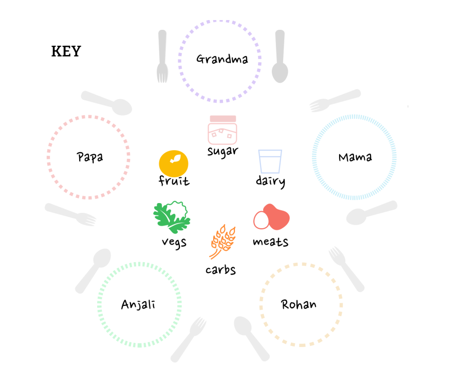
The shape of the Thali chart draws inspiration from a traditional Indian way of serving food. A ‘thali’ is typically a large plate with many small bowls for dal (pulses), curries, sabzis (dry vegetable dishes), and dahi (curd). It is served with a portion of rice, chapatis or puris, and pickles or chutneys. Thalis can range from two bowls to 50, depending on the occasion.
Let’s start by looking at the legend. Each Thalis chart will consist of a plate, depicting who made the dish, filled with circles colored showing which and how many food groups were represented.
Here is the final visualization, which consists of each of the Thali charts, but also has (1) a ton of great annotations, (2) usefully summaries, and (3) stacked bar charts for quicker comparison.
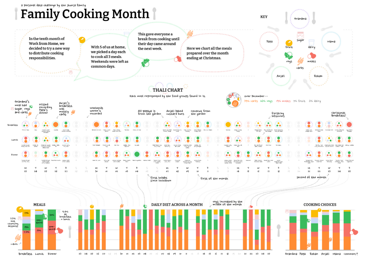
Having just the stacked bar charts would have been easier, but Thali charts connect not just Jhunja with his work, but also makes this more engage for the audience and makes it so much more relatable to us. I just think this is so fun!
Happy plotting!