Monday Data Viz - Out of Scale
2022-04-11 Aaron Chafetz
data-viz vizualisation monday-data-viz
Working with PEPFAR data is made easier by the fact that there are standard indicators with clear definitions that are collected across over 50 countries through one reporting tool. As a result it’s immensely easier to work with the data whether you are working with PrEP data in Kenya or Malawi or HIV testing data in the Philippines or South Africa. The challenge, however, comes from the vastly different scales that can appear across countries or even within the same country and comparing different regions or partners. Trying to visualize global program targets for treatment is going to create a scaling issue when you have 1.7 million people living with HIV in Nigeria compared with only 280 thousand in Lesotho.
So, what do we think about the different scales? Oftentimes, when visualizing country programs at a global level, the small programs can barely be seen on the same plot or the scales are made free so it makes it challenging to compare across the different plots. Both are far from optimal.
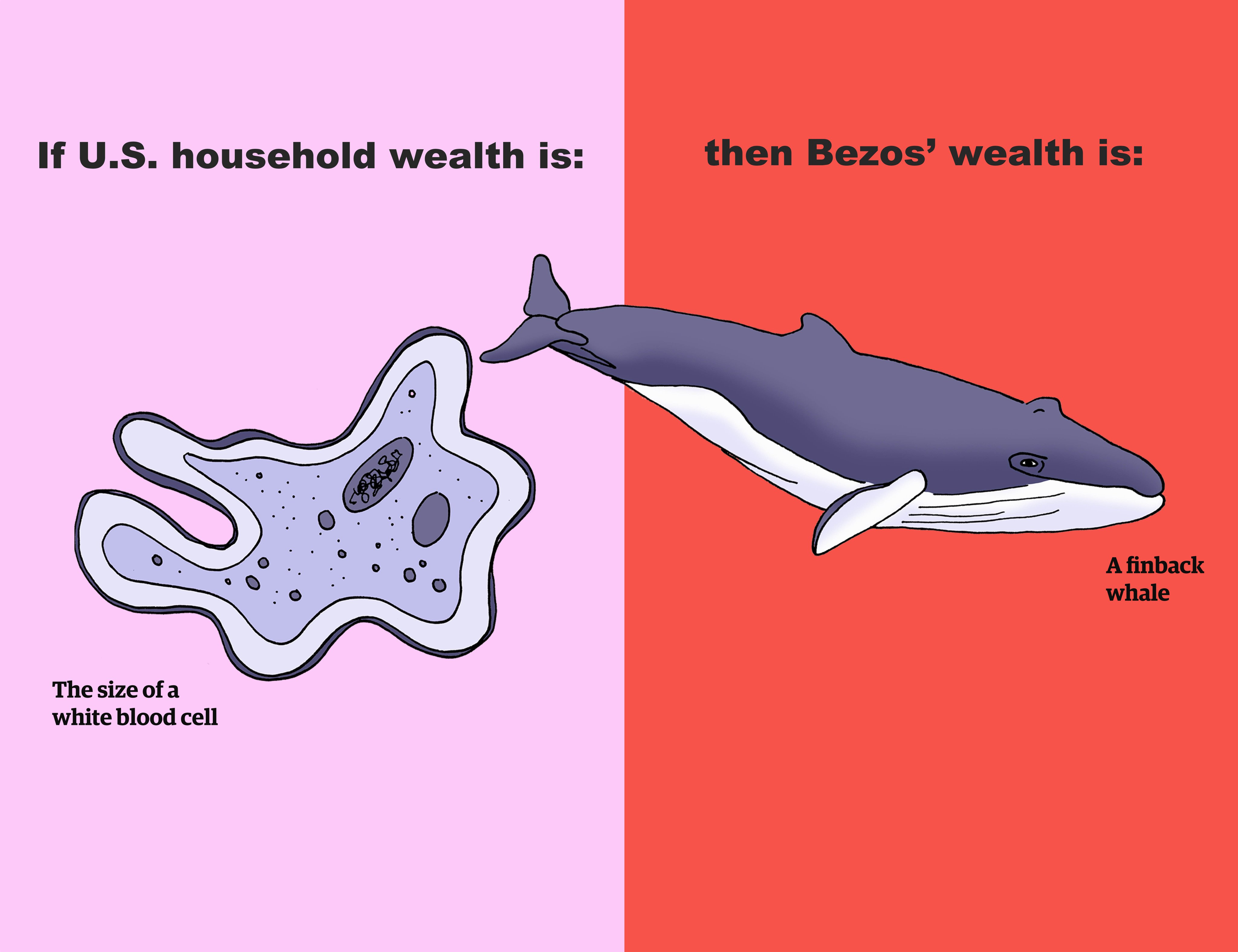
This issue is not unique to PEPFAR. Last week, I came across a recent piece by the talented Mona Chalabi in the New York Times Magazine, where she tackles this problem as she looks at Jeff Bezo’s wealth. Visualizing Bezo’s wealth is not just scaling issue but a comprehension one as well. Chalabi approaches this problem by drawing comparisons to normal items to help us evaluate the vast scale…literally drawing them. The online article is dynamic, so I pulled a few static examples from her Twitter since I thought they were particularly great.
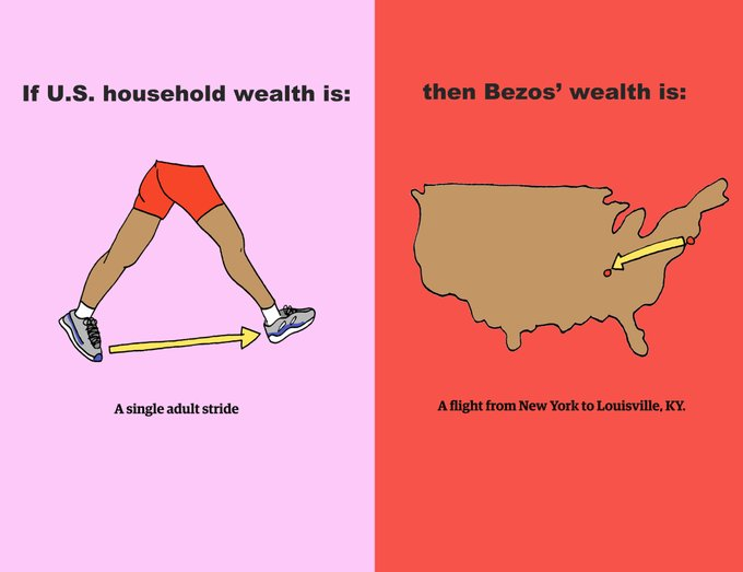
And this one was good too :)
When we try to make comparison with vastly different scales, maybe consider non-standard approaches for how you might visualize the difference.
Happy plotting!