Monday Data Viz - Elements of a Good Visualization
2021-03-29 Aaron Chafetz
data-viz vizualisation monday-data-viz
This morning, I wanted to share an old work that I am constantly reminded of. The Venn Diagram below comes to us from David McCandless of Information is Beautiful.
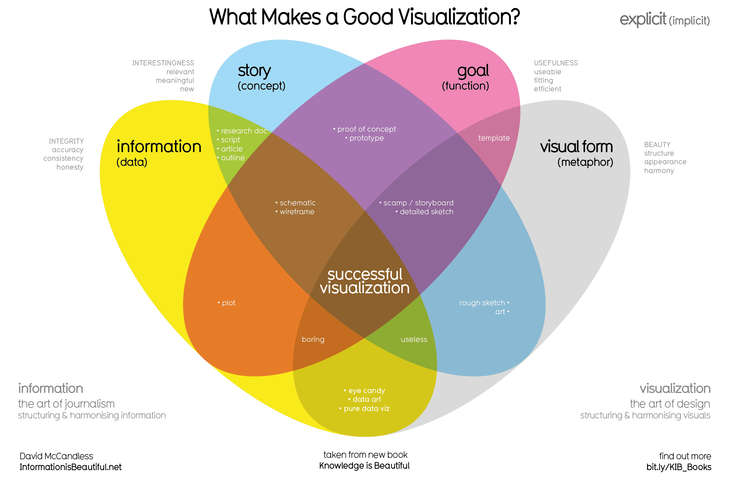
The takeaway message is pretty clear - a successful visualization requires a lot of elements to come to together in a thoughtful way. Having data or a clear goal or or the most amazing colors in the world or the shiniest of data viz programs all on their own will not automatically create a great visual. Even if you have a few of these elements layered together, you make progress towards a successful visualization, but it’s not yet there. For example having the data and visual form (aka applying principles of visualization) create “eye candy”, but they are devoid of a story or goal. Adding just one, but not both of these elements creates either a “boring” or “useless” visualization.
As you go about crafting your next chart, think critically about how to incorporate each of these pieces into your work to get to a successful visualization.
Happy plotting!