Monday Data Viz - Heads Up!
2021-05-10 Aaron Chafetz
data-viz vizualisation monday-data-viz
I imagine some of you had your heads up all weekend, hoping the falling space debris (and what a fabulous headline from the NYTs!) was not hurdling down to earth in your general proximity.
The event reminded me of a pretty neat graphic from an article the Washington Post ran a month ago by Christian Davenport on the advancements in satellite technology and its implications.
Just as computers have shrunk from room-size behemoths to an iPhone that can fit in your pocket, satellites, too, have shrunk dramatically. Instead of being the size of a garbage truck, costing as much as $400 million, satellites now are often no larger than a microwave or even a loaf of bread. They cost a fraction of their predecessors, as little as $1 million or less, and can be mass-produced in factories, or in some cases a garage or college classroom.
As the size and cost of satellites have come down, their numbers have grown dramatically. The number of satellites in operation more than doubled from 1,381 in 2015 to 3,371 by the end of last year, according to Bryce Space and Technology, a consulting firm that tracks the industry. In 2011, there were only 39 satellites launched that weighed less than 1,322 pounds, or 600 kg, according to Bryce. By 2017, that was 338, and by last year, as SpaceX began putting up hundreds of its Starlink satellites designed to beam the Internet to rural areas, the number leaped to more than 1,200.
Along with this story, Alyssa Flowers drew up a great graphic to help visualize the doubling of satellites in orbit over the last 5 years.
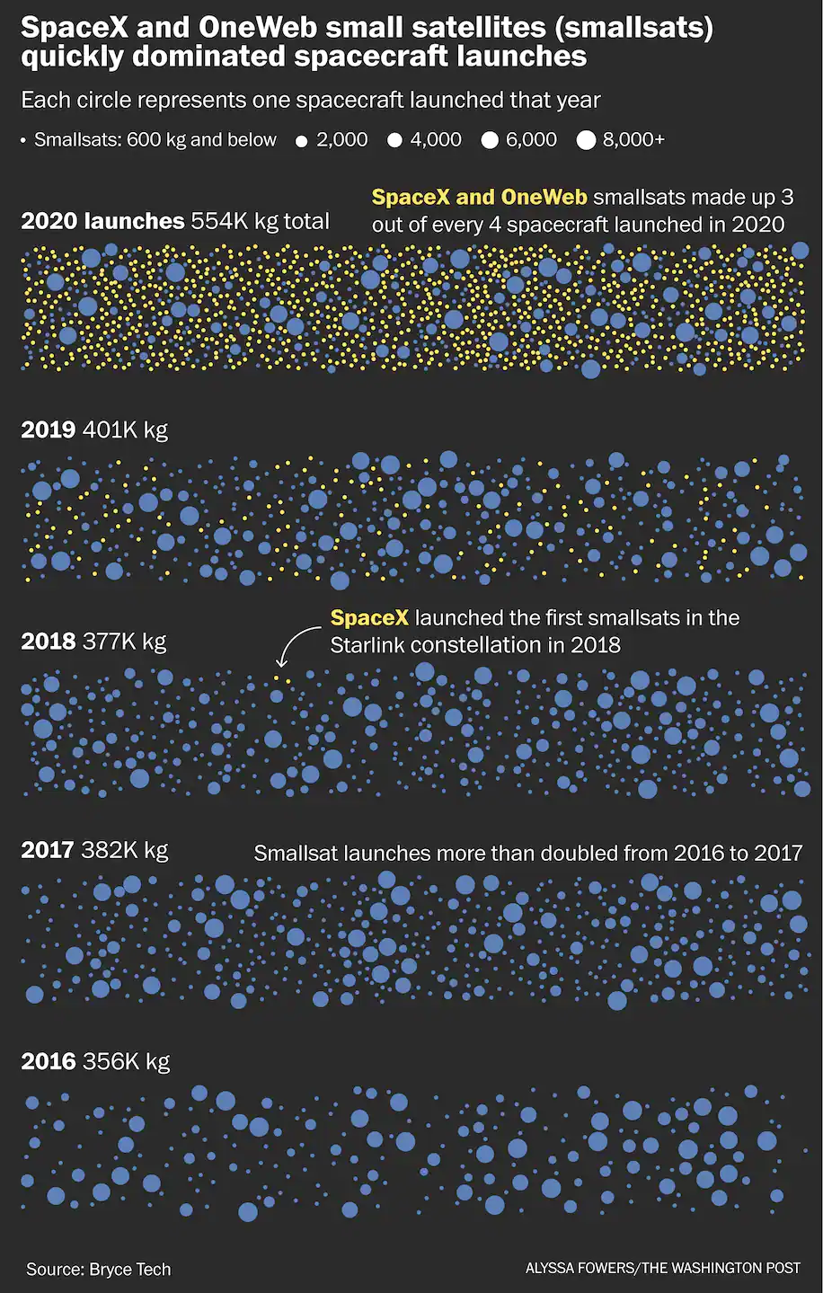
The display of lots of data here is fabulous as are the use of color/size encoding and annotation. This visual could have been done with a bar graph, but I think this graphic does a lot more justice. A bar graph would have been more precise (you could have compared the count of each of these satellites and types over time, but this setup helps convey the density and distribution of satellites and is more eye catching.
Just a reminder that every visualization requires tradeoffs that depend on what you’re trying to convey and to whom.
Happy plotting!