Monday Data Viz - Conveying Concepts with Visuals
2021-08-02 Aaron Chafetz
data-viz vizualisation monday-data-viz
A picture is worth a thousand words and when we try to explain complex topics, a visual or image is often the best way to more easily convey what is going on. Think Ikea.

| One of those tougher topics that is currently coming up repeatedly these days in the media is their portrayal of breakthrough cases of COVID. As the number of cases is on the rise again in the US, news outlets have often provided their audience with the (misleading and) more sensational figure - the probability vaccinated given infected, P(vaccinated | infected) - instead of the more accurate value - the probability infected given vaccinated, P(infected | vaccinated). |
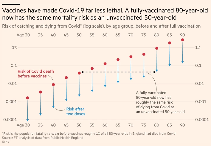
As per usual during the COVID pandemic, the Financial Times has come to the rescue with an excellent article and visuals on breakthrough infections. Oliver Barnes and John Burn-Murdoch kick off the article talking about why vaccinated people are getting the infection and not just talk through the value of the vaccine, but also visualize it as seen below. This is a powerful graphic that applies a TON of great data viz principles to show the reader the powerful impact of getting the vaccine on reducing mortality by different age groups - active title, annotations, color, lack of chart junk, integrated label.
Barnes and Burn-Murdoch don’t stop there though. They provide a great visual breakdown of why breakthrough infections are going up - we simply have a larger pool who have been vaccinated. The probably is that we have seen the wrong proportion used to describe the situation.
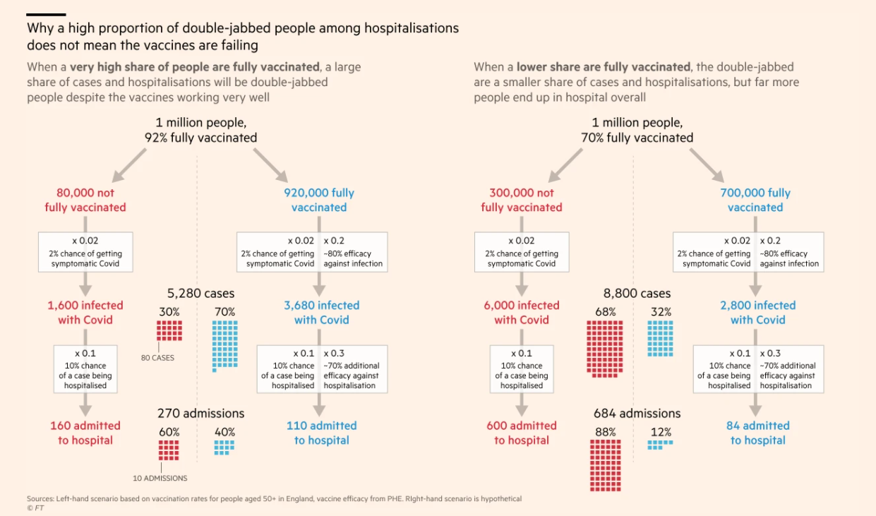
From the right visual, the proportion in the middle when used, gives the wrong impression - 70% of the 5,280 caes were from vaccinated individuals. We should be looking at the infections/hospitalizations/deaths, not with a denominator of the # of admissions or cases, but rather the subset of the population, those that are fully vaccinated or not. Alternatively, we should be comparing the rate of infection for those vaccinated, .004 (3,680 infected / 920,000 fully vaccinated) with the rate of infection for those not vaccinated, .02 (1,600 infected / 80 not fully vaccinated).
Providing a visual representation is really a powerful way to convey a talking point and have it stick with your audience.
Happy plotting!