Monday Data Viz - Annotate Like a Designer
2022-03-07 Aaron Chafetz
data-viz vizualisation monday-data-viz
During the Data Visualization Conference last month, I caught a session with Alli Torban and really liked what she had to say and her work. My synapses started firing when I saw her name on a post on Data Literacy last week. In it, Torban discussed cleaning up a visual’s annotation with a few key tweaks to make it shine.
Torban outlined three guidelines - keep it simple with as few elements/colors as possible to get your point across; be consistent and purposeful; rely on a textual hierarchy. She takes her sister’s Excel chart (based on her sister’s collected data) and vastly improves it, making it look like a more polished product by cleaning up the annotations using these guidelines.
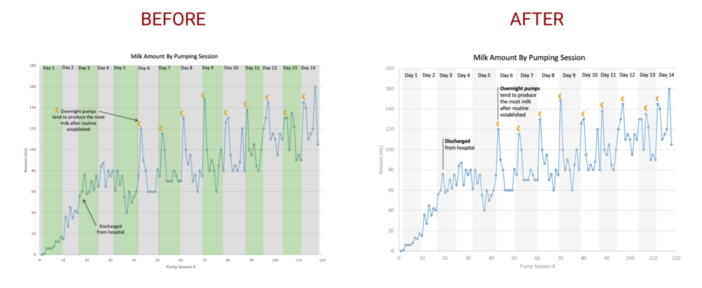
Check out her post (and quick video at the end) for the specifics!
Happy plotting!