Monday Data Viz - Stop the stoplights
2021-08-23 Aaron Chafetz
data-viz vizualisation monday-data-viz
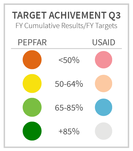
The MER Q3 data was just released Friday, which means it’s time yet again to look at target achievement. Since as long as I’ve been around working in the PEPFAR space, people have been very wed to their stoplight colors to tell them whether things are going well or not. Earlier this year, we changed up the colors for target achievement at USAID to be more colorblind friendly and get away from the harsh green-yellow-red Excel colors.
Well, we’re not the only ones fed up with the color palette. Just last week, Stephanie Evergreen published a blog post entitled Friends Don’t Let Friends Use Stoplight Color Schemes. She starts out with the same argument as ours, that the stoplight colors aren’t color blind friendly, and saves her most important point for last, which I cannot get more behind. In the last section, she says,
When color emphasis is everywhere, nothing stands out. It just results in a visual that feels noisy and busy. A better option would be to restrict your color-coding and select only reds or only greens. Anything that isn’t in red, you’ll know is good to go. Or, conversely, anything that isn’t in green needs attention. Pick just one color to get your audience to focus.
Color should be used strategically and when we do a data dump and present all the data/colors, we’re not actually saying anything. What do we want to convey to our audience? The answer to that should be the driver of what we actually chose to emphasize with color, making it easier for our audience to have the clear, take home message they need to know.
Next time you’re asked to present on target achievement, think about what your audience needs to know and use color to highlight that in the data.
Happy plotting!