Monday Data Viz - Dual Axis Manipulation
2022-06-06 Aaron Chafetz
data-viz vizualisation monday-data-viz
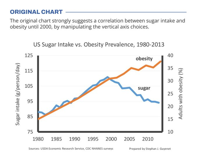
I’ve long rebuked the use of dual axes plots and last week, I saw yet another great example of why multi-axes can be so dangerous. The example comes to use from Koen Van den Eeckhout. He pulled the visual below, which has some truncated and manipulated axes to make it appear there is a strong correlation between sugar intake and obesity.
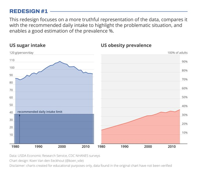
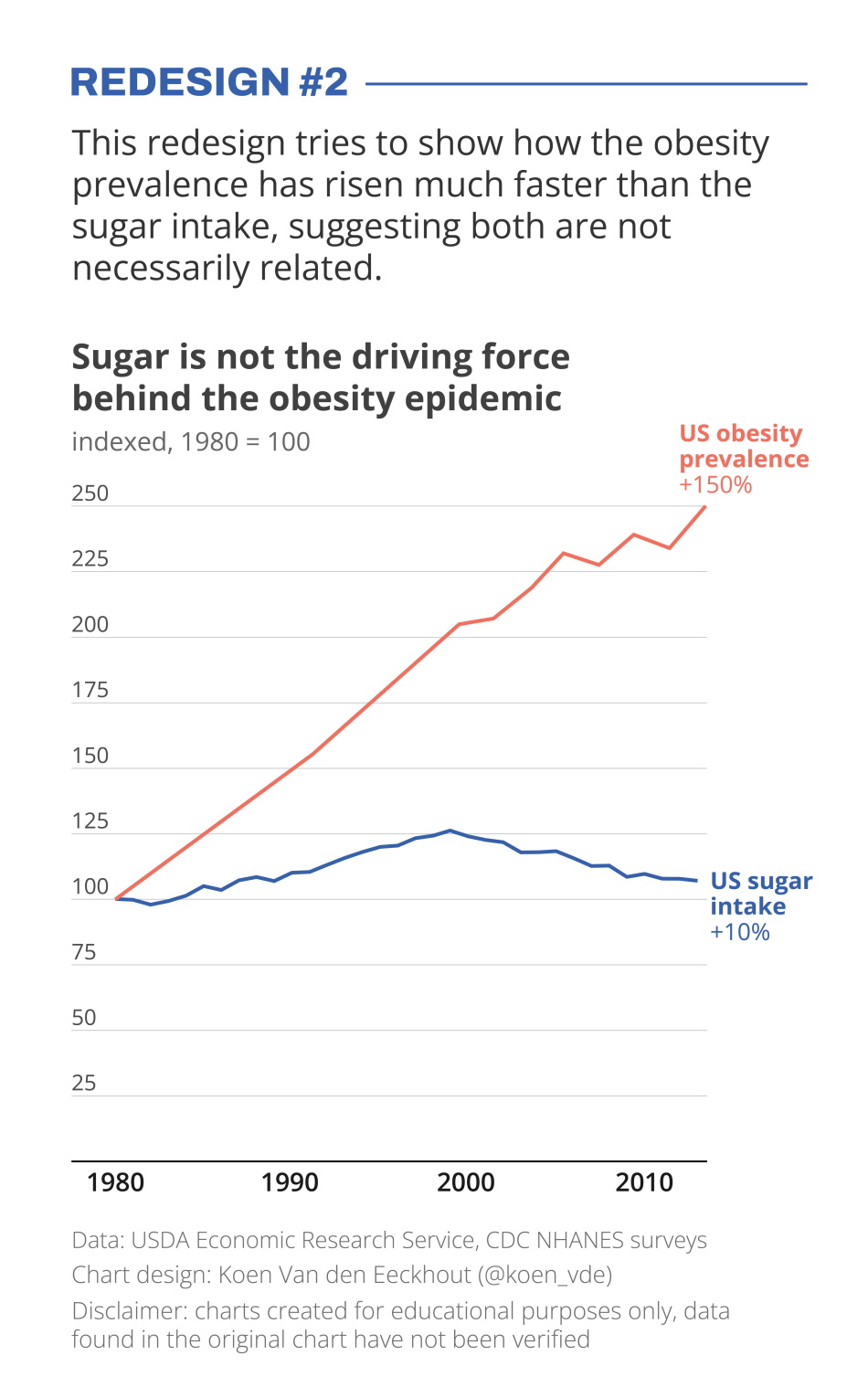
Van den Eeckhout takes the time to design two remakes to better represent the trends. I think the second does a pretty good job comparing the growth (indexed from the 1980s level).
Happy plotting!