Monday Data Viz - Encoding Target Achievement
2021-03-22 Aaron Chafetz
data-viz vizualisation monday-data-viz
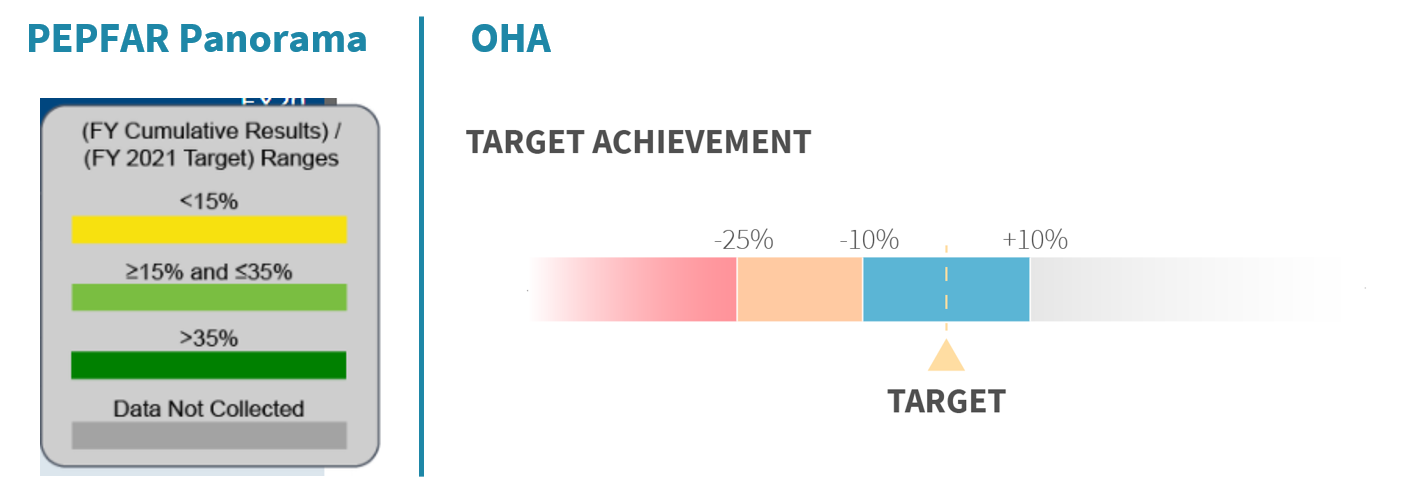
In the PEPFAR space, we spend a lot of time visualizing achievement to monitor how successfully our countries/districts/partners are at getting to their fiscal year targets. Traditionally, we’ve used a green-yellow-orange color scheme to match PEPFAR Panorama (here, we don’t see orange , and have moved to a version that utilizes variants of the OHA color palette, making achievement colors color-blind friendly.
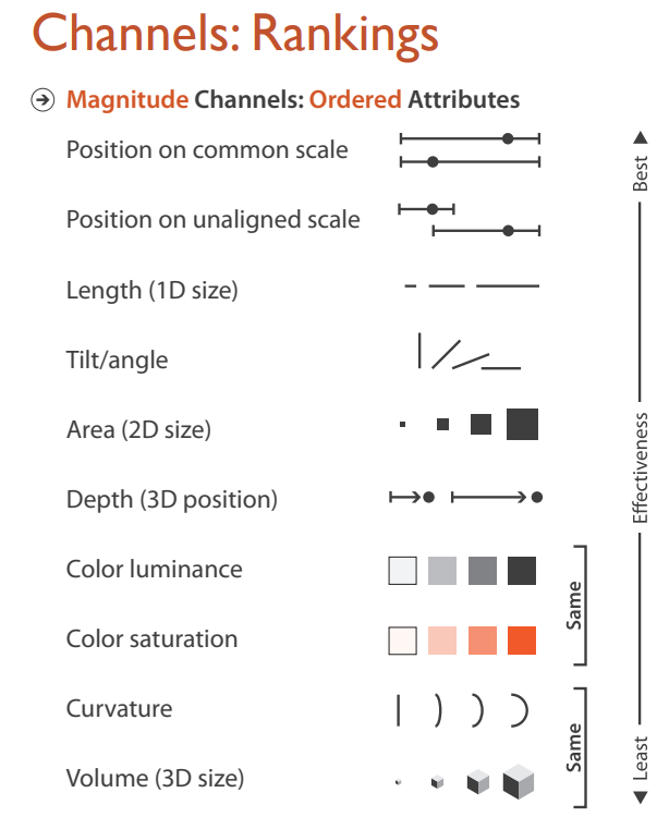
Color is only one channel to encode data. And while it gets the point across, there are other, more effective ways to encode data. If we return to Tamara Munzner’s discussion of channels and marks to encode data, which we discussed a couple of months ago, color falls much further down the effectiveness scale.
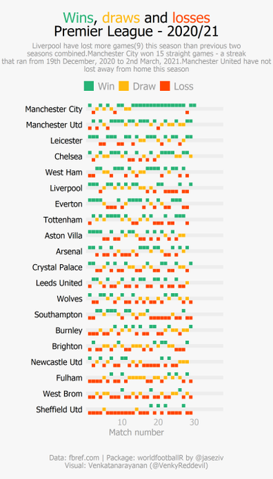
I’ve noticed a few examples of some ways to encoding success/achievement that I liked and wanted to share as alternatives. One at first glance appears to also rely purely on color encoding. But, if you look at this visualization of Premier league team records from a recent Twitter post, you can see that position/alignment is used to encode the data as well, making it easier for the reader to scale the information and pull out the trends.
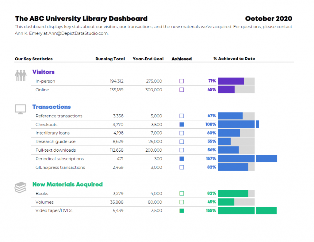
The other example comes to us from Ann Emery of Depict Data Studio.In her blog post, Emery works to improve two ineffective visuals, one on target achievement. Rather than use color for achievement, she combines position on a common scale as the primary encoding (bars against a 100% gray backdrop, making achievement/over achievement really pop) as well as color luminance (non fill vs fill on the achieved square).
Keep these variants of depicting achievement in mind when you consider ways to amplify your messaging.
Happy plotting!