Monday Data Viz - Inline Legends
2021-05-17 Aaron Chafetz
data-viz vizualisation monday-data-viz
The other week, I was reviewing some old visualizations and was reminded of one I spent quite a bit of time reviewing at the time. The below plot comes to us from Henrik Lindberg, who used BLS data to visualize how various activities vary by income group.
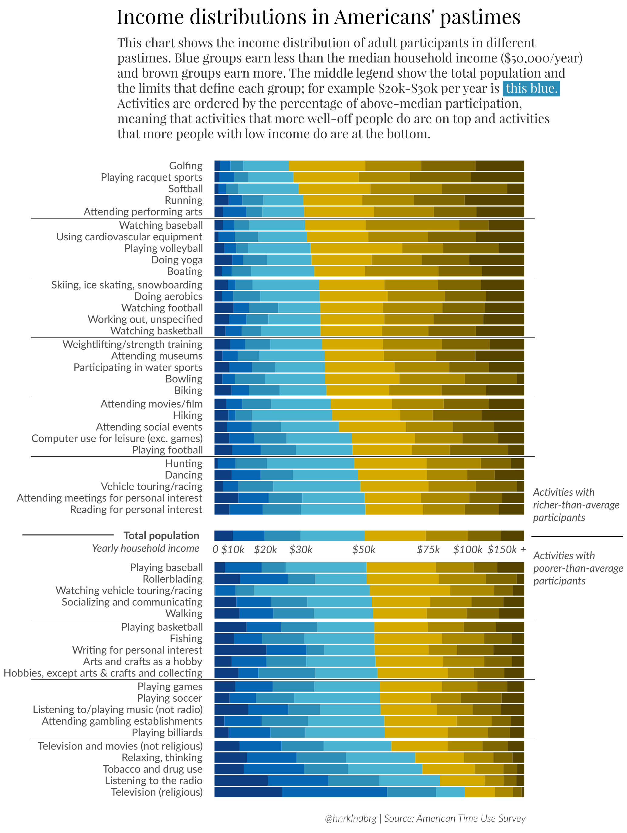
I’m not typically a fan of stacked bar charts, but this one in particular is an exploratory piece, designed for the audience to engage with the plot, rather than tell a particular story. Lindberg’s plot has a few nice features - diverging color palette, category breaks for easier readability, useful subheader, ordered categories from activities most engaged in by upper income brackets down to those with more participation by lower income groups. What I enjoy most about this graphic is the legend that is integrated in the middle of the plot, which provides the reader with the distribution of income groups as well as a clear divider between activities for more well off compared to less well off participants.
Hope you enjoy reviewing the plot as much as I did and think about how you might integrate your legend inline with your data in your next visualization.
Happy plotting!