Monday Data Viz - Coverage Remake
2022-12-12 Aaron Chafetz
data-viz vizualisation monday-data-viz
I wanted to share a graph makeover from our very own Tim Essam from a few weeks back. The country team he supports had a visual in their prep POART slide deck which approximated the treatment coverage gap for 15-24 year olds across their ten of their SNUs (subnationat unit - region, province, etc).
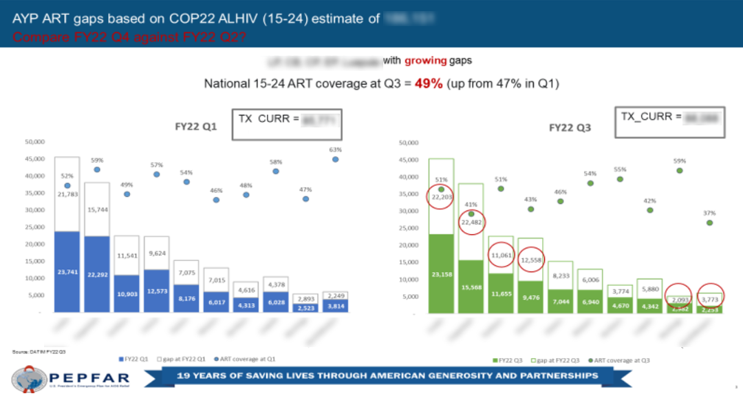
The original plot is from last POART and shows the gap from the first and third quarter of this year. It attempts to highlight the growing gap over this time for seven of the SNU (those that have red circles + Western), though it is masked by some less ideal aspects detailed below:
- The tile of the figure is just descriptive and doesn’t emphasize a takeaway message (which is found in the text at the top of the white section under the titles); and the subtitle is written in red text on a blue background making it quite challenging to read
- There are text boxes about each graphic providing the number on treatment, which shows a growth overall, even we’re seeing declines over most SNUs in this period, so it doesn’t fully fit with the purpose given its prominence
- The SNUs listed on the x-axis are too long and have to be written at a 45 degree angle, making it harder for the audience to read. It would be better if the axes were swapped so the SNUs would be written horizontally
- The ordering for the SNUs is based on Q3 patient volumes, when it might be better sorted on PLHIV.
- The plot utilized dual axes to show the coverage percent from the treatment over the PLHIV estimate, which is not ideal and makes it more difficult to read and interpret.
- The purpose of the plot seems to be to emphasize the drop in treatment coverage, but its difficult to compare the bars of each province when they are not paired next to one another
- The PLHIV estimate is taken here as a singular number, when it would be better to think about it and visualize it as a range.
- No source information is provided.
Tasked with updating this plot for Q4, Tim remade the graph with a greater focus on comparing the gap. He also thought it was critical to add a missing piece not evident from the original visual - between FY21 and FY22, the PLHIV estimates saw some drastic adjustment upwards and then start to see a small adjustment down for FY23. Given our targeting process, the target achievement still look relatively okay in FY22 since ramp up in PLHIV doesn’t play in until FY23. These extra pieces of context help put things in perspective.
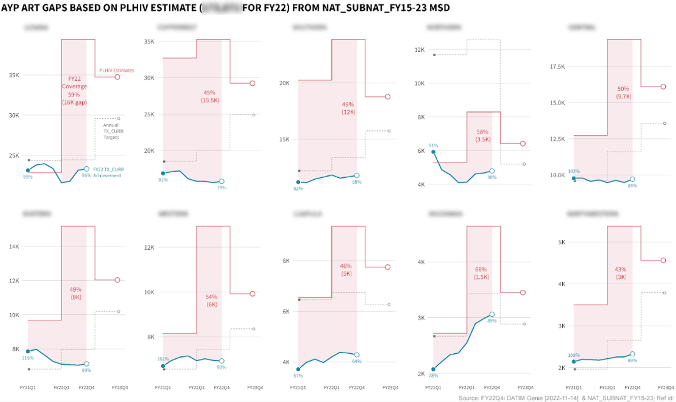
Rather than faceting by period, Tim set up these small multiples by SNU so you can make the relevant comparisons (change in the gap between periods) more easily. The plot also emphasizes the coverage gap, depicted with the red fill between the PLHIV point estimate (plotted as a step) and the treatment volume (plotted as the blue trend line). I think this is a great improvement! Great work, Tim.
When we are asked to update visuals (or asked for new ones), it’s really important to return to the purpose of the plot and ensure that message is coming across with how the data are displayed, rather that staying true to the original.
Happy plotting!