Monday Data Viz - Viz Eliciting Emotions
2022-10-24 Aaron Chafetz
data-viz vizualisation monday-data-viz
A former colleague of ours flagged a great series of visuals from The Upshot last week that I wanted to share with you all. In their article, Aatish Bhatia, Francesca Paris and Margot Sanger-Katz explored what items from President Biden’s proposed 2022 budget actually were passed by Congress. We typically see planned-to-actual plots as overlapping bars, fill bars, bars against a target line. Instead, Bhatia et al use two Voronoi diagrams to compare the two.
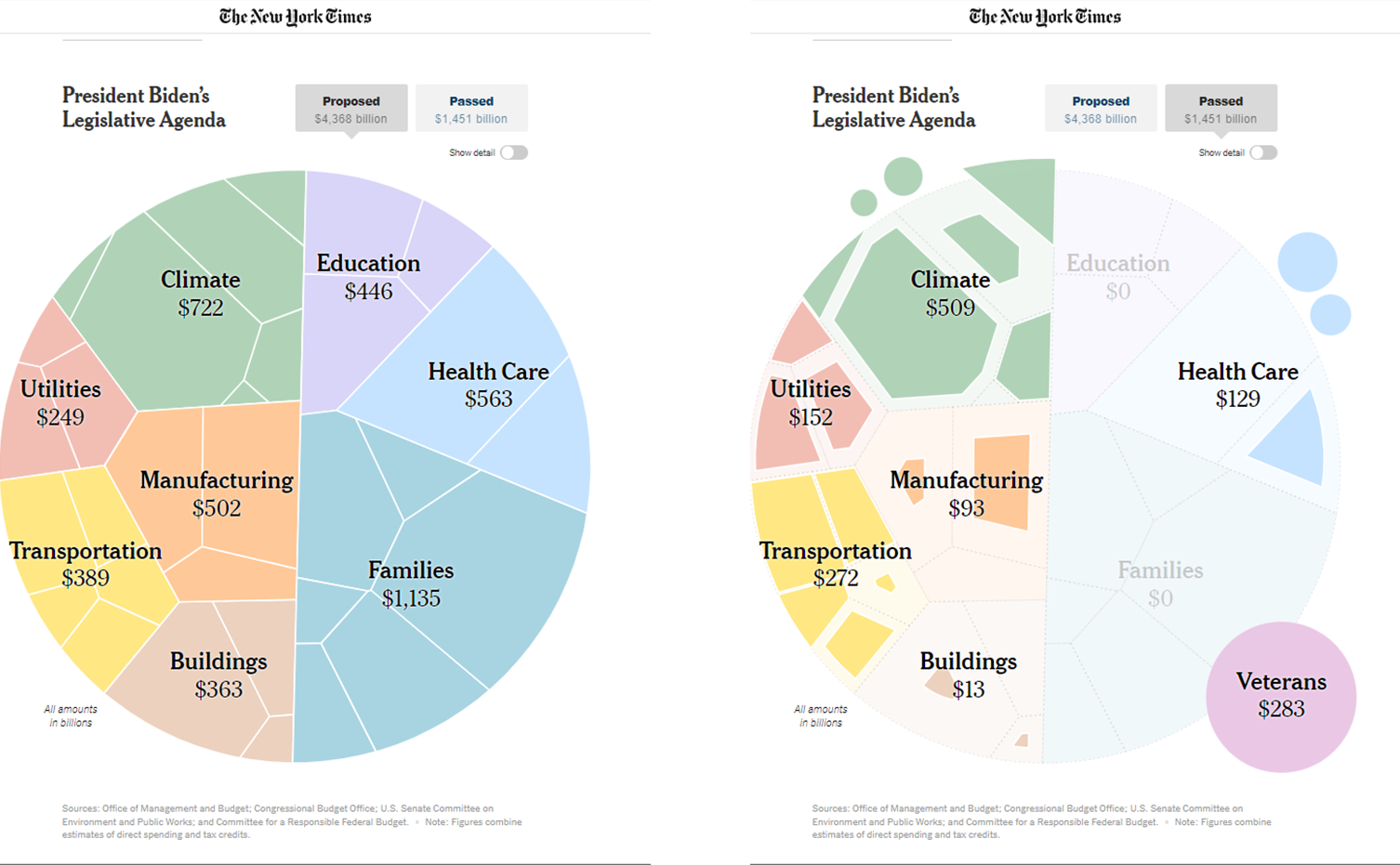
More interesting than the plot type is the way in which they present the visuals. As you scroll down the article, the plots change from proposed to passed. These dynamic plots shrink as you go down, eliciting some emotional appeal as you get to the bottom, watching as all the proposed families and education proposed budgets shrivel to nothing.
Happy plotting!