Monday Data Viz - Small Multiples and Group Context
2023-03-06 Aaron Chafetz
data-viz vizualisation monday-data-viz
I, like the next data visualizer, love small multiples graphs. And I was happy to see Yan Holtz (of From Data To Viz) added a great small multiples plot to his R Graph Gallery site. For this viz, Hotlz recreated a visualization originally produced by Gilbert Fontana in the Visual Capitalist about the decline in consumer confidence.
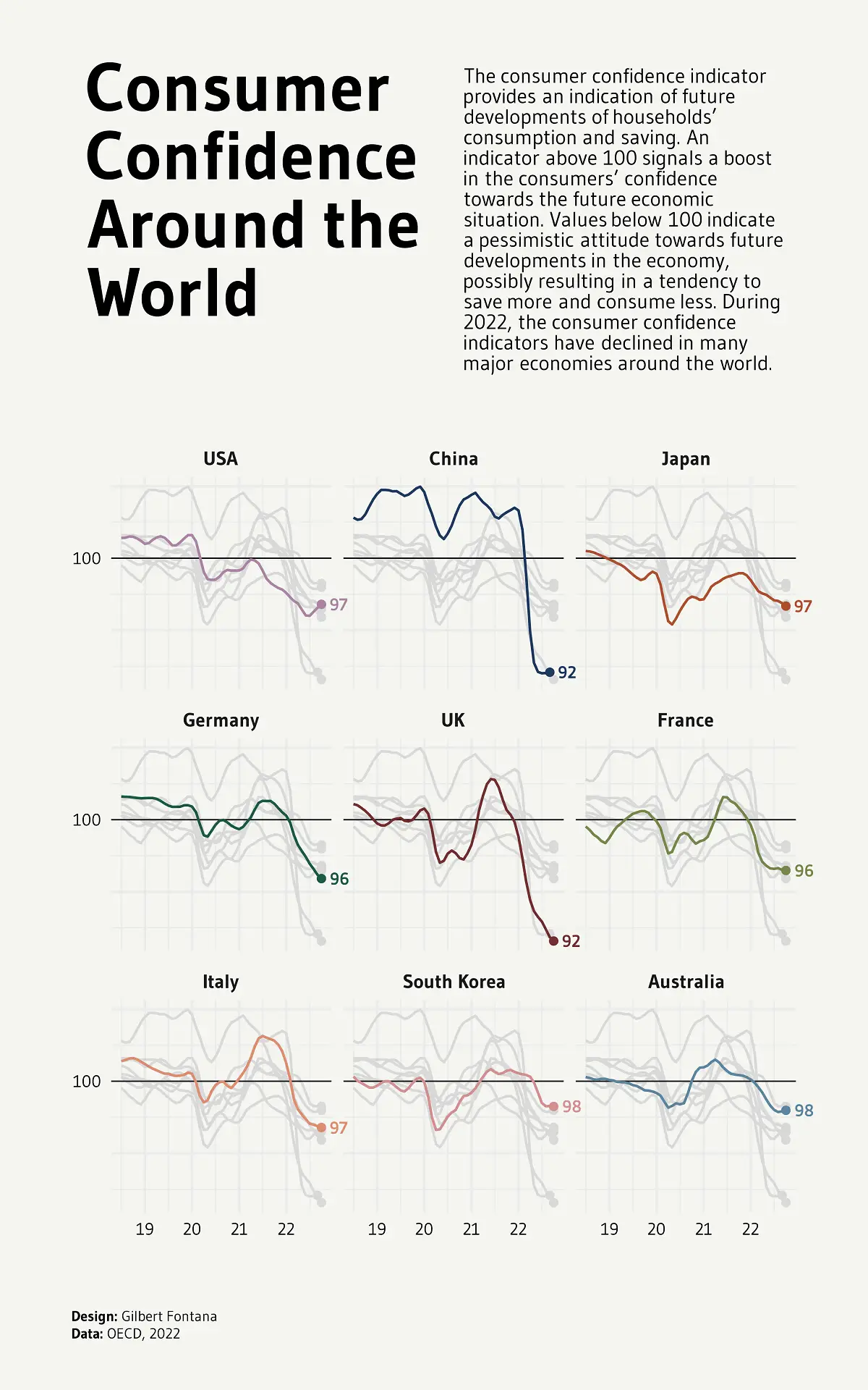
How cool is this? If you were to plot all the countries’ lines on one chart, you would have what is affectionately known as a spaghetti plot. But by breaking out the trends by country, you can quickly and more easily compare how each individual is doing. And to take this a step further than the normal small multiples you typically see, the plot also had the additional context piece of all the other countries faintly plotted in the background.
If you haven’t checked out Holtz’s R graphic gallery before, it is an amazing resource with how to build all different sorts of plots (in R for this particular site) from the ground up. So you can not only be inspired by the different graph types, but also learn to recreate them with your own work.
When you are creating your next small multiples graph, I would highly encourage you to consider adding in additional contextual info by drawing in the other comparison points in a light color/high transparency in the background.
Happy plotting!