Monday Data Viz - A Riff on Tile Grid Maps
2021-06-07 Aaron Chafetz
data-viz vizualisation monday-data-viz
A few weeks ago, the New York Times had an interesting op-ed by Dr. Sema K. Sgaier about the US’s vaccine strategy. In her article, Sgaier talks about the using “psychobehavioral segmentation” to bin different groups “based on their shared beliefs and barriers to getting the vaccine”.
After conducting a national survey of U.S. adults, we grouped people into distinct profiles based on their shared beliefs and barriers to getting the vaccine. This approach, borrowed from the marketing world, is called psychobehavioral segmentation. It will allow health officials to target their strategies in ways that ignore demographic categories, like age and race. In the United States, we used this approach to identify five distinct personas: the Enthusiasts, the Watchful, the Cost-Anxious, the System Distrusters and the Covid Skeptics.
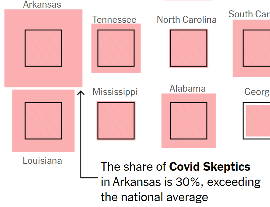
Sgaier does a great job breaks down these different profiles, identifying what makes up the group, their fears and how to reach them. Of import to me were the accompanying graphics designed by Stuart A. Thompson from NYT’s visual journalism department. Thompson does a riff on a traditional tile grid map, which is usually filled like a heatmap and every unit is the same size.
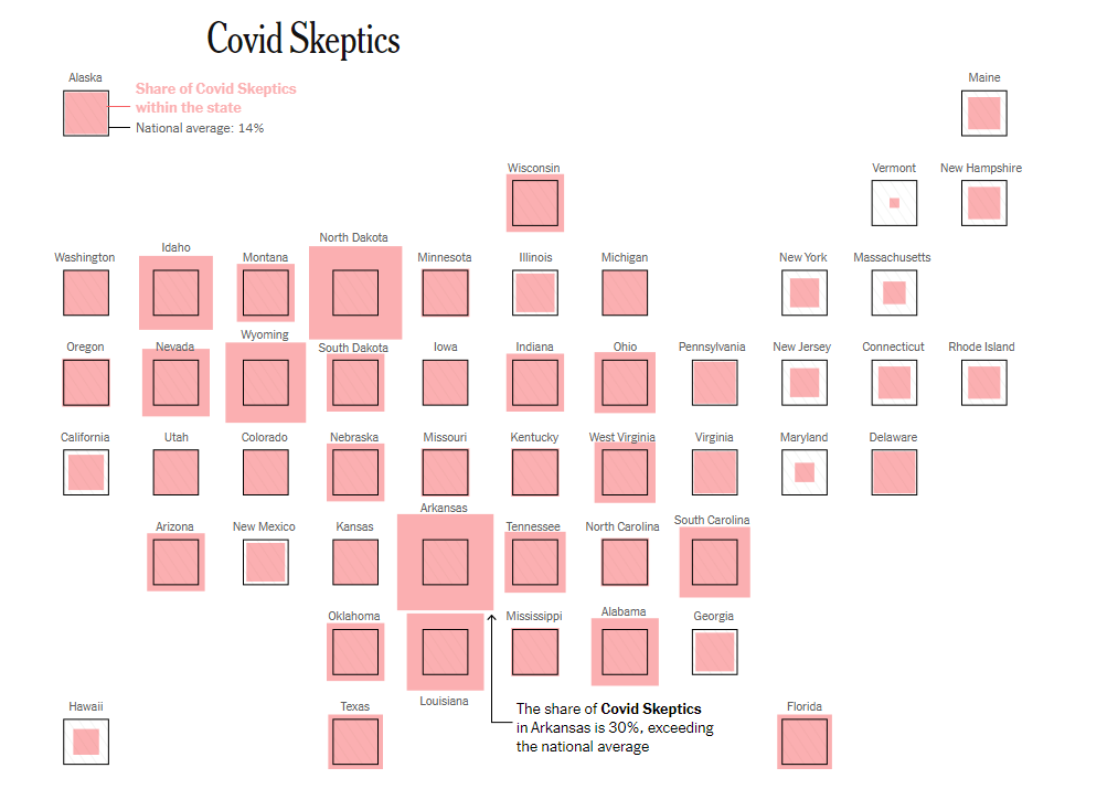
Rather than just fill based on the share of the group, Thompson does something interesting; he uses two boxes, one that shows the national average (black box) and then overlays that with another box to show the proportional size of profile group share in the state.

If you recall from Tara Munzer’s work on marks and channels, it’s actually easier for us to interpret these boxes - Area (2D size) - than it is color - luminance, saturation, or hue.
What is also great is each visual includes an annotation which (1) helps the reader understand what they’re looking at and (2) highlights an important takeaway.
I thought this was a pretty nifty concept that we could learn from and apply to our own work. We don’t necessarily have to use a tile map, but we could have a small multiples visual of say the share of MMD uptake by partner or district in a particular country. These are some great figures and definitely a good source of inspiration!
Happy plotting!