Monday Data Viz - Visual Hierachy, Part I
2021-10-25 Aaron Chafetz
data-viz vizualisation monday-data-viz
Data visualization is more than plotting points on a page; it’s a powerful lever to synthesize tens or millions of distinct data points into a digestible product. With this being the case, we spend substantial time artfully crafting each and every visualization to be purposeful and adhere to the best and up to date data visualization practices in the field. We aim to structure our visualizations to convey as much information seamlessly as possible without overburdening the visual or audience, i.e. prioritizing user experience and user interface (UX/UI). We are able to do this first and foremost by maintaining a visual hierarchy, heavily relying on text of varying sizes and gray as a primary color in our palette.
To help explain this idea of a visual hierarchy, we can look to Jon Schwabish’s seminal journal article. Schwabish starts off his piece discussing the importance of pre-attentive visual processing for an effective graphic. He describes that “[in] contrast to ‘attentive processing’ - the conscious part of perception that allows us to perceive things serially - pre-attentive processing is done in parallel and is much faster. Pre-attentive processing allows the reader to perceive multiple basic visual elements simultaneously”. He provides the following example, asking the reader to count the number of 3’s in across the next few lines.
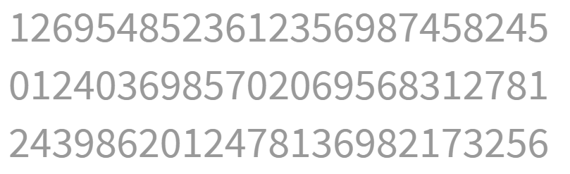
This task is made challenging by the fact that nothing stands out with no visual hierarchy, which then requires use to rely on the slower attentive processing.
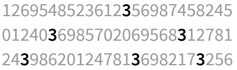
In the second example, Schwabish encodes the visual by adjusting the typeface to bold and reducing the brightness of the font to zero, making it black. In doing so, Schwabish creates a visual hierarchy, allowing the reader to utilize pre-attentive processing to more easily perform this task. In essence, this creates a visual hierarchy, the “way that information is structured and prioritized in a design,” along with elements like size, hue, saturation, location (Chapman 2019). Strategically incorporating these elements create layers of information based on importance, making the visuals more meaningful, memorable, and have stronger take-away messaging.
Leveraging the visual hierarchy to make strong products requires the use of low brightness (gray) and smaller text across various elements. Understanding that we are all mostly working off small laptop screens, we work to ensure that every element, even those at the bottom of the visual hierarchy are still 100% readable. The current literature recommends that “[the] smaller the text, the higher its contrast to the background needs to be for it to be readable. The contrast ratio between background and foreground should be at least 2.5 for big text and at least 4 for small text” (Muth 2018). In designing our OHA visualization style guide, we relied on a web tool to check the contrast of our text and elements, finding that the lower text elements on our hierarchy, axis labels and annotation, have a ratio of 8, double what is recommended for small text. Trouble, however, can arise in a few areas - (a) poor screenshot resolution when its pulled into a new slide deck; (b) reducing the size of the graphic from taking up the full slide to only a small fraction of it (visuals are optimized to be 10 x 5.6, the full dimensions of a slide); and (c) when the background is not white and a similar hue is used, further reducing the contrast.