Monday Data Viz - Re-plotting the difference
2022-03-14 Aaron Chafetz
data-viz vizualisation monday-data-viz
It’s been a little while since Andy Kirk updated his “Little of Visualization Design” series”, but he added a new post last week, which sparked some joy in me. Kirk highlights the below visual from Timour Scrève at Voila, which compares the wage gap (gray area) between men and women.
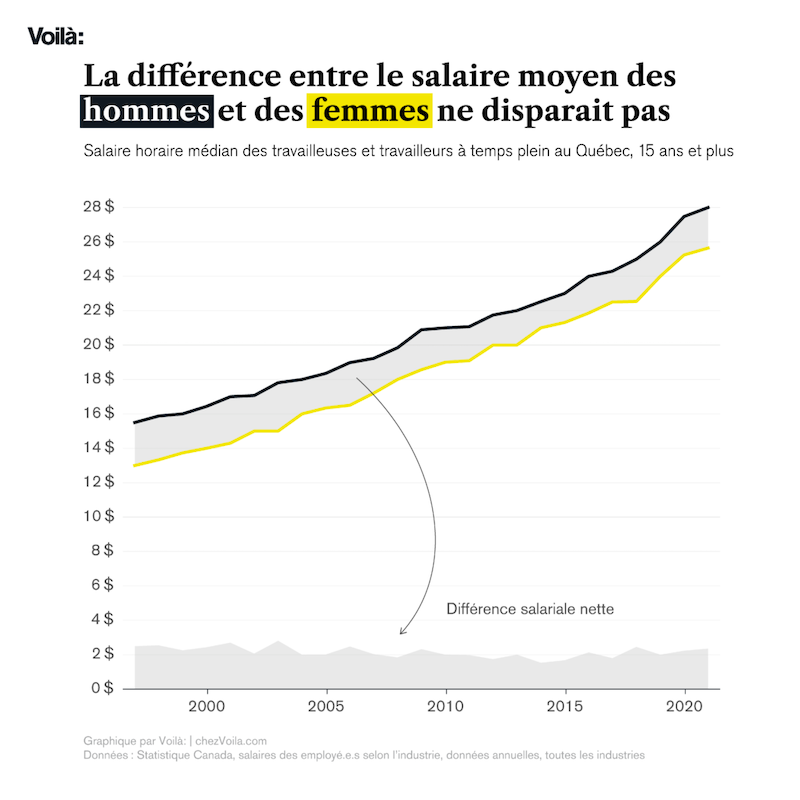
The key element here is the secondary plotting of the wage gap along the x-axis. Kirk says
For a reader, it can be difficult to perceive the absolute size of this gap given the baseline (in this case, the yellow line for ‘women’) shifts up and down. I think it is really smart, therefore, to embed a secondary plot within the same chart space using an area chart at the bottom of the chart to show the trends of wage-gap itself.
I think this is brilliant as well, further benefited by Scrève’s use of color, title labeling, and annotation.
Happy plotting!