Monday Data Viz - Applying the Style Guide to Our Work
2022-10-31 Aaron Chafetz
data-viz vizualisation monday-data-viz
Last week, I was asked to update a visual showing the number of patients currently on treatment for two partners. This visual had been provided to SGAC at Q2 and needed to be updated with the Q3 data. The original visual was intended to show that after both mechanisms had shifted at Q1 (and became contracts instead of cooperative agreements), funding and resulting staffing issues caused a drop in FY22Q1. While the smaller partner’s (Y) current on treatment’s numbers rebounded by Q2, the larger partner (X) only started to see an uptick in Q3 (not in the original visualization).
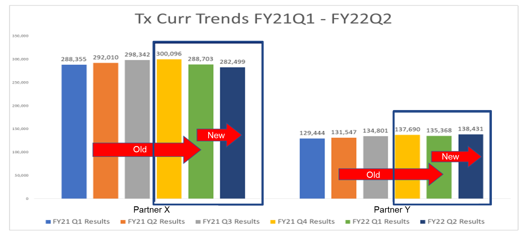
The visual above was what was sent to SGAC and we can list off a host of things that could be improved with it:
- Meaningless (and default) color used to encode to each quarter, making both everything a focal point and nothing a focal point at the same time and focusing the reader to use a unnecessary legend
- Use of direct labeling of each bar with a superfluous level of specificity in addition to also having a labeled y axis
- A descriptive title rather than an active one
- Use of bold and red (and different heighted/lengthed) arrows to indicate the partner transition
As part of a check in meeting with SGAC, the country team wanted to update the above visual with Q4 data. Using data viz principles found in the OHA Style Guide, we were able to craft an improved visual to provide to SGAC.
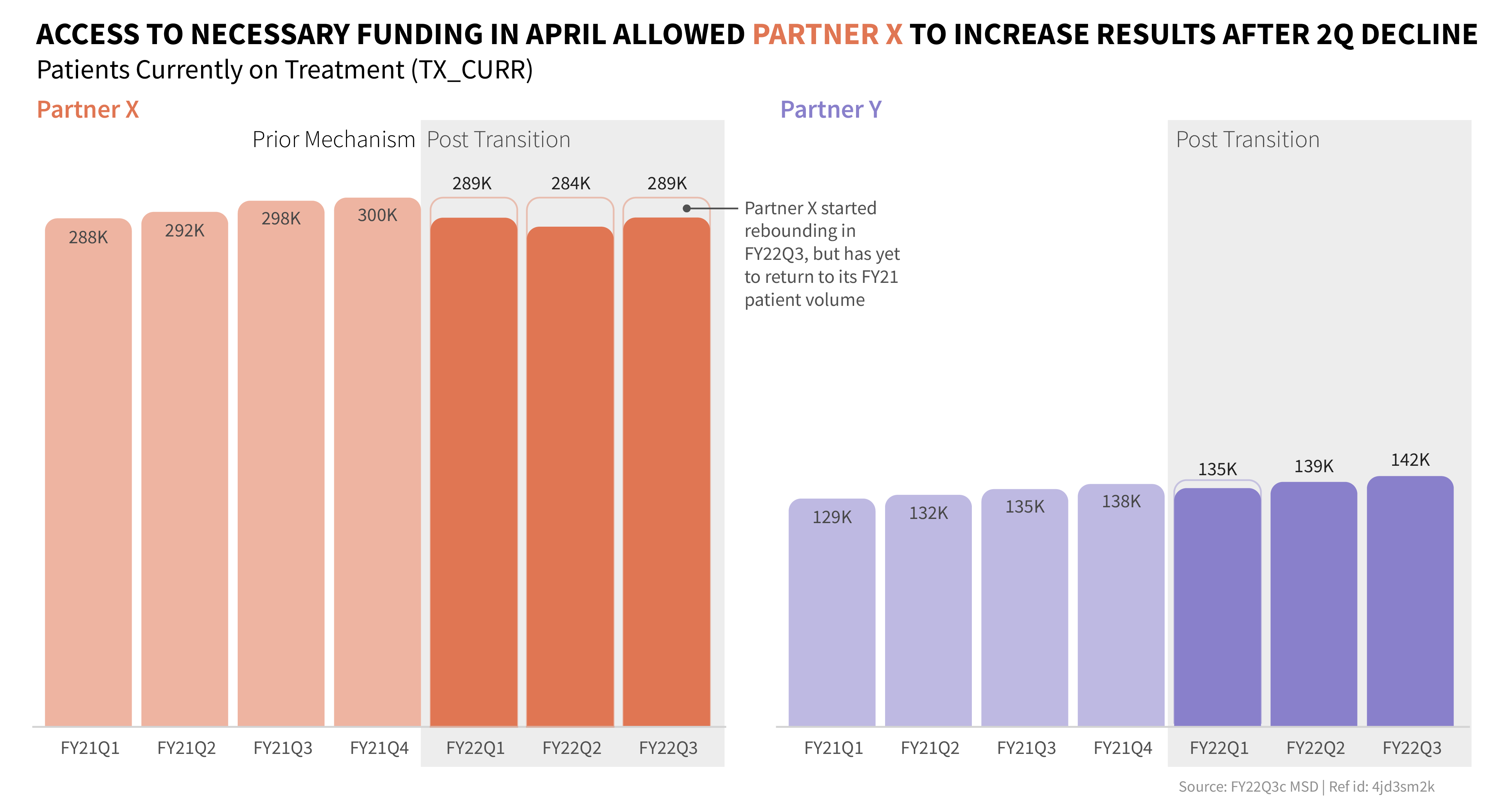
While the remake may not be the perfect visual, it does drastically improve the ability to clearly communicate its purpose to the desired audience.
Happy plotting!