Monday Data Viz - What are we looking at?
2022-08-22 Aaron Chafetz
data-viz vizualisation monday-data-viz
Last month while I was traveling, I noticed some visualizating being used on the flight status tracker. Let’s take a look at what’s going on.
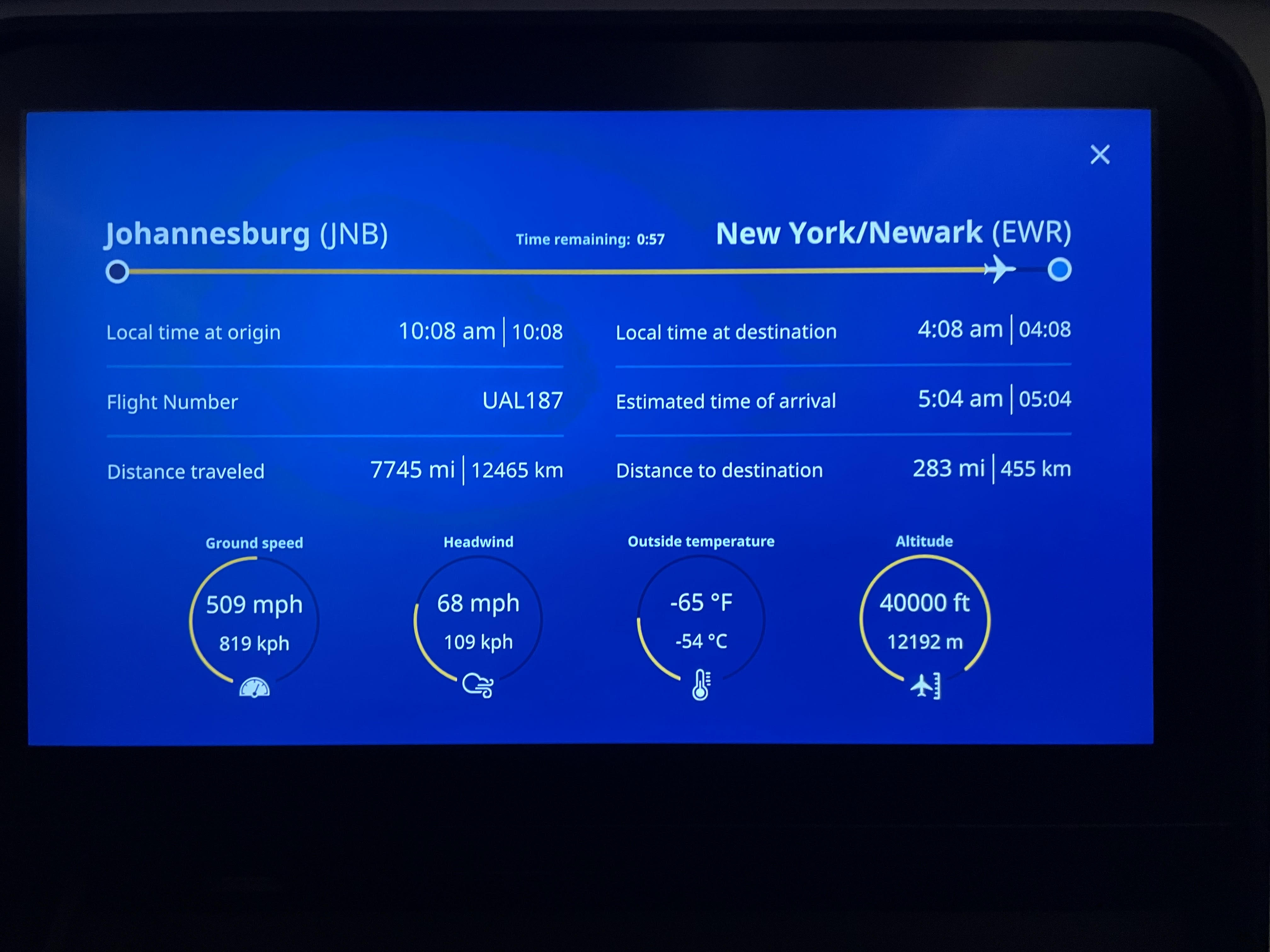
We have a handy little status bar at the top that shows the plane moving from left (departure) to right (arrival). Less than an hour to go in a 15+ hour flight back from Joburg! Next up we have some tabular data and finally at the bottom we have some donut plots. Donut plots are essentially pie charts with the center taken out.
If you look at the far right plot to start with, we see an altimeter of sorts. The good news is that the donut chart had a data point in the middle (well, two to be exact), telling us what the actual flying attitude was - 40k ft. A passenger plane flies at a max height of around 42k ft (the “service ceiling”) and the yellow bar is about 95% filled so that makes some sense. But, it’s not all coming up roses. If we look instead at ground speed on the far right, we see a speed of 509 mph. But when we put this in context with the donut plot, which is at about half full, it would imply that the plane’s max speed is 1,000 mph. If we look up a Boeing 787’s max speed it’s actually just under 600 mph, so the yellow bar should be 85% filled and not 50%. I’m not even sure what to make of the temperature.
When you see numbers and plots in the real world, take a second to make sure they make logical sense before you take them at their face value.
Happy plotting!