Monday Data Viz - Filling the Gap
2022-03-28 Aaron Chafetz
data-viz vizualisation monday-data-viz
Last week, Axios put out a COVID visual by Will Chase that I thought was really impressive. The visual shows the difference between excess deaths (per 100,000) in Republican versus Democratic states where there was a large margin of victory in the 2020 election.
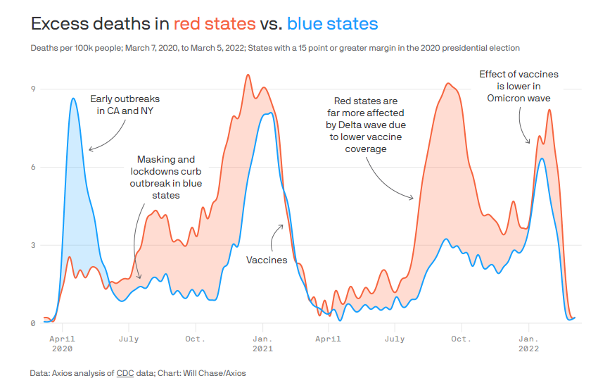
As Chase and Caitlin Owens write, the visual supports Dr. Steve Woolf’s JAMA article that “state policies can affect health outcomes” and does so with a more effective visual than the one in the journal article (below).
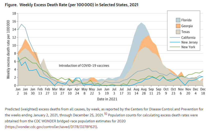
While there are a number of elements that make Chase’s visual much more effective than the original, I think the choice in chart type (and aggregation) make for a visual with much clearer takeaways. Chases uses this area chart where the fill between the two trend lines draw the clear distinction of the size of the gap. And that fill color is color coded (rather than say gray), so it is even easier with a quick glance to know which group of states had larger excess death rates. In the JAMA article, the states are depicted as either areas or lines for the different party victories, which make it rather chaotic and even hides some of the data.
I think Chase’s version is a really strong graphic, made even better when you contrast it to how it was visualized in the original journal article.
Happy plotting,