Monday Data Viz - What's your type-face?
2023-01-30 Aaron Chafetz
data-viz vizualisation monday-data-viz
With State Department’s move away from Times New Roman to Calibri, I thought it would be a good time to talk about typefaces. The rationale Secretary Blinkin provided for this change was accessibility; Times New Roman is a serif typeface - it has little lines attached to the end points of letters - which can make it harder to read than a sans serif typeface.
This change doesn’t have much bearing on our works as USAID’s main fonts - Gill San (primary), Source Sans Pro (web), Arial (alternate when Gill Sans is unavailable), and Garamond (alternative for text in longer documents) - are sans serif save for Garamond.
Lisa Charlotte Muth had some great things to share about picking a typeface for data viz
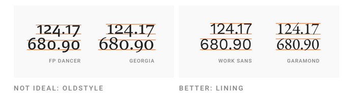
For data visualizations, sans-serif (”without serifs”) typefaces are most often the better choice. They look cleaner and are often easier to skim than serif fonts, especially when it comes to numbers.
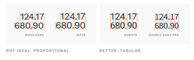
Muth also points to two factors that we take advantage of by using Source Sans Pro with our visualizations - use fonts with lining and tabular figures. And even better yet, Source Sans Pro is “multiplexed”, “each character and figure uses the same width in each font weight”
And unlike default typefaces on your PC, webfonts, including Source Sans, come in a variety of weights beyond bold- thin, light, regular, medium, bold, and black, or extra bold - which can add a lot to your visual.
I recommend reading the rest of Muth’s article for great pointers on using text in your data visualizations.
Happy plotting!