Monday Data Viz - Slope chart + small multiples
2022-04-18 Aaron Chafetz
data-viz vizualisation monday-data-viz
As PEPFAR, we’ve been collecting quarterly MER data that runs back to FY15, so trend data is a staple for our work. Armed with ample data, our first stop when plotting trend over time is a line chart, but do we always need 6 or 16 quarters to plot as a line or bar graph? Sometimes the purpose is just to show change from a particular point in time to now (e.g. year over year change). Denise Lu and Albert Sun of the New York Times do a great job exemplifying this in an article on COVID deaths from last December.
In their article, they show the COVID death rate for different group before and after all adults became eligible for the vaccine. They utilize slope charts, which are just simplified line charts that help demonstrate the change (via the slope) between two points. From the visual below, we can see that the COVID death rate for 85+ fell from 15% to just 7%, compared with the complete opposite with 25-44 year olds, going from 7% up to 13%.
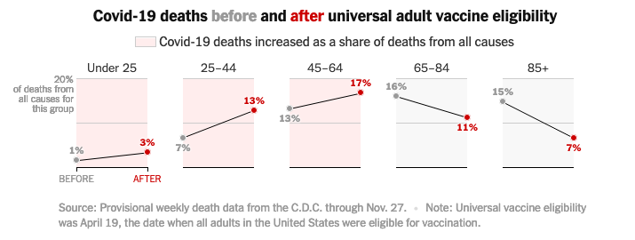
Lu and Sun use an inline legend with color, showing the “after” share in red to really emphasize these data points. They also call out the age groups where the death rate rose after the vaccine, with a light red shade as the plot’s background. And finally, they utilize small multiples, replicating the slope chart by race/ethnicity and age to be able to compare all of these groups without creating a messy spaghetti plot.

The next time you want to show change overtime, consider using slope charts (and small multiples) using Lu and Sun as a great, informative, and clean example of how to do this.
Happy plotting!