Monday Data Viz - The importance of context
2022-09-12 Aaron Chafetz
data-viz vizualisation monday-data-viz
This week I wanted to share a map that had been making the rounds on social media a month or so again. The map comes to us from ProPublica and was actually published back in early 2019. Let’s take a look at the visualization.
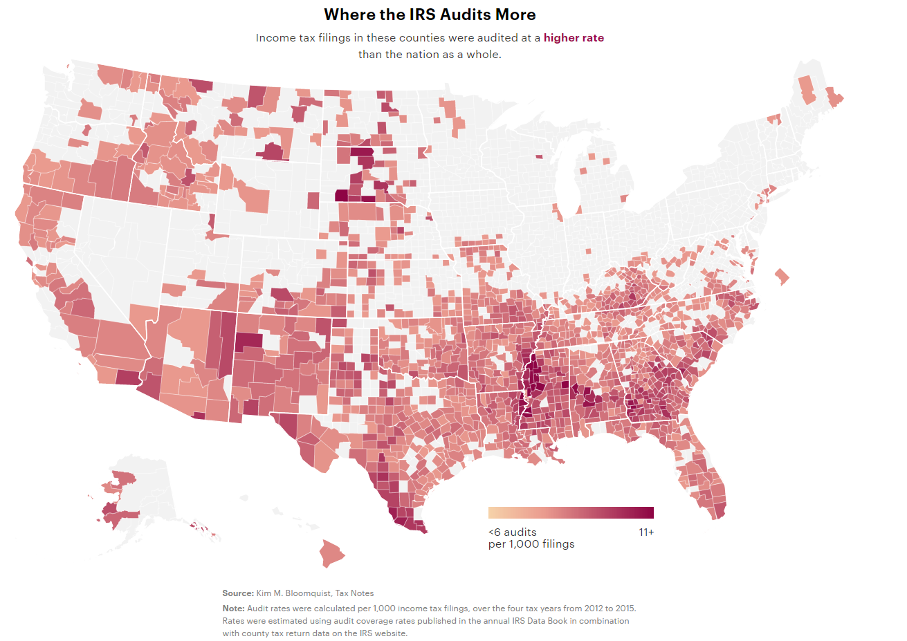
The title and subtitle explain what is being depicted - “Where the IRS Audits More” - and explain a bit more detail - these are audits of income tax filing and the dark red shows higher rates. What can we learn from this picture? We can see pretty quickly that IRS audits fall predominantly in the south; we see a number of high rates in Mississippi, Texas, Alalamba, and Georgia. Given the title and the supporting data, it seems that the IRS ignores the northern states and selectively targets the south (and west).
The first thing we should be wary of with all maps is that not all land area and therefore space on the page represent the same amount of people (the good news is that rates are displayed here, not counts, so they are controlling for population density). For example, Wyoming takes up a lot more land area compared with DC, but DC has a larger population. So in this map, Bronx County, New York is leaning darker red (9.1 audits per 1000 filings), but it is a tiny spec compared with say Jackson County, North Dakota (9.2), which has a much larger land area.
The real kicker here though is the missing context. The title makes it seem like the IRS is to blame for singling out the south. However, if you read the article they point out that “the IRS audits EITC recipients at higher rates than all but the richest Americans, a response to pressure from congressional Republicans to root out incorrect payments of the credit.” And they link to another article from 2018 that explains that as the IRS “dwindled in size and capability [during the Trump administrator], audits of the poor have accounted for more of what it does”. The article from 2019 is telling the same story, but it lacks the contextual piece in the graphic itself (and even in the title of the article), leading it to be easily misused.
When we produce a visualization, it’s critical to have informative titles and include contextual information since each visualization should be able to stand up on its own even when pulled from the report/article/presentation it was lifted from.
Happy plotting!