Monday Data Viz - Remake - What’s worth knowing in economics?
2021-09-13 Aaron Chafetz
data-viz vizualisation monday-data-viz
Last week I came across an article that had some pretty interesting findings, but had a pretty poor graphic to explain their findings. The article was written by two economists at the University of Bonn in Germany, Peter Andre and Armin Falk, who were using a “global survey of almost 10,000 academic economists to find their opinions on what economic research should look like.” Their piece was accompanied by the below graphic, used to show the gap between what surveyed economists think is important versus what actually gets published in journals.
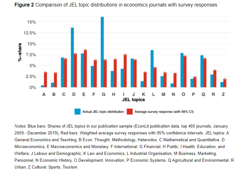
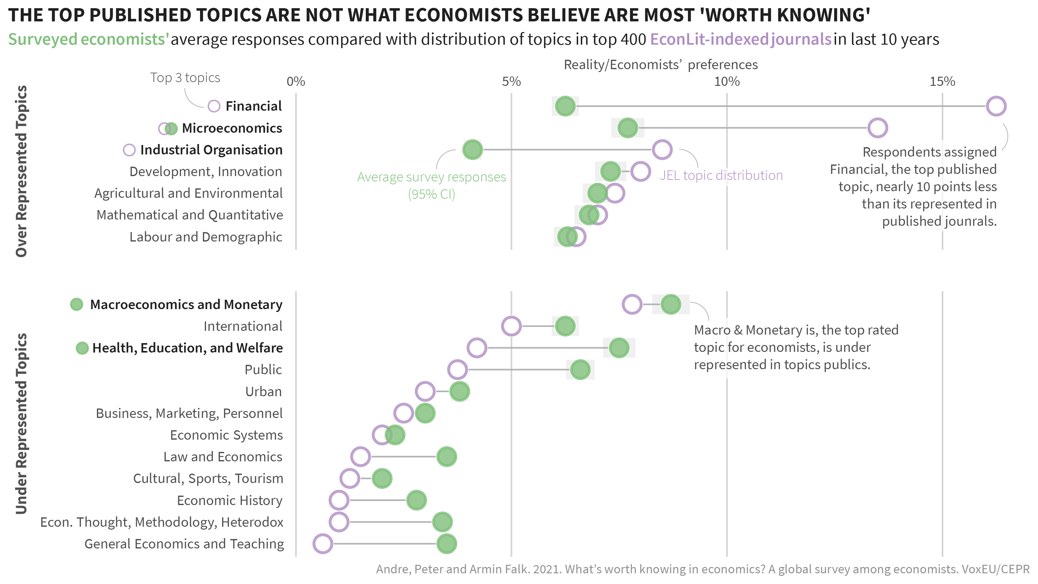
Not a stellar graphic. What data viz principles are not adhered to in this graphic? Use of a descriptive, non-action oriented title Each of the 19 topics are written out in a large text box below the graphic, making the reader flip back and forth to figure out what they’re looking at. No useful ordering to align the topics other than alphabetical The y-axis text is unaligned and minor grid isn’t easy to calculate mentally Default excel colors used I took some time to remake this in a way that I thought better told the findings the authors got across in their piece. Ideally they wanted to show the gap between the economists’ distribution and the journal topic area distribution and highlight the areas that were over represented in journal articles compared with what the average economist through the topic distribution should be. They specifically called out the large gap in Finance, topic G, so I highlighted this in the remake with an annotation. I converted the plot to a dumbbell plot as an alternative to the clustered bars, switched the plot orientation to write out the full topics and added a title with a take away point. In addition to ordering the topics by JEL publishing distribution, I also subdivided them into groups of over or under represented based on whether economists thought there should be less or more articles written in these areas. And finally, I called out the top 3 topics for each JEL/economists, which were somewhat flagged in the article.
Remaking plots is a great way to test out your skills and put data viz principles into practice, regardless of the topic area.
Happy plotting!