Monday Data Viz - Visual Hierachy, Part II
2021-11-01 Aaron Chafetz
data-viz vizualisation monday-data-viz
Last week, I talked a bit about leveraging the visual hierarchy and gave an example from Schwabish’s 2014 journal article. Today, I wanted to showcase this effect in the wild.
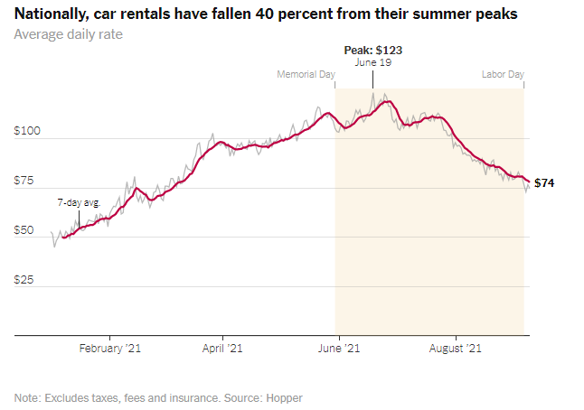
If you look to any news outlet with a graphics team, you will see ample application of the visual hierarchy. Below is an example from Quoctrung Bui and Neil Irwin at the New York Times, which provides a great example to walk through, going from the most important items at the top of the visual hierarchy all the way to the bottom. Each component in the graphic is there for a reason and relies on different elements (e.g. size, hue, saturation, location, etc) to layer information into a hierarchy.
-
Red trend line - This is the primary element that draws the reader’s attention depicting a trend over time. We can quickly trace that it has gone up from where it started, peaked about three-quarters of the way through, and has dropped since then.
-
Title - The authors use an active title that draws the reader’s attention by: (a) locating it in the upper-left corner of the visual, (b) making the text large, and (c) making the text black to stand out. Also important, but beyond the visual hierarchy, we have an descriptive title that informs the reader of the context and takeaway - we’re talking about car rents and the price has fallen significantly since the summer.
-
Subtitle - The text is a lighter saturation (gray) and smaller than the title, but due to its location in the upper-left conder, it is likely the next element the audience reads. The text is less important and provides some contextual information about how to read the values in the visual.
-
Black annotation text - Besides the title, there are only three other text elements that are black, which annotate the peak point price, where we are today, and in smaller font by the y-axis is an annotation about what the red line represents.
-
Yellow annotation box - This box calls our attention with its hue and saturation, saying there is something important about this area. Based on the title we read, our first assumption is that this covers summer.
-
Light text annotation - The text above the yellow annotation box is supplemental and is light so as not to draw attention or distract from the rest of the visual. It provides us with the context around when the authors are defining the summer
-
Text on the x-axis - At this point, the reader likely drawn to the lighter font labeling the x-axis to know when the trend is occurring and draw insights from particular dates and spikes/declines
-
Text on the y-axis - After taking the rest of the information in, the reader is left to understand the magnitude of the trend over this period, and looks to the y-axis, with the lighter labeled font.
-
Gray trend line - The very last element on the plot the reader likely “accesses” is the daily average rate, which not only sits behind the 7-day average, but has a very light saturation.
Without leveraging elements like smaller text and use of gray, the visual hierarchy becomes blurred and every element becomes important…meaning nothing is important. As a result, it’s much more challenging for the audience to interpret and remember the graphic.