Monday Data Viz - Gray...it's not just for breakfast anymore
2021-10-04 Aaron Chafetz
data-viz vizualisation monday-data-viz
In data visualization, gray can be one of the most powerful tools in your arsenal. The use of gray can allow you to minimize chart junk while also adding more details or dimensions to provide key context.
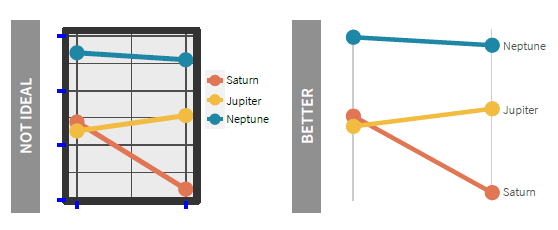
Chart junk is often thought of as adding frills , such as imagines, shapes, disconnected legends., but importantly also consists of basic elements of a chart - borders, grid, ticks, etc. When we look at the left image below from the OHA Style Guide, your eyes are immediately drawn to the dark, thick borders. And the lines of interest are swallowed up by the black gridlines. The right image, while also dropping the unnecessary data elements, switches over to use gray for the start and end vertical lines. The lines are more subtle by using gray as opposed to black, providing you with a less imposing chart element.
Another critical use of gray in data visualization is to provide context. It may be useful to include other data points or lines in your visual, but they may not be the focal point. By using gray to color the other data, we can provide context without overwhelming the reader and allowing our focal data to shine through. Let’s take a look at this image from the Financial Times.
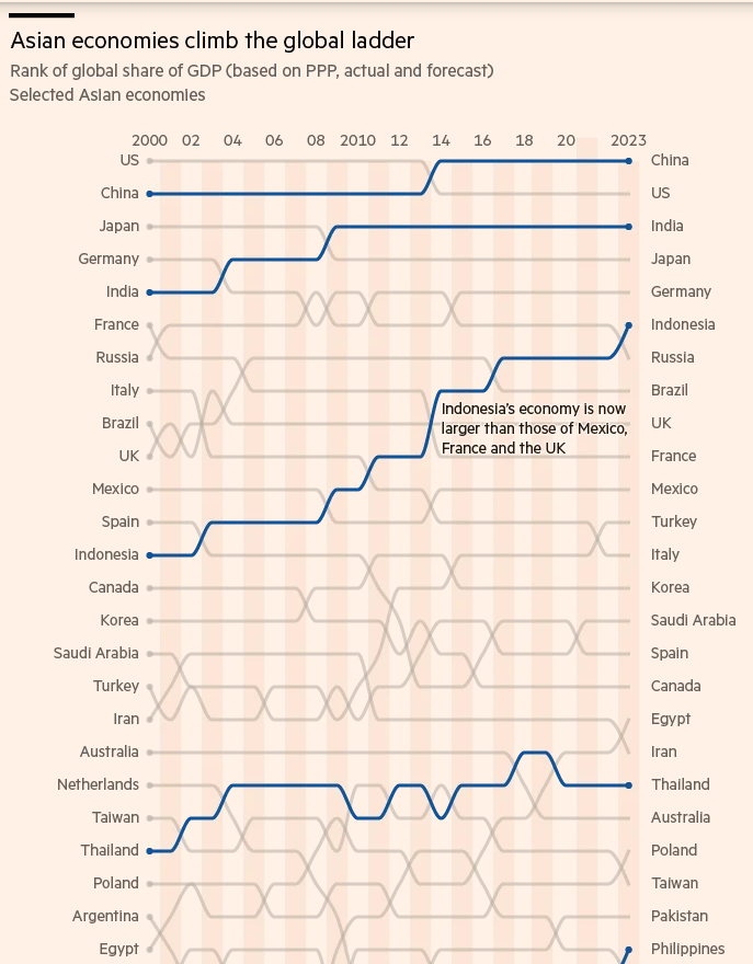
The plot comes from a 2019 article from Valentina Romei and John Reed focuses on “the coming of the Asian Age, which will supposedly mark an inflection point when the continent becomes the new centre of the world.” This bump chart is a truncated version of the original which has tons and tons of lines. But the authors use a blue to highlight the Asian countries, which are quickly and easily picked up. All other countries are in a (bluish) gray. All these other countries’ positions are important contextual points, but are not taking away any focus from the Asian ones.
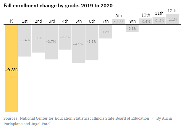
And then let’s turn to another example from Dana Goldstein and Alicia Parlapiano at the New York Times. In their article, they analyze public school enrollment data from across the country, finding a huge decline in enrollment, specifically for kindergarteners. The visual below supports just that and is extremely effective. The focus is on kindergarten, standing out against the gray with a strong yellow. The other grades are all shaded in gray to provide key contextual information, without taking attention away from the important point.
I can go on and on with examples, but I think you’ve gotten the point. Gray is a magical color that helps us minimize otherwise obtrusive data elements and helps layer in additional data to provide context without diverting attention for the points that matter.
Happy plotting!