Monday Data Viz - Highlighting Outliers
2021-07-12 Aaron Chafetz
data-viz vizualisation monday-data-viz
For most of our data related work in PEPFAR, we look for patterns through analyzing trends over time and results against targets, almost exclusively in the aggregate. In his book Info We Trust, RJ Andrews talks about the need to probe the data to truly find patterns. The following passage is a gem (p100):
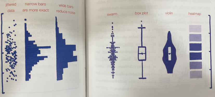
The search for patterns can be augmented. Layered guides, like mini-maps to the data, help bring features of interest to our attention. We may be tempted to hijack any of the following devices as standalone summaries of the data but it is far too early for that. Profiles in data, just like profiles of people, conceal essential details. We are still wearing our explorer hats and digging for treasure. No data point should be hidden. For now, each profile is an accessory guide that will help us supercharge our inspection.
These visual profiles, seen below (p100-1), help us explore the distribution of our data with different trade offs, with an end purpose of extracting a meaningful pattern.
As mentioned earlier, we tend to look at data in the aggregate. Here’s an example from PEPFAR Spotlight, looking at aggregate data in South Africa at both annual trends and target achievement.
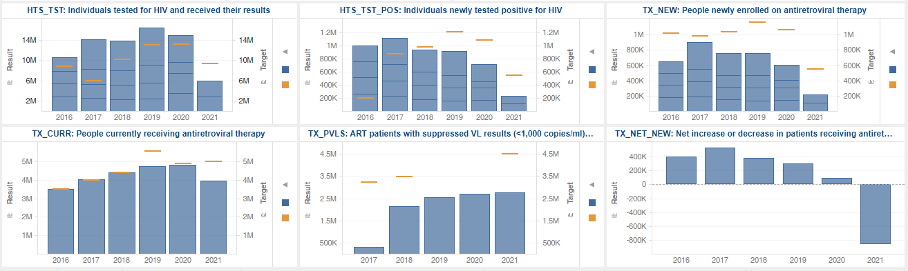
This look at that data provides an immediate benefit, but can only help us so far. We collected site level data across age/sex, so what can we do to better understand the data and distribution to find other useful/meaningful patterns?
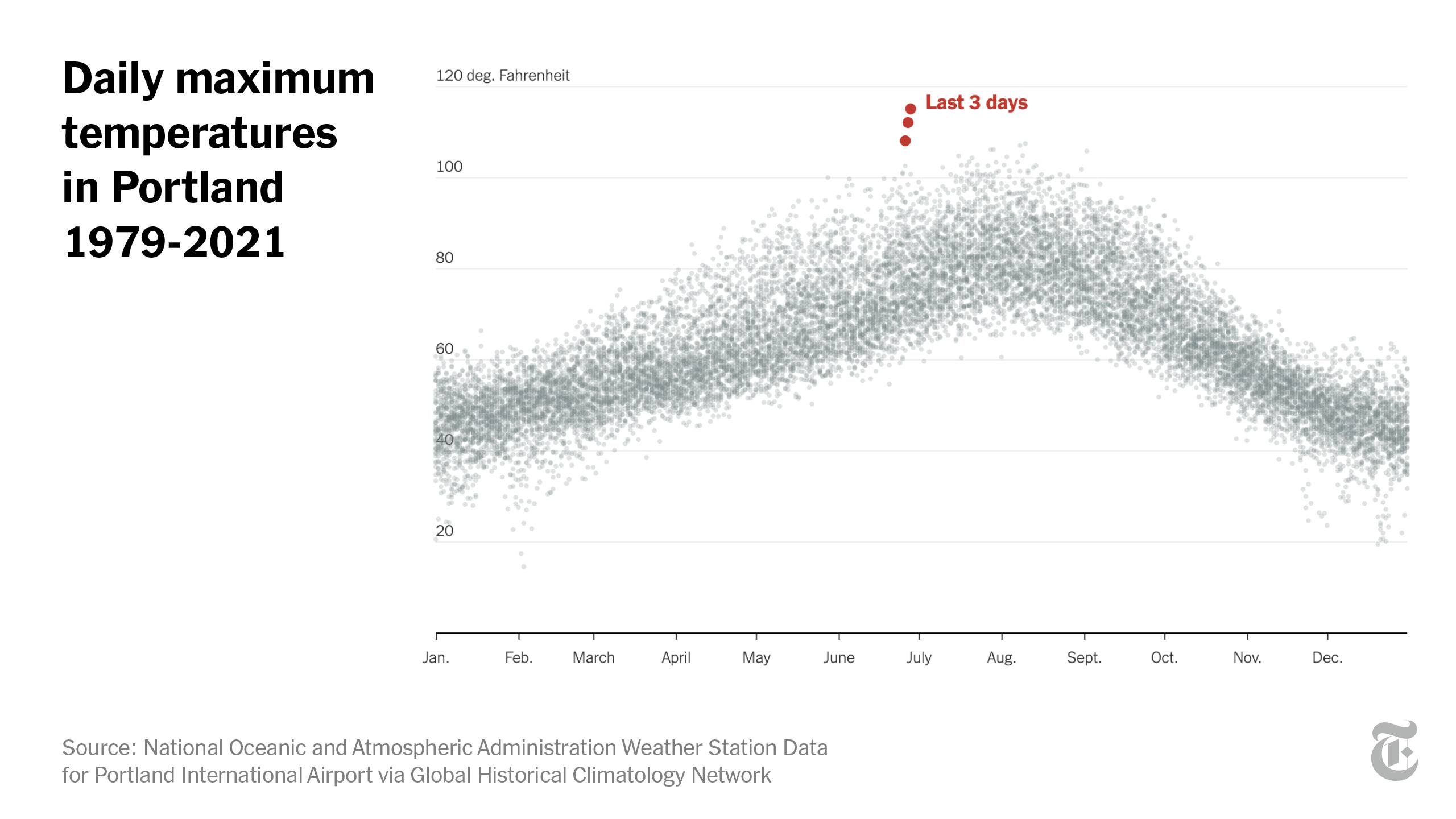
A couple weeks back while the Pacific Northwest was experiencing their heatwaves, Aatish Bhatia, Henry Fountain and Kevin Quealy at NYT’s The Upshot wrote an article about the unprecedented nature of this heatwave. Bhatia et al are exactly right when they say, “To understand the magnitude of the departure from historical norms, it helps to visualize it.”
So visualize they did. They produced the fabulous visual below depicting daily max temperatures in Portland over 42 years. Rather than produce a long time series line graph, they stripped out year and plotted the 15 thousand points of daily temperatures by month (helping show seasonality) and labeling just 3 outliers that happen during the heatwave. What a powerful image that (a) makes a strong point and (b) is likely to get stuck in your head.
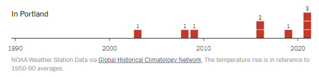
Compare that to another visuals they have towards the end of the article which shows the number of days in the city well above historic averages. Useful, but certainly not as compelling.
As you visualize your data, think about how to explore the distribution for patterns as Andrews suggests and use that to make a compelling point about the data you’re working with.
Happy plotting!