Monday Data Viz - Sub Par Sports Apps Data Viz
2022-05-09 Aaron Chafetz
data-viz vizualisation monday-data-viz
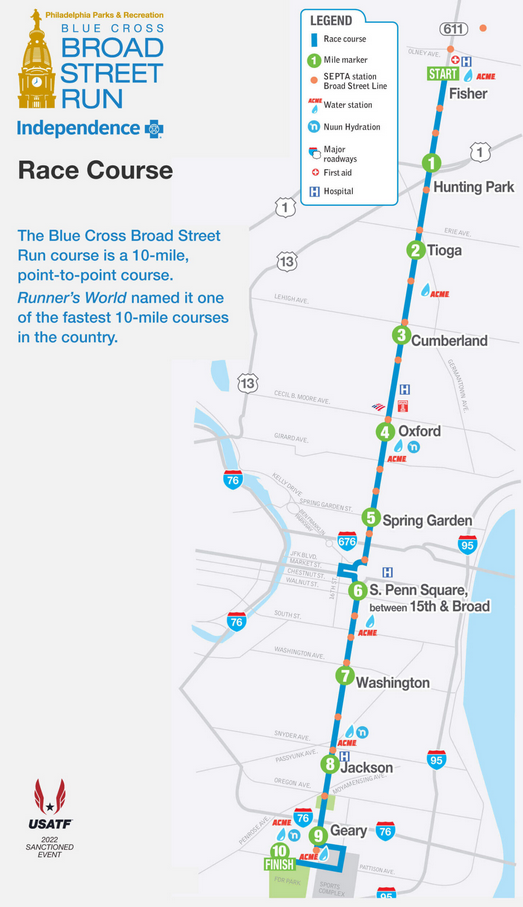
The other weekend, Jessica R and I lucked out with some great weather when we ran the Broad Street 10 miler, the largest 10 mile race in the country. The race takes place in Philly and you run from almost the northern tip of the city down Broad Street until it terminates at the Navy Yard (and is a net downhill race).
As someone who works with numbers every day, it will come as no surprise to you that I avidly track my running metrics. Time, pace, and distance are pretty straight forward, but I also spent a lot of time worrying about heart rate (and heart rate zones based on my functional threshold heart rate) and cadence. I track these things in real time on watch, but also analyze them (usually) after I finish my workout.
In analysing those metrics, I bounce between a few different apps to review the data. Each has some things they are better at than others, but all are pretty equally bad at data viz.
Let’s start with this pacing chart from an app called Strava.
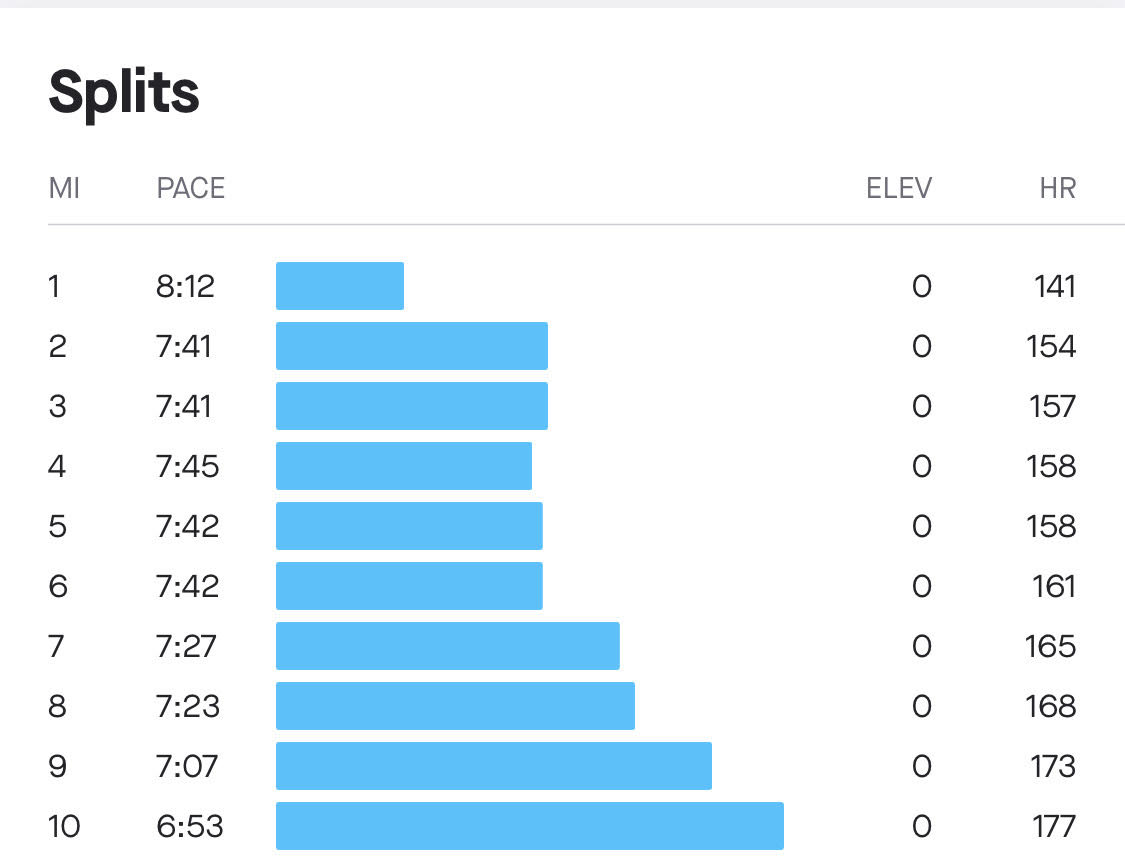
This visual is using a horizontal bar chart to display my pace (min/mile or how long did it take to run a mile). Along the y axis, we go from the first mile at the top down to mile 10 at the bottom. And along the x-axis is the pace. Let’s compare the first two miles. In the first mile I ran a pace of 8:12 min/mile and sped up to a pace of 7:41 for mile 2. What is going on here? I ran a faster pace, which means my time dropped and yet, the bar increased. Not only did it increase, the bar length for mile 2 is more than double the size of mile 1, despite only dropping about 30 seconds (or 6%).
Next up, let’s look at how Garmin displays data, focusing on heart rate (beats per minute) over the race.
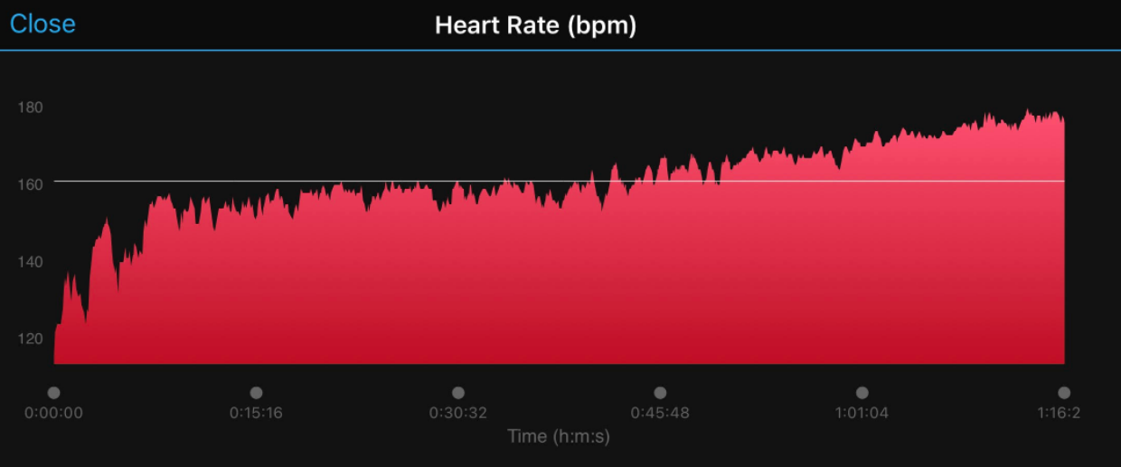
Garmin uses an area chart to show the second by second changes in my heart rate. Heart rate starts out low in the left hand corner is high by the end of the race. After being in a nice rythmn between miles 1 and 6, I start speeding up my pace for the last four miles and you can see the associated “heart rate drift”. That said, take a look at the y-axis. What’s the problem? It starts around 115 bpm, rather than a zero. If this were a line chart, that would be okay, but since this is an area chart, we need to have a zero baseline since our eyes are evaluating the length of the filled height. At mile 2, I had a heart rate of 156 bpm, compared with mile 10 when I had a heart rate of 179. This is a 23 bpm increase, or 15%, but the use of a filled area chart makes it seems like there is a much larger difference.
And lastly, we can look at the TrainingPeaks app.
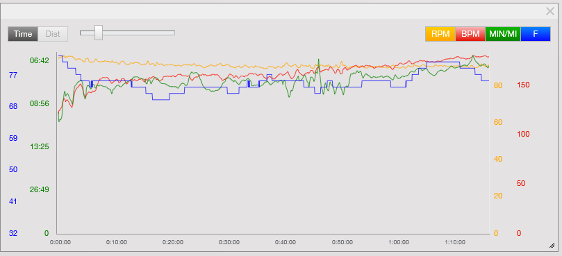
TrainingPeaks by default plots all of your data on the same plot. Here we have cadence (yellow), heart rate (red), pace (green), and temperature (blue). In PEPFAR, we see a lot of use of dual axes graphs, which we’ve gotten used to. It’s not a best practice when you have two, let alone 4 metrics with different axes all plotted together since your mind is looking for patterns about when different lines cross one another, which is completely meaningless given the different axes. Furthermore, this is just a messy spaghetti plot that makes it hard to draw any real inferences from.
When you see data viz in the real world, take some time to evaluate the principles before taking what is provided at face value.

Happy plotting!