Monday Data Viz - Plot Function
2021-02-22 Aaron Chafetz
data-viz vizualisation monday-data-viz
For these posts, I usually share some interesting, novel, or important content that I’ve come across around data visualization principles and techniques. Instead of doing that today, I wanted to share a resource produced in house, that Tim and I with the help of Katya and the rest of the Analytics Standards Group, have been working on for quite a few months now.
The OHA Data Visualization Style Guide expands upon the 1-page cheat sheet released earlier this year. We state in the introduction,
This guide should not be viewed as a software specific tool that will tell you how to create visualizations, but rather a tool that lays out the foundational elements of the OHA brand. There are definitely things that you should and should not do when creating a visualization. But, because of the diversity of products used/created across the office, from exploratory to static communication pieces, there is no one size fits all solution to data visualization creation. Instead, this document is simply a guide complete with examples that are to be emulated. The chart types presented herein are not meant to be exhaustive. They are put forth to illustrate a stylistic approach that is consistent, identifiable and built on industry best practices.
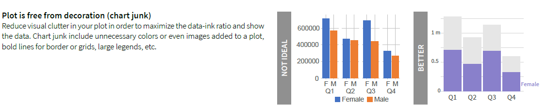
We spent a lot of time building out examples of applying good data visualization techniques to graphs we see throughout PEPFAR (which was surprisingly not so simple to do). These examples make up the bulk of the style guide, touching on best practices when it comes to text, lines, position/arrangement, and colors. You’ll find a number of pages that have examples like the visual below, talking about a particular chart principle and exposing you to what it looks like when applied.
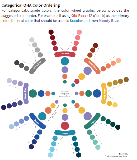
In addition to the chart principles, we layout the OHA colors for us in analytic products, providing hex codes, ordering, colors for chart elements, and a continuous palette for each primary color. These colors were found in the one page cheat sheet, but we had a bit more room to go into more detail here.
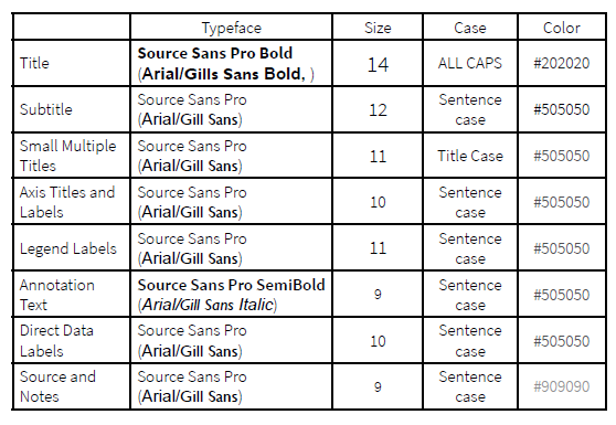
You’ll also find mention of the primary typeface we recommend for visuals which is Source Sans Pro, USAID’s primary typeface for web/digit products. M/CIO has developed a package in Software Center to install this typeface on your GFE, but does still require being at UA or RRB, not on your home network (they are also currently installing this on Tableau Server). Alternatives are the other USAID fonts - Gill Sans MT and Arial.
At the back, in addition to the resources we sought for inspiration and reference, you will find some useful links to the Excel themes file and Tableau Preference file which contain the colors for these software as well as our glitr R package which incorporates color palettes, styles, fonts, and other parts of this style guide into your R visuals.