Monday Data Viz - Offset bars
2021-09-27 Aaron Chafetz
data-viz vizualisation monday-data-viz
Germans were at the polls to decide something big, their next government. For the first time in 16 years, Angela Merkel was not on the ballot, basically since George W. Bush started his second term in office. From the results, Merkel’s party (the Christian Democratic Unions), lost by a small margin to the Social Democratic Party, but not enough to win outright, so a coalition government will be formed.
Politics aside, elections bring about lots of graphics to compare polls, votes, and opinions from around the country. Lisa Charlotte (Rost) Muth shared a few graphics yesterday about the German election, one of which from the Berliner Morgenpost really caught my attention.
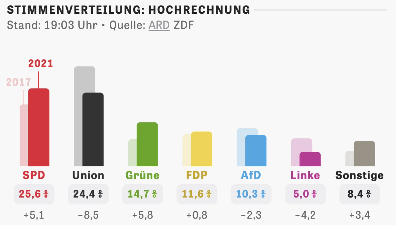
The visual is nothing wild or novel, just a humble bar chart, but done well. The above visual is a great use of an offset bar chart, comparing the last election results to early results from yesterday. Rather than a clustered, or full offset bar, chart, the bars from 2017 overlap by about 75%, reducing the need for extra spacing and/or smaller bars. Furthermore, the 2017 bars have a low opacity, making it clear that the front, high opacity bars are the focal point, while also giving important contextual information. Below the current vote estimates for each party, they have the gain/loss compared to the 2017 election in a more subtle gray and non-bold typeface. And then lastly, not only did I like the inline annotation but also the fact the bars are slightly rounded at the edges, just making it a little less cut and dry.
The results are in now, so enjoy checking out the full results on the Berliner Morgenpost and other news outlets so see the rest of the visualizations coming out of the election and what will be needed to form a coalition government.
Happy plotting!