Monday Data Viz - One topic per slide
2021-10-18 Aaron Chafetz
data-viz vizualisation monday-data-viz
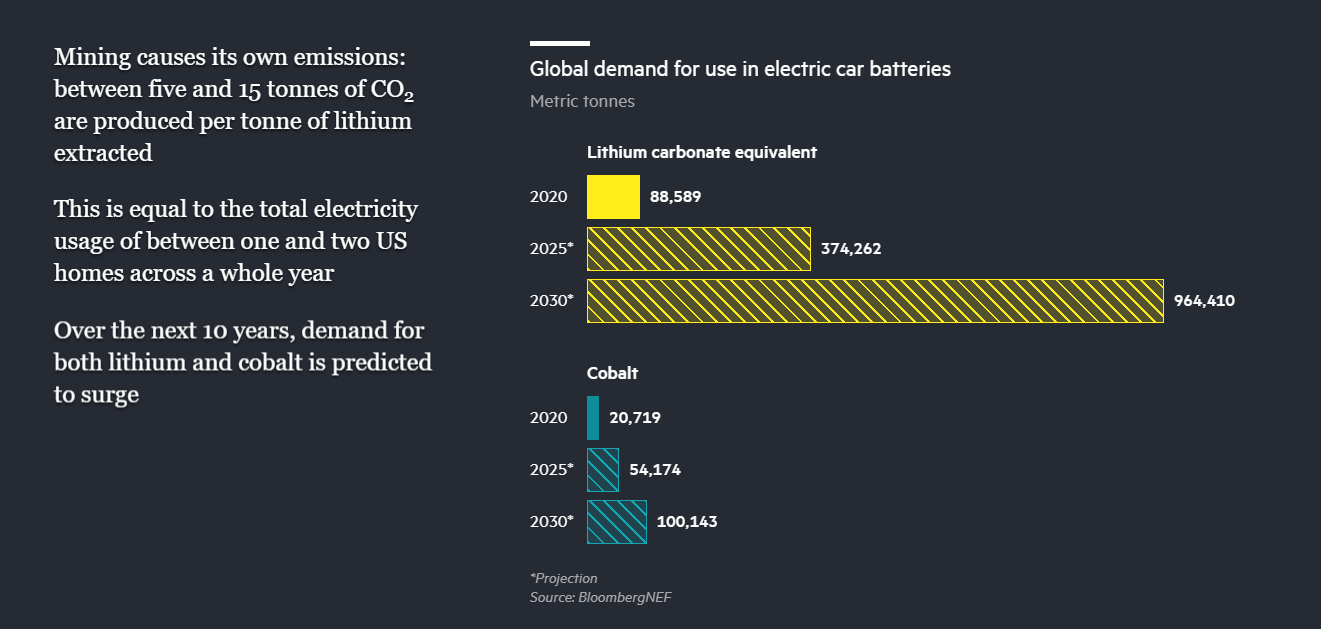
When presenting data, I’ve learned that it’s best to keep it simple; each slide should convey one point to the audience. Doing this leads to crafting a deck that has a lot more slides and a quicker pace getting through them, but in the end, leads to more memorable associations with your key takeaway points.
The other week, I came across a scroll responsive Financial Time article by their Visual Storytelling Team. FT does a fabulous job digging into what differentiates an electric vehicle from a normal, gas guzzling car and what makes it cleaner (or not). The article is not dissimilar to a PowerPoint presentation; as you scroll, the text and visuals respond and you have a message that is aligned to the graphic to tell a story.
I picked a few examples from the article, showing both their use of one topic per “slide” as well as their strong use of inline labeling annotation. I would highly recommend having a read through the whole article if you have a chance and think about how you can craft clear visuals that convey a single point in your slides.


Happy plotting!