Monday Data Viz - Annotations Abound
2022-10-17 Aaron Chafetz
data-viz vizualisation monday-data-viz
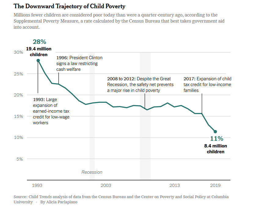
Last month, the New York Times had an article on the decline in childhood poverty. What stood out to me was a graphic from Alica Parlapiano, which had such great annotations. Parlapiano’s plot relies heavily on a visual heirarchy to direct the reader to different areas at different times. The start and end percentages are bold and large and the only non black text on the page. The actual number of children is a bit smaller below that, but bold and black and larger so they also really stand out. And then Parlapiano has provided some contextual pieces throughout the plot to show when different federal programs were enacted. These notes provide important background and liven up a visual that would be largely white space without it. She even annotates the periods of recession which fade into the background, but provide another important reference annotation.
Happy plotting!