Monday Data Viz - Size and Scope
2022-06-27 Aaron Chafetz
data-viz vizualisation monday-data-viz
With everything else in the news recently, the conflict in Ukraine has been receiving less of our attention these days, but is important nonetheless. I wanted to share a couple of graphics Bianca Pallaro and Alicia Parlapiano of the Upshot created last month on the size and scope of the US’s massive aid package to Ukraine.
In May, Congress approved an additional “$40 billion in additional aid to Ukraine … [bringing] the total U.S. commitment during the Russian invasion to roughly $54 billion.” That’s a lot of money. This is where data viz plays in. As humans, we’re good at a lot of things, but have a hard time comprehending numbers when they get large. At its core, data visualization is about providing us multiple data points for comparison and context.
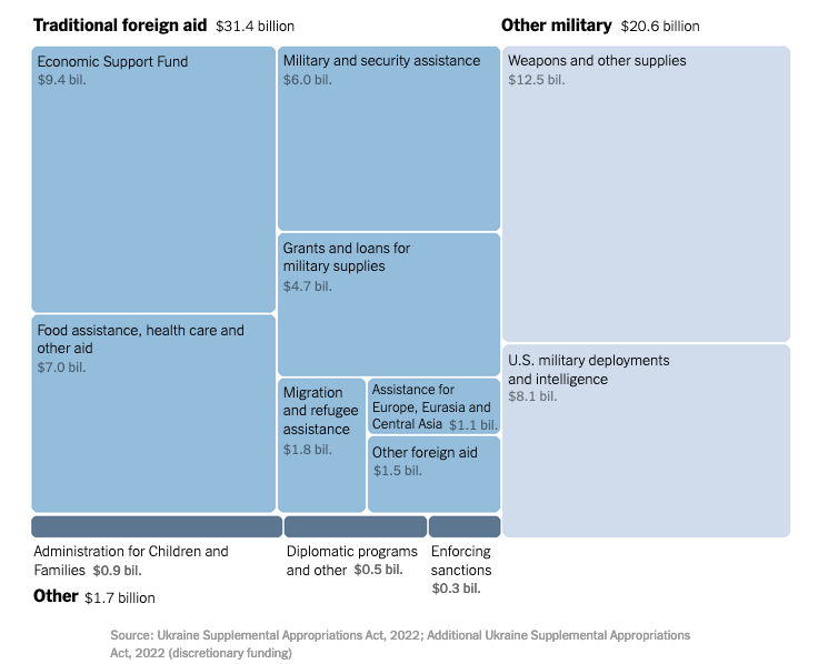
Pallaro and Parlapiano created a number of graphics to put the size and scope of the recent aid in perspective. They start their article with the scope of funding so you can see what broad categories the aid is contributing to. We can see that more than half of the funding ($31 billion of the $54 billion aid package) counts as traditional foreign aid, where a large chunk is going to economic support and food assistance and health care.
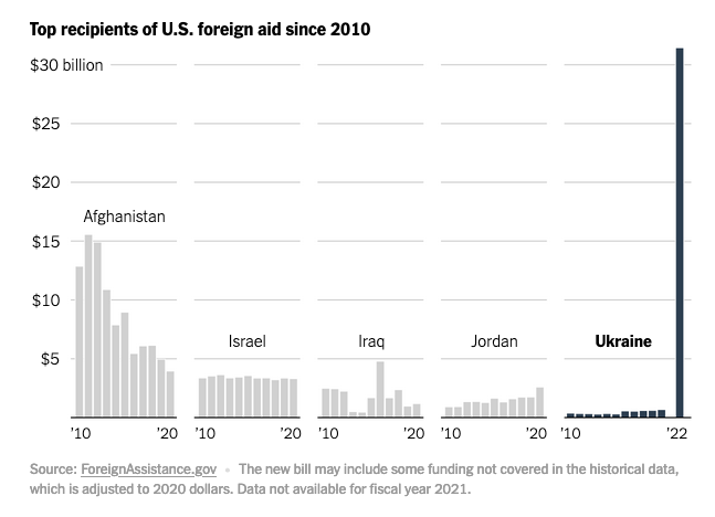
While the above graph gives us a good starting point, I find the graph below the most compelling. At the far right, the bar graph depicts the US traditional foreign to Ukraine over the last 12 years. As a point of comparison, we can see the funding has skyrocketed. Not only do Pallaro and Parlapiano provide us with the Ukraine’s aid in the graph, but also include small multiples of other large recipients of US foreign aid. As a point of comparison, the $31 billion of traditional aid is “roughly two times the amount given in 2011 to Afghanistan, the largest U.S. foreign aid recipient until now.”
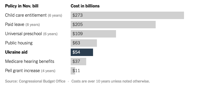
Pallaro and Parlapiano also provide another couple of useful comparisons to the $54 billion. First, while not visualized, they state that the aid is “less than a tenth of the $750 billion the government is projected to spend on defense this year.” And second, they provide the aid in the context of other domestic spending priorities on the Democrat’s agenda (although, it may be useful to see an average annual spending comparison since not all programs below will be provided over a 10 year time horizon).
For your own work, think about how you can leverage important comparison points with your data viz to make for more a compelling case than one data point can offer.
Happy plotting!